
Your landing page’s weakest score is Information hierarchy.
How Human Behavior ranks
69Growth scoreupdated
category scores
category scoresShowHide
Score over time
Information hierarchy
62FairDoes the design help or inhibit what the page is trying to say?
 1234
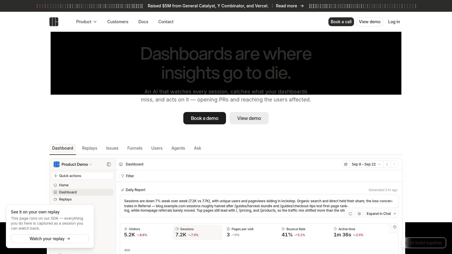
- Dark hero headline text — "Dashboards are where insights go to die" renders in near-black on black — the core message is barely legible at a glance.
- Book a call button — Header "Book a call" duplicates the hero "Book a demo" at equal visual weight, splitting the primary action into two competing targets.
- Animated ASCII banner — Flickering bracket glyphs flank the funding announcement at the very top, pulling first attention away from the headline below.
- Demo tab strip — Seven equal-weight tabs (Dashboard, Replays, Issues, Funnels, Users, Agents, Ask) invite exploration before the value prop and CTA have fully landed.
Trust
64FairProof that the product is real, competent, and safe to try.
| Trust read | |
|---|---|
| Human Behavior | "Raised $5M from General Catalyst, Y Combinator, and Vercel" funding banner |
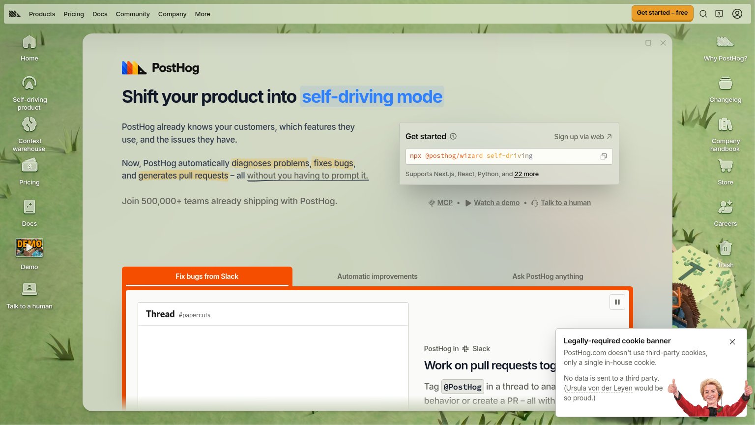
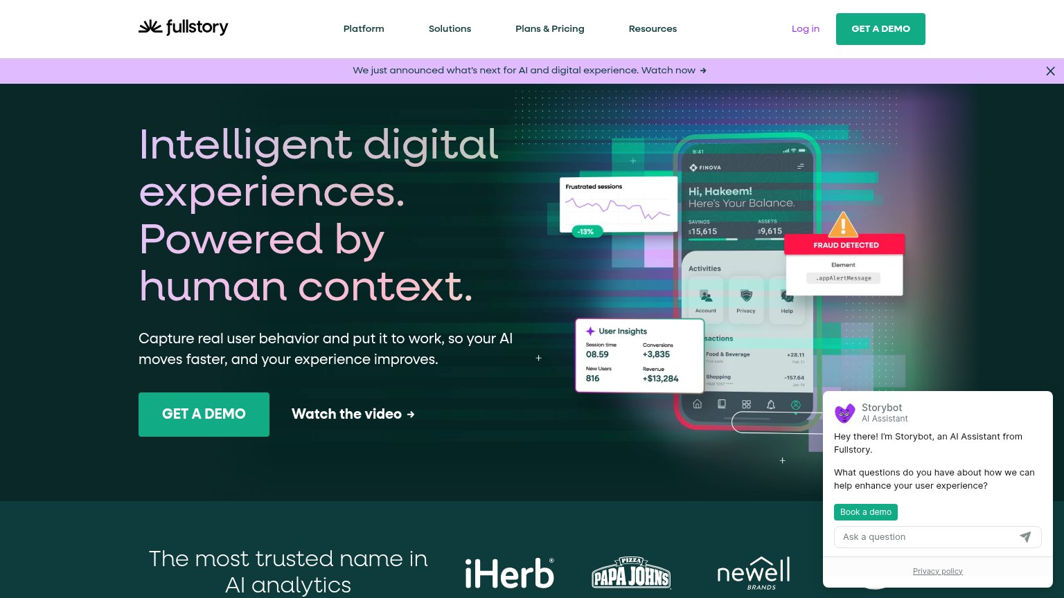
| Join 500,000+ teams already shipping with PostHog. | |
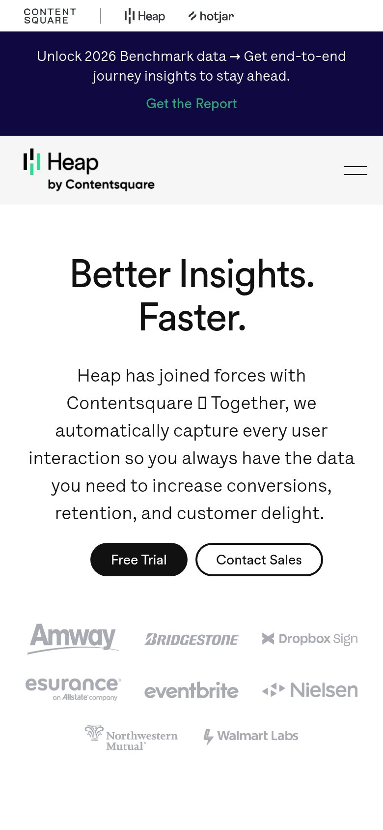
| Customer logo wall (Amway, Bridgestone, Dropbox Sign, Esurance, Eventbrite, Nielsen, Northwestern Mutual, Walmart Labs) | |
| Customer logo strip: iHerb, Papa John's, Newell Brands | |
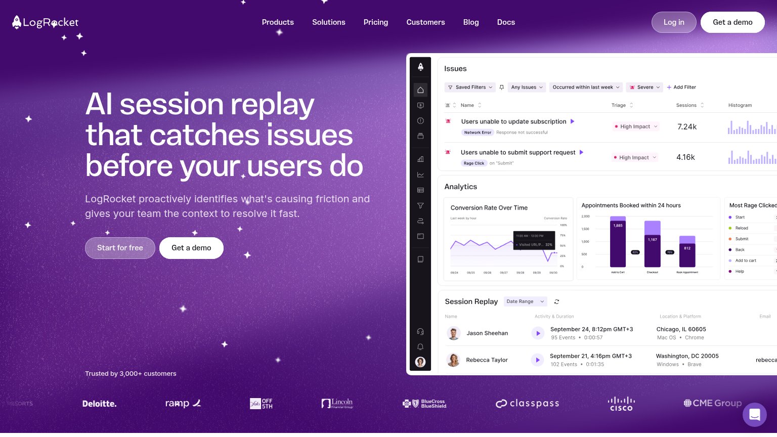
| "Trusted by 3,000+ customers" line above a logo wall including Deloitte, Cisco, BlueCross BlueShield, ClassPass, and CME | |
| "Over the past 5 years we've gone from zero to profitable" |
CTA
70FairCopy, size, verb, cost-feel — does the primary CTA earn the click?
Problems
- booking a demo feels costly
- competes with nav 'Book a call'
- 'View demo' vs 'Book a demo' confuses
- no zero-commitment path in hero
Mobile web
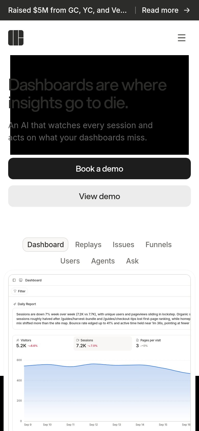
72FairThe phone experience as a first-class citizen.
 1234
- Faded headline text — Headline 'Dashboards are where insights go to die.' renders dark-gray on black — nearly unreadable at first glance.
- Truncated banner text — Promo bar cuts off to 'Raised $5M from GC, YC, and Ve…', wasting the top 40px on unreadable copy.
- Overflowing dashboard card — Daily Report text and stat tiles run off the right edge — desktop-width embed not scaled for the phone.
- Wrapping tab row — Seven tabs (Dashboard…Ask) wrap into two lines instead of collapsing to a horizontal scroller.
Value props
78FairTitle, subtitle, hero — do they sell the product's true value?
Human Behavior’s headline sells
Dashboards are where insights go to die.
An AI that watches every session, catches what your dashboards miss, and acts on it — opening PRs and reaching the users affected.
Working
- Pain-first headline hits real frustration
- Subhead names concrete actions: PRs, outreach
- Live demo shows AI Daily Report in action
Could improve
- Headline alone says nothing about the product
- No proof numbers anywhere in hero copy
- Mobile subhead drops the 'opening PRs' specifics