CaucusYC P25 landing page report.
← Back to YC P25

Your landing page’s weakest score is Trust.

Fix Trust

Score over time

757065605550Fireside 64 on Mar 23 (Wayback)Fireside 64 on May 7 (Wayback)Fireside 64 on May 15 (Wayback)Fireside 65 on Jun 17 (Wayback)Fireside 65 on Sep 11 (Wayback)Fireside 68 on Sep 21 (Live)Indigov 62 on Apr 21 (Wayback)Indigov 61 on May 18 (Wayback)Indigov 60 on Jun 29 (Wayback)Indigov 61 on Aug 13 (Wayback)Indigov 64 on Sep 21 (Live)NationBuilder 56 on Sep 17 (Wayback)Caucus 56 on Apr 21 (Wayback)Caucus 56 on Aug 27 (Wayback)Caucus 59 on Sep 21 (Live)Apr 21Aug 27Sep 21
Past reportsShow past reportsHide past reports
  1. Sep 21, 202659LiveOverall +3 · Information hierarchy +10 · CTA +4Viewing
  2. Aug 27, 202656No score movementView →
  3. Apr 21, 202656First tracked report — strongest Information hierarchy 68, weakest Trust 48View →

Trust

48Poor

Proof that the product is real, competent, and safe to try.

Trust read
Caucus"Backed by Y Combinator" badge
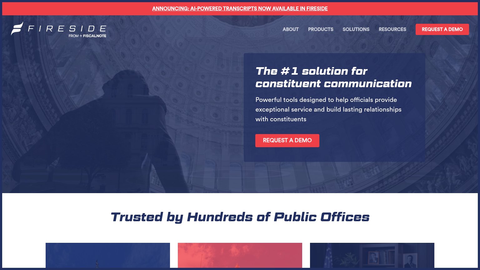
Fireside"Trusted by Hundreds of Public Offices" section header
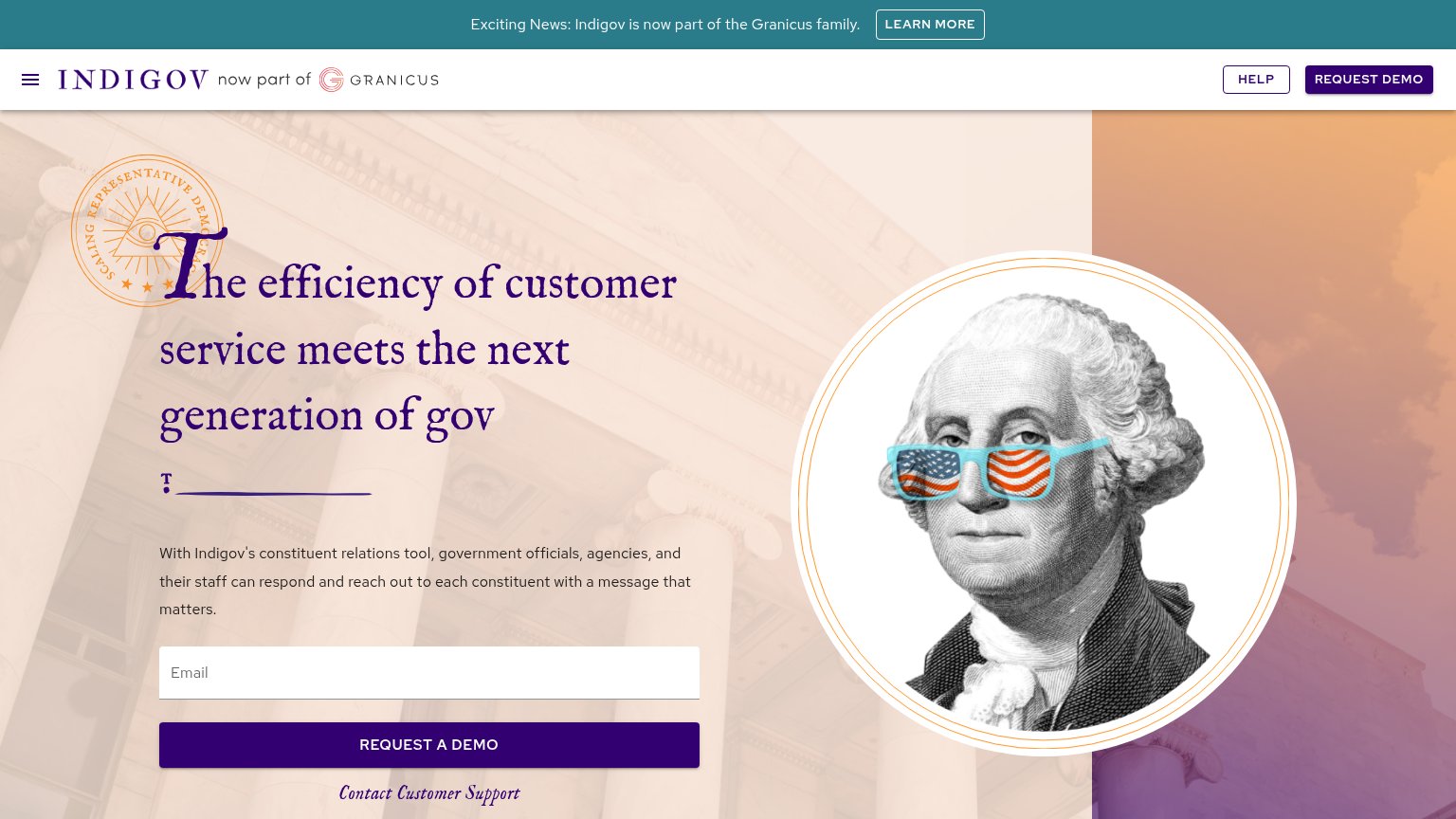
Indigov"Exciting News: Indigov is now part of the Granicus family." banner with "now part of Granicus" header lockup
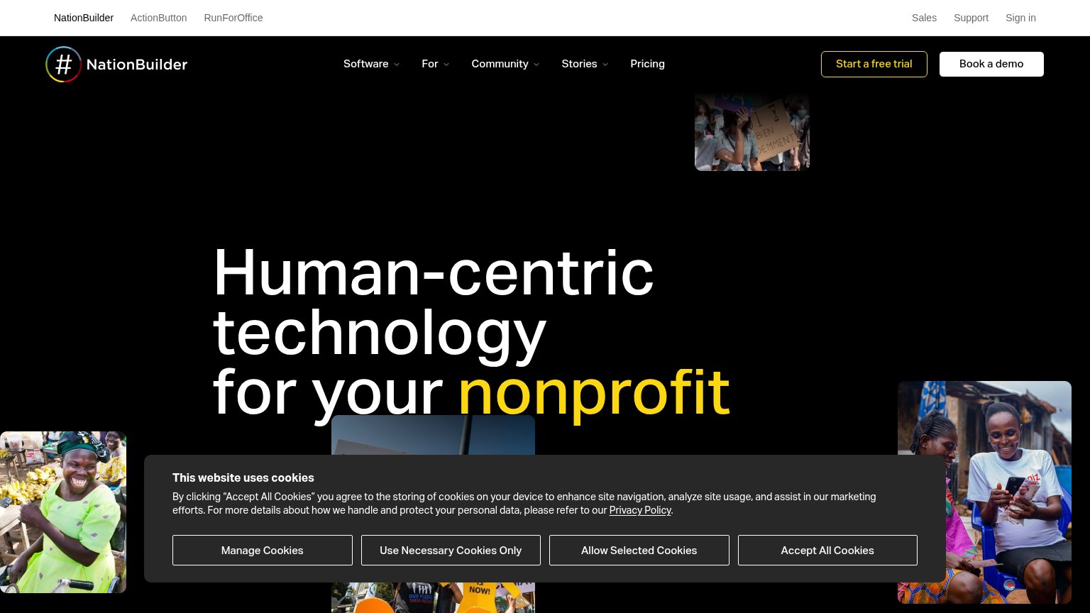
NationBuilderimplicit context NationBuilder may benefit from pre-existing familiarity among its target audience.

Mobile web

54Fair

The phone experience as a first-class citizen.

Mobile web mobile capture
No specific callouts

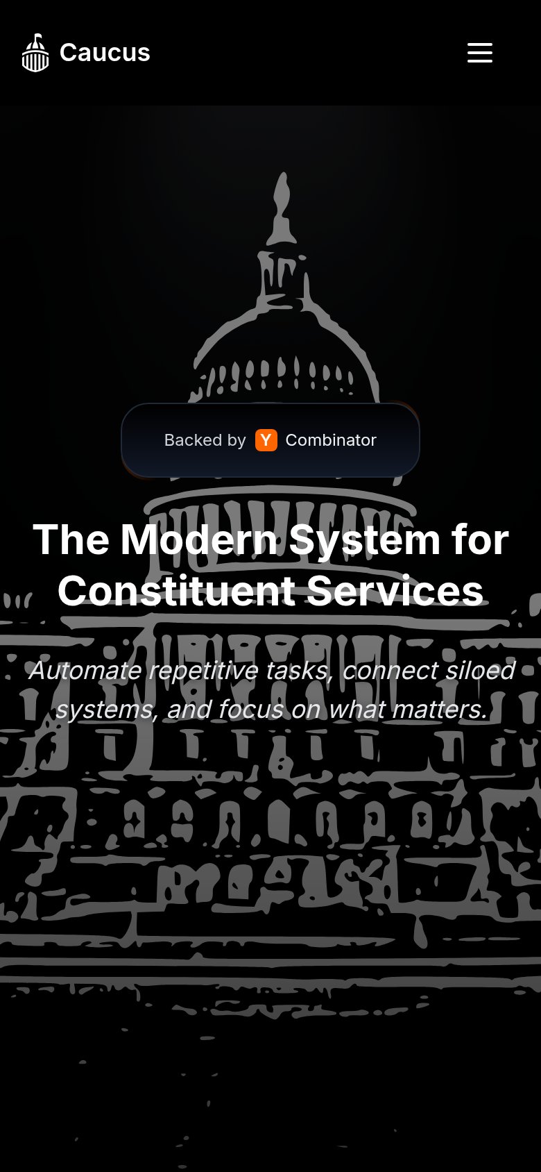
The biggest failure is that the primary CTA is missing from the mobile fold entirely: the desktop "Request Demo" button collapses behind the hamburger menu, leaving no tappable action anywhere in the first viewport — a visitor sees the "Backed by Y Combinator" badge, the headline, and the subhead, but nothing to do next. The nav itself collapses cleanly into a compact hamburger, and the fold stays uncrowded with a single value statement, "The Modern System for Constituent Services." Readability suffers where the italic subhead "Automate repetitive tasks, connect siloed systems..." sits in gray over the busy Capitol illustration, dropping contrast at exactly the line that explains the product. The single biggest lever is adding a full-width "Request Demo" button directly under the subhead so the mobile fold converts instead of dead-ending.

CTA

56Fair

Copy, size, verb, cost-feel — does the primary CTA earn the click?

Caucus
NationBuilder
Indigov
Fireside

Problems

  • no CTA in the hero itself
  • hidden behind hamburger on mobile
  • 'Request' feels costly, sales-gated
  • small nav-corner footprint

Value props

58Fair

Title, subtitle, hero — do they sell the product's true value?

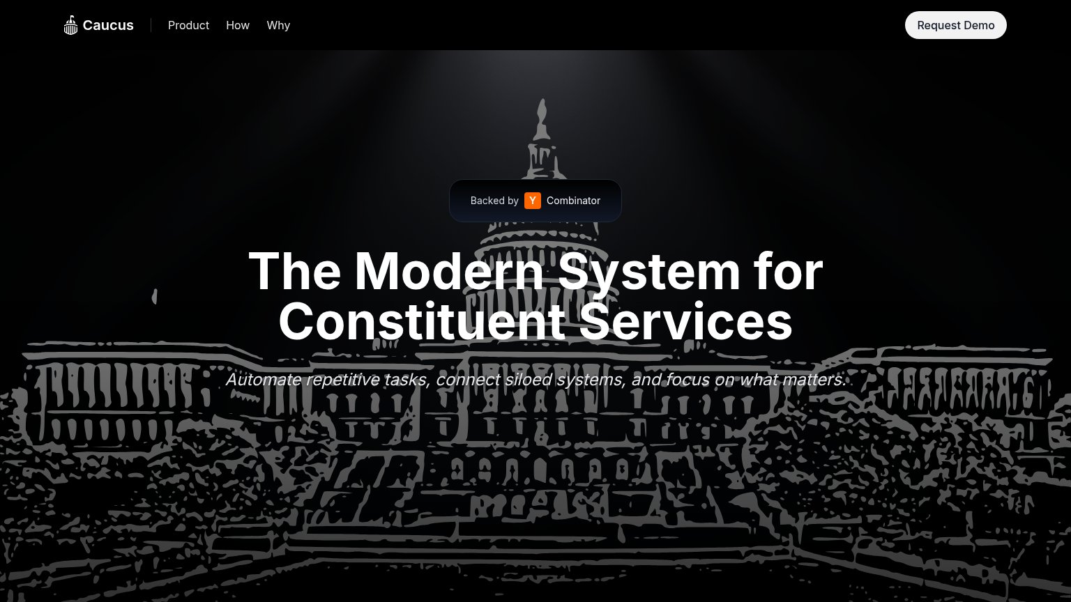
Caucus’s headline vagueThe Modern System for Constituent ServicesAutomate repetitive tasks, connect siloed systems, and focus on what matters.

Working

  • Names the audience: constituent services
  • YC badge adds credibility
  • Subhead hints at real pain: silos

Could improve

  • "Modern System" is a category, not value
  • No numbers or named outcomes
  • Hero art decorates, never demonstrates

Information hierarchy

78Fair

Does the design help or inhibit what the page is trying to say?

Information hierarchy annotations on the desktop capture123
  1. Italic subheadline text — Thin italic white type sits directly on the light-gray Capitol steps, making the only benefit statement the least legible line in the fold.
  2. Request Demo button — The sole CTA is stranded in the top-right corner, outside the centered headline-to-subhead scan path; no button follows the value prop.
  3. Y Combinator badge — The badge sits above the headline in the scan order, so social proof outranks the value proposition it should support.

Competitors

inferred from product, audience, and value prop