
Your landing page’s weakest score is Trust.
How Blueshoe ranks
63Growth scoreupdated
category scores
category scoresShowHide
Score over time
Trust
34PoorProof that the product is real, competent, and safe to try.
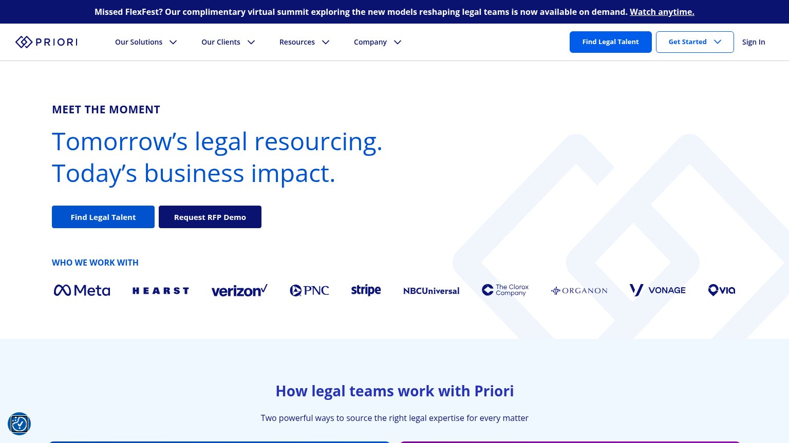
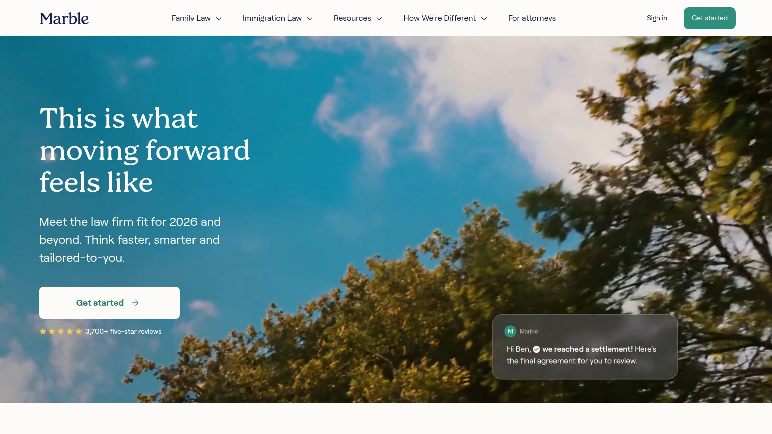
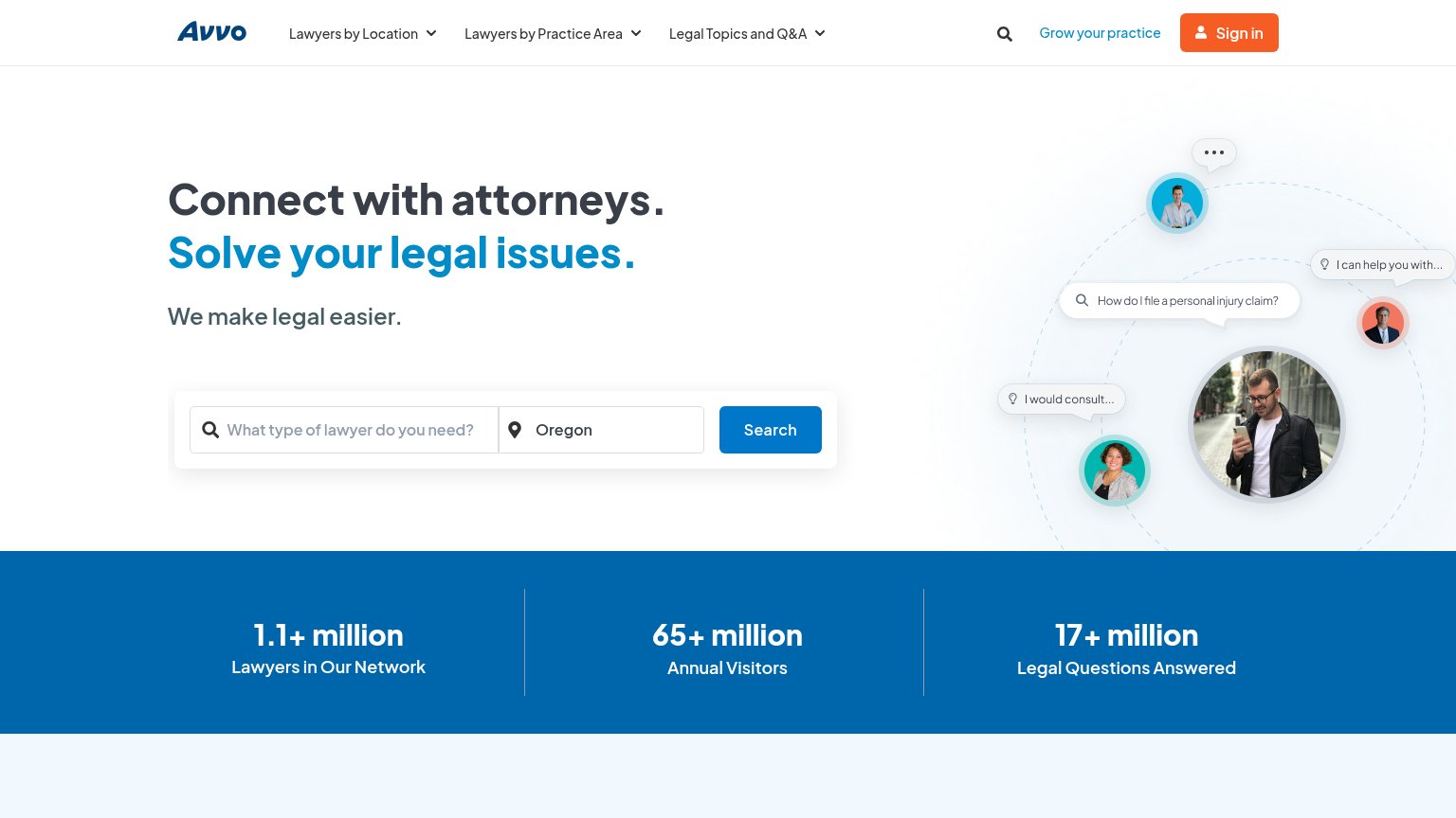
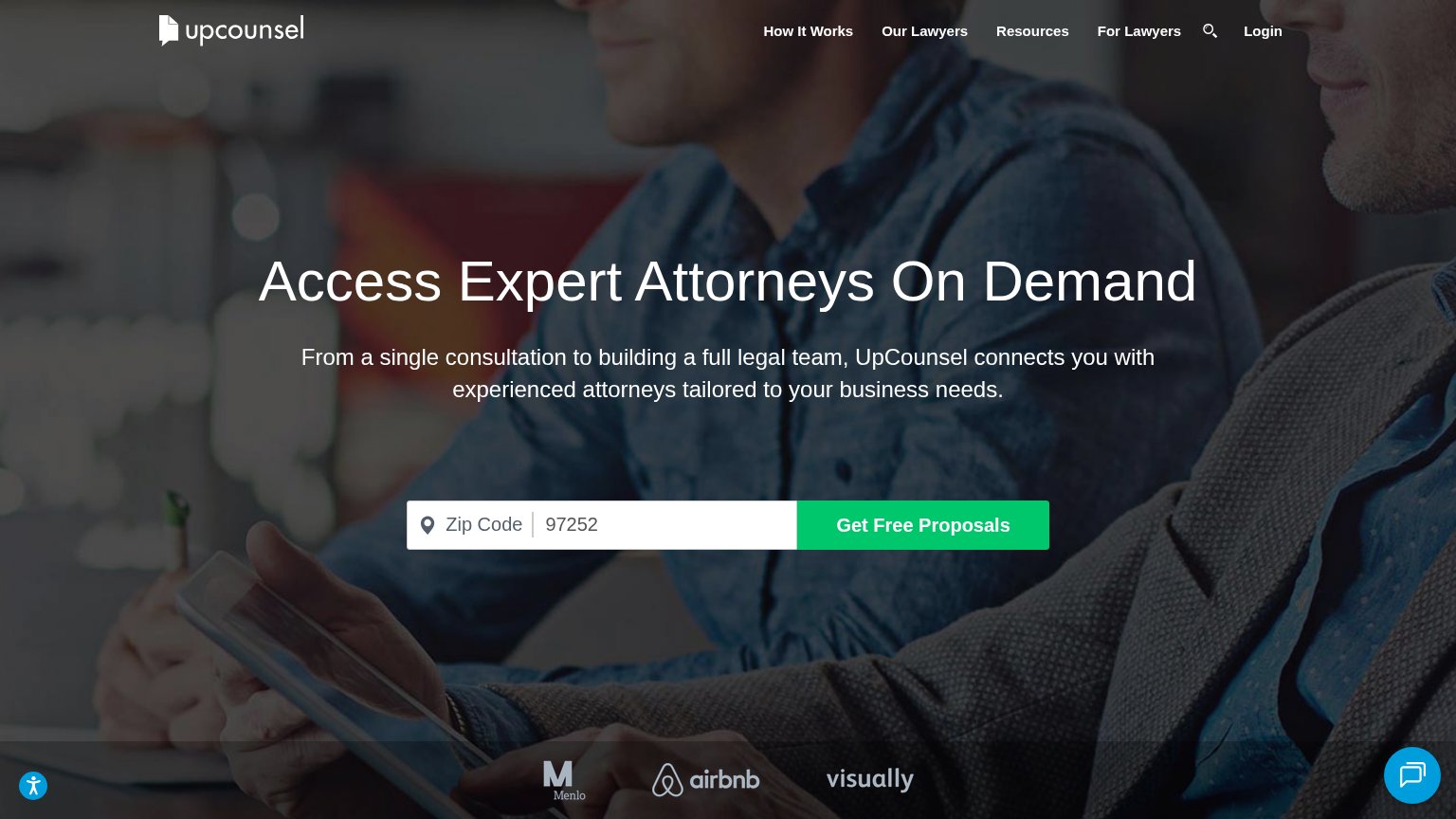
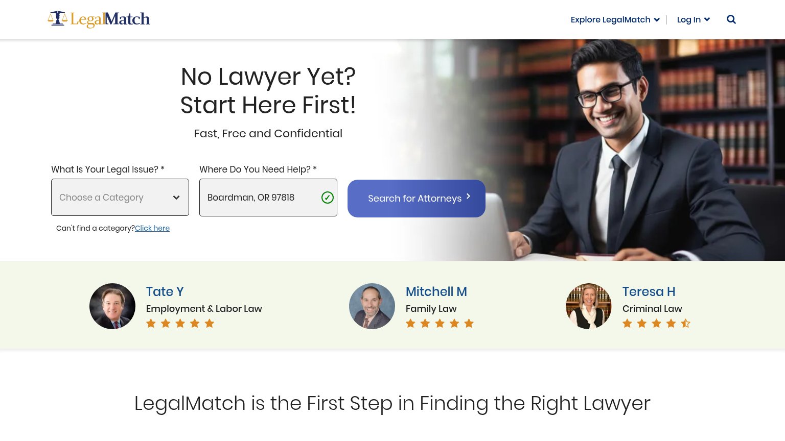
| Trust read | |
|---|---|
| Blueshoe | No visible trust signal identified. |
| "3,700+ five-star reviews" with five-star rating row beneath the Get started CTA | |
| Attorney profile cards with photos and star ratings ("Tate Y — Employment & Labor Law") | |
| Stats bar: "1.1+ million Lawyers in Our Network / 65+ million Annual Visitors / 17+ million Legal Questions Answered" | |
| Logo strip with Menlo, airbnb, and visually at the bottom of the fold | |
| "WHO WE WORK WITH" logo bar featuring Meta, Hearst, Verizon, PNC, Stripe, NBCUniversal, The Clorox Company, Organon, Von |
Value props
58FairTitle, subtitle, hero — do they sell the product's true value?
Blueshoe’s headline vague
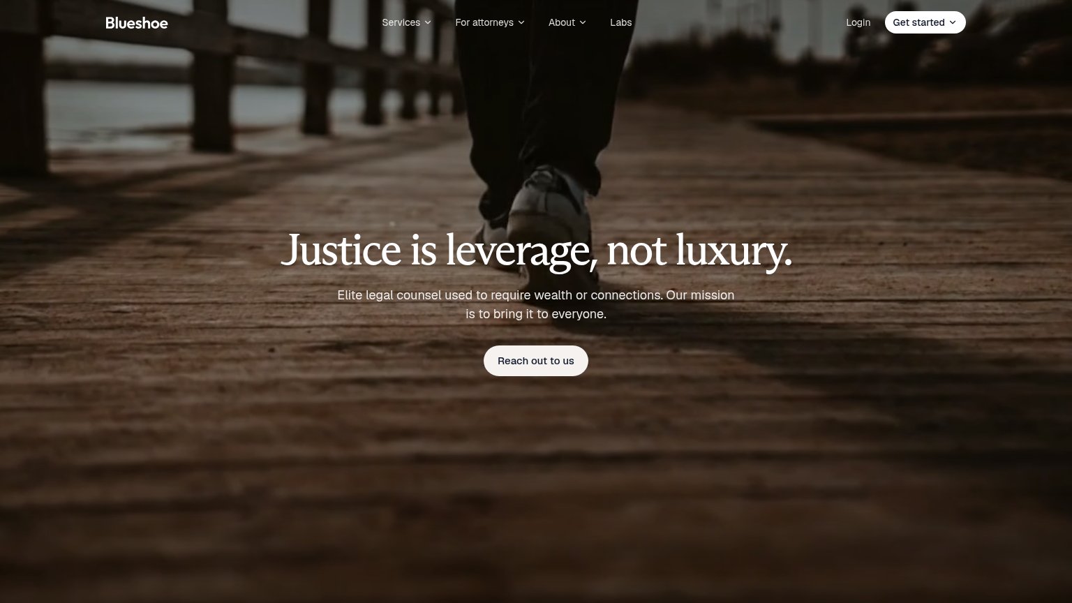
Justice is leverage, not luxury.
Elite legal counsel used to require wealth or connections. Our mission is to bring it to everyone.
Working
- Emotionally sharp, quotable headline
- Names the access/wealth pain point
- Clear underdog positioning
Could improve
- Never says what the product is
- No numbers, pricing, or proof
- Hero image decorates, not demonstrates
CTA
62FairCopy, size, verb, cost-feel — does the primary CTA earn the click?
Problems
- 'Reach out' feels like a chore, not value
- 4 words — over the 3-word limit
- conflicts with nav's 'Get started'
- outcome of click is unclear
Information hierarchy
76FairDoes the design help or inhibit what the page is trying to say?
123- Reach out CTA — Vague label with low urgency and modest footprint; competes with 'Get started' in the nav so neither reads as the primary action.
- Get started nav button — Filled white pill styled at equal weight to the hero CTA, splitting attention between two conversion paths and its dropdown chevron adds friction.
- Hero subtitle text — Low-contrast small type over a busy dark photo makes the mission statement harder to read than the headline it supports.
Mobile web
83StrongThe phone experience as a first-class citizen.
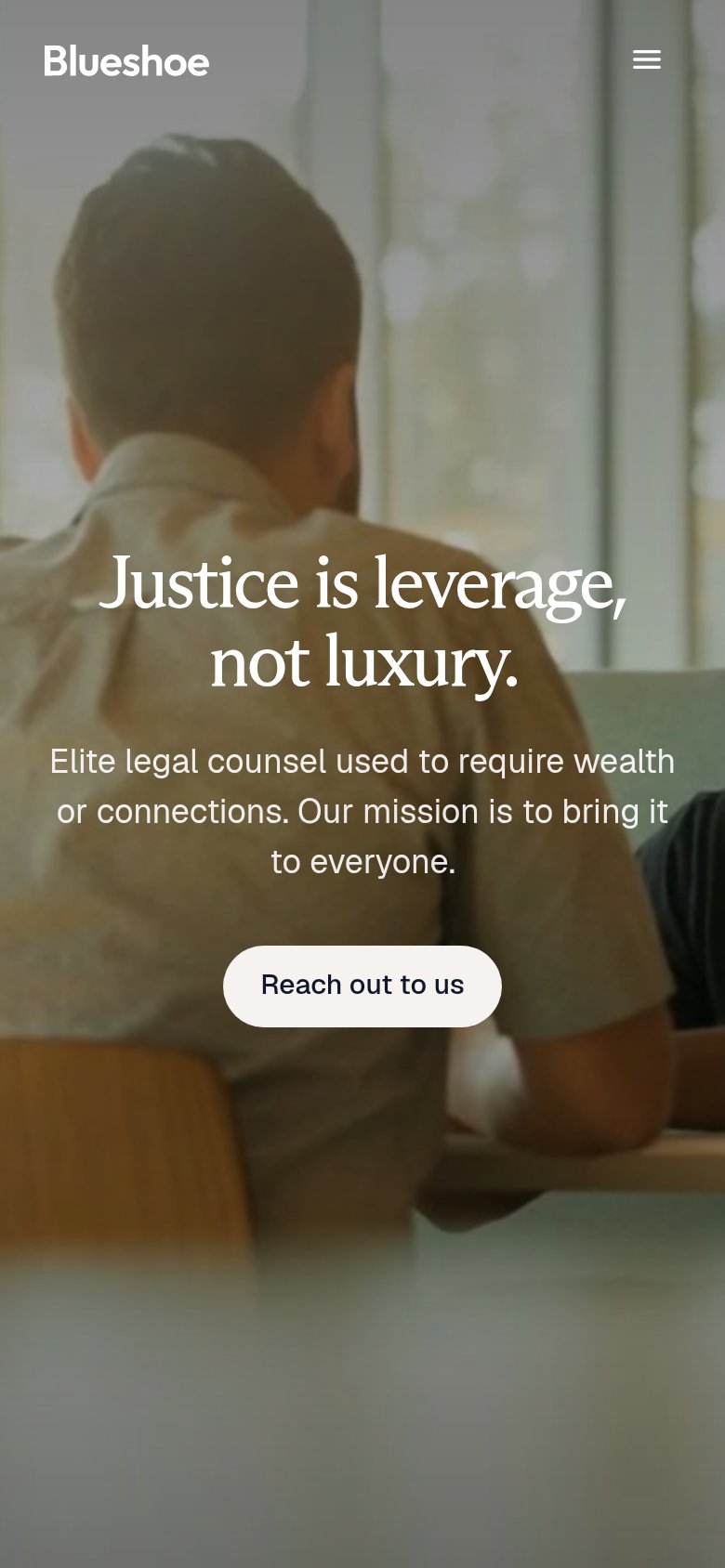 1
- Reach out button — Pill sits at two-thirds width instead of a full-bleed thumb target, and its cream fill blends into the pale photo behind it.