
Your landing page’s weakest score is Value props.
How Priori Legal ranks
- 1.
Eudia74
- 2.
Axiom69
- 3.
General Legal68
- 4.
Priori Legal67
- 5.
Crosby67
- 6.
Lawtrades66
67Growth scoreupdated
category scores
category scoresShowHide
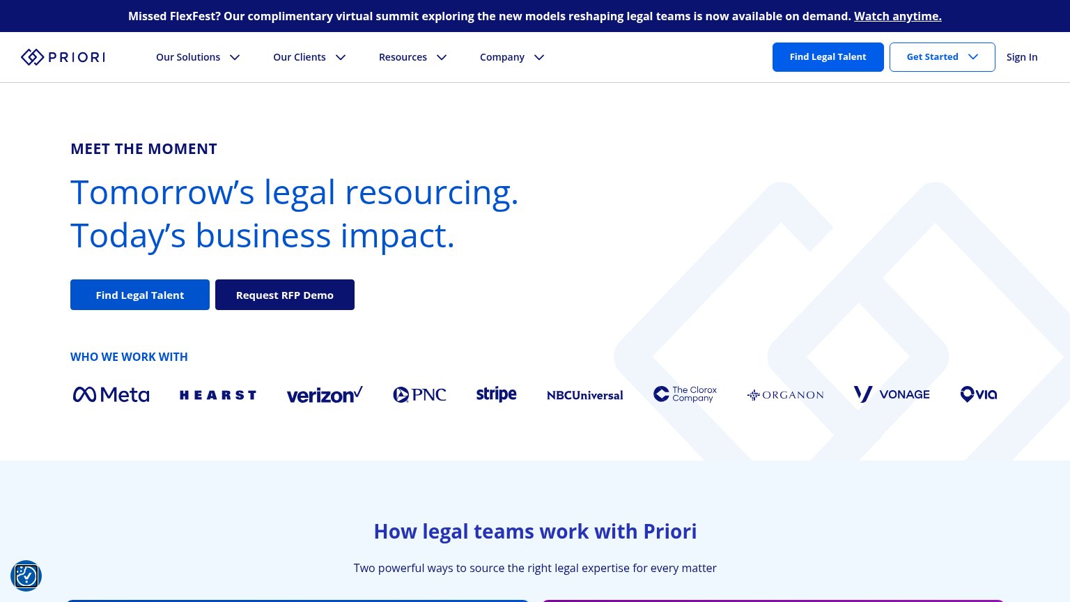
Value props
52FairTitle, subtitle, hero — do they sell the product's true value?
Priori Legal’s headline vague
Tomorrow's legal resourcing. Today's business impact.
Working
- Blue-chip logo bar builds instant trust
- CTAs hint at the marketplace model
- Clean, confident enterprise tone
Could improve
- Headline is buzzword abstraction
- No subhead to explain the product
- Hero art decorates, shows nothing
Mobile web
64FairThe phone experience as a first-class citizen.
 1234
- FlexFest promo banner — Four-line sticky banner eats the top fifth of the viewport before the brand or value prop appears.
- Oversized hero headline — Headline barely scaled down from desktop, wrapping into five tall lines that push CTAs toward the fold.
- Stacked twin CTAs — Two equally weighted buttons compete for the tap instead of one clear primary action.
- Chat bubble widget — Floating bubble overlaps the Verizon logo and adds clutter at the thumb zone.
Information hierarchy
72FairDoes the design help or inhibit what the page is trying to say?
What works
What to improve
Trust
72FairProof that the product is real, competent, and safe to try.
How Priori Legal compares
Trust read
CTA
76FairCopy, size, verb, cost-feel — does the primary CTA earn the click?
How Priori Legal compares
Recommended rewrites