
Your landing page’s weakest score is Trust.
How Avvo ranks
78Growth scoreupdated
category scores
category scoresShowHide
Trust
66FairProof that the product is real, competent, and safe to try.
| Trust read | |
|---|---|
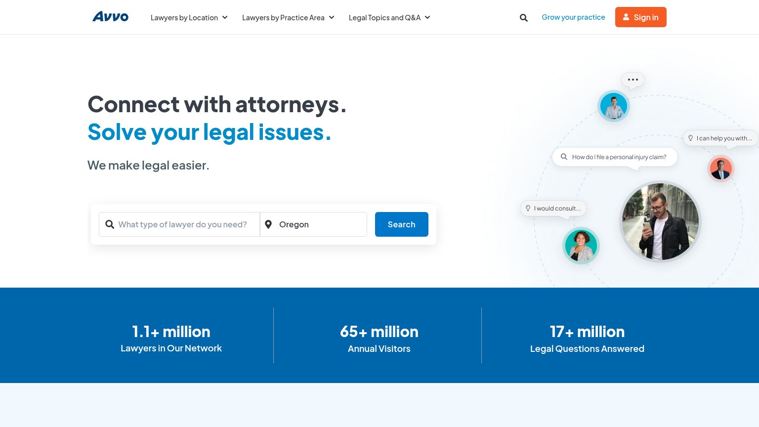
| Avvo | Stats bar: "1.1+ million Lawyers in Our Network / 65+ million Annual Visitors / 17+ million Legal Questions Answered" |
| No visible trust signal identified. | |
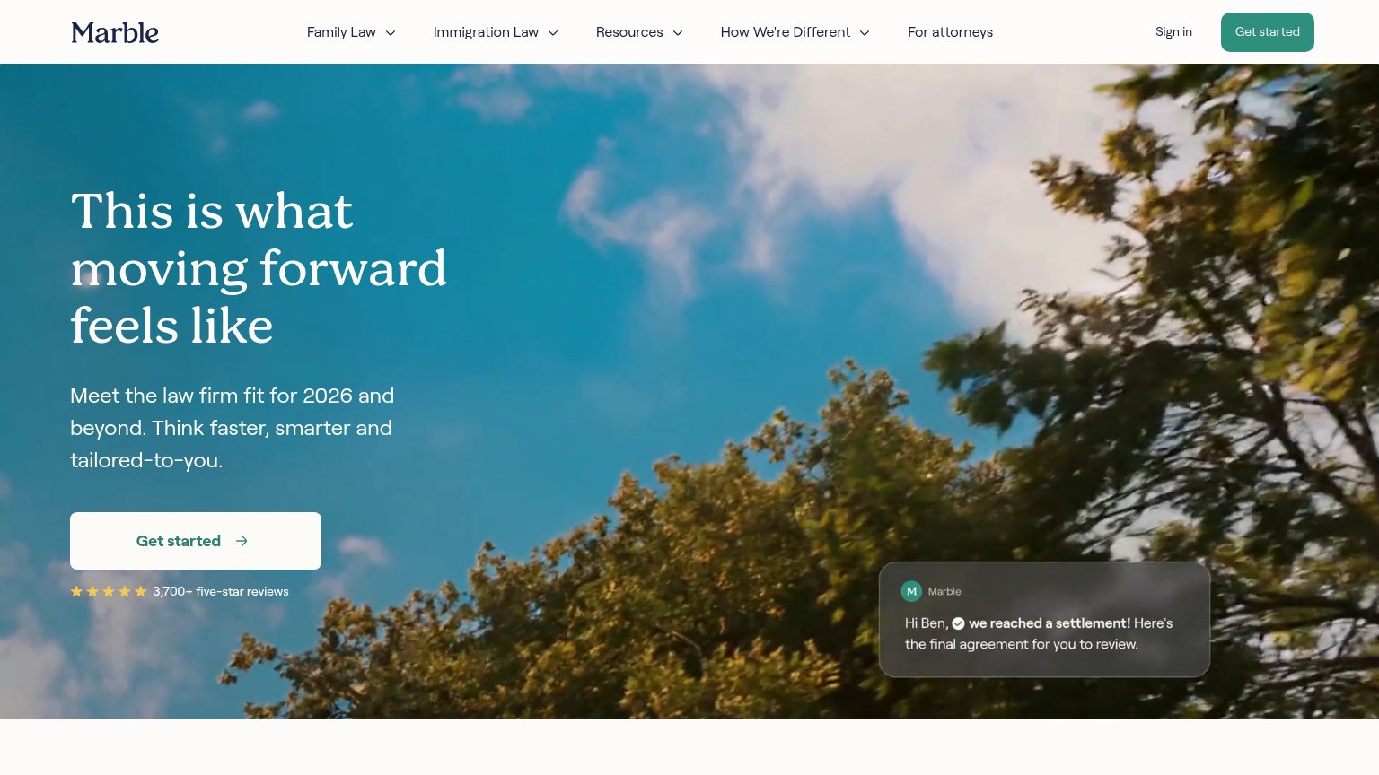
| "3,700+ five-star reviews" with five-star rating row beneath the Get started CTA | |
| Attorney profile cards with photos and star ratings ("Tate Y — Employment & Labor Law") | |
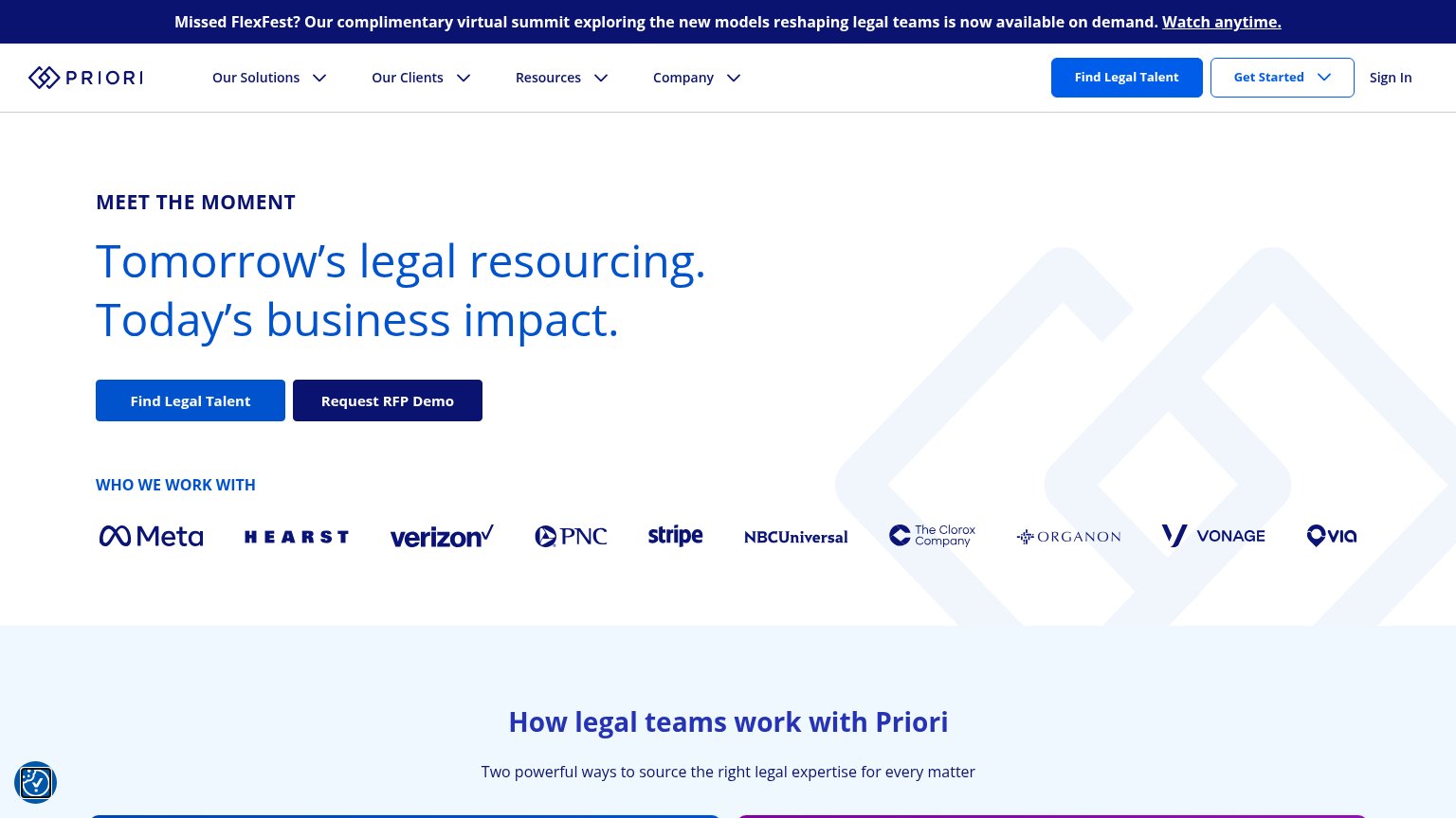
| Logo strip with Menlo, airbnb, and visually at the bottom of the fold | |
| "WHO WE WORK WITH" logo bar featuring Meta, Hearst, Verizon, PNC, Stripe, NBCUniversal, The Clorox Company, Organon, Von |
Information hierarchy
76FairDoes the design help or inhibit what the page is trying to say?
123- Grow Avvo's practice link — Blue text link plus orange 'Sign in' button pull attorney traffic into the CTA scan path, competing with the consumer search action.
- Search button contrast — The primary 'Search' button is the same blue as the headline accent and modest in footprint, letting the orange 'Sign in' out-shout it.
- Nav dropdown row — Three dropdowns ('Lawyers by Location', 'Practice Area', 'Legal Topics and Q&A') plus a search icon open dozens of exits before the primary action.
Value props
76FairTitle, subtitle, hero — do they sell the product's true value?
Avvo’s headline
Connect with attorneys. Solve your legal issues.
We make legal easier.
Working
Could improve
CTA
82StrongCopy, size, verb, cost-feel — does the primary CTA earn the click?
How Avvo compares
Recommended rewrites
Mobile web
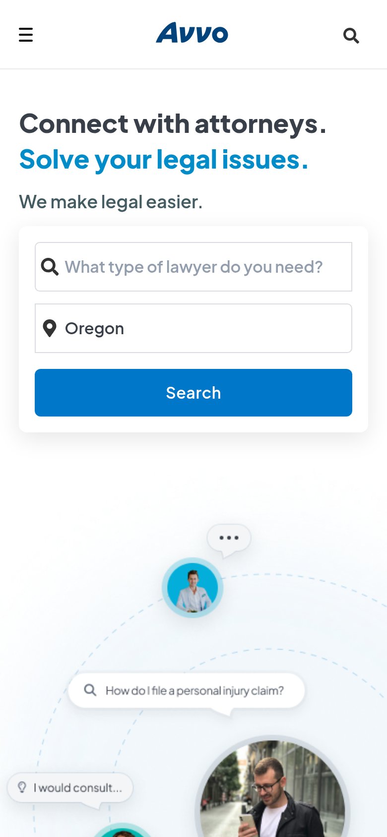
90StrongThe phone experience as a first-class citizen.
What works
What to improve