
Your landing page’s weakest score is Mobile web.
How Veeza AI ranks
68Growth scoreupdated
category scores
category scoresShowHide
Score over time
Mobile web
58FairThe phone experience as a first-class citizen.
 123
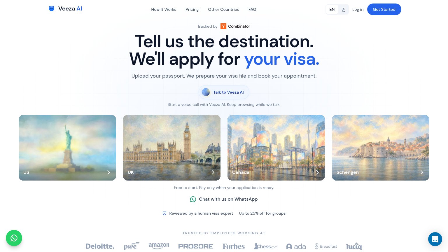
- Six-line hero headline — "Tell us the destination. We'll apply for Veeza AI's visa." wraps into six cramped lines and pushes the CTA toward the fold edge.
- WhatsApp chat bubble — Floating chat bubble overlaps the Canada destination card and competes with the Intercom bubble on the opposite corner.
- Intercom chat bubble — A second floating bubble sits over the Schengen card, doubling corner clutter with no conversion role.
CTA
64FairCopy, size, verb, cost-feel — does the primary CTA earn the click?
Problems
- no 'free' despite free-to-start line
- two competing hero asks
- voice call feels costly
- hero CTA smaller than headline pull
Information hierarchy
68FairDoes the design help or inhibit what the page is trying to say?
1234- Talk to Veeza AI — Mid-fold pill outranks the nav's 'Get Started' — two competing primary actions leave the visitor unsure which starts the visa process.
- Header nav links — Four nav links plus a language toggle and Log in stack six exit paths ahead of the conversion CTA.
- Destination cards row — Four equal-weight clickable cards fragment the next step into five choices with 'Talk to Veeza AI'.
- WhatsApp chat row — 'Chat with us on WhatsApp' adds a third styled action channel in the fold, diluting the primary path.
Trust
68FairProof that the product is real, competent, and safe to try.
| Trust read | |
|---|---|
| Veeza AI | Backed by Y Combinator badge above the headline |
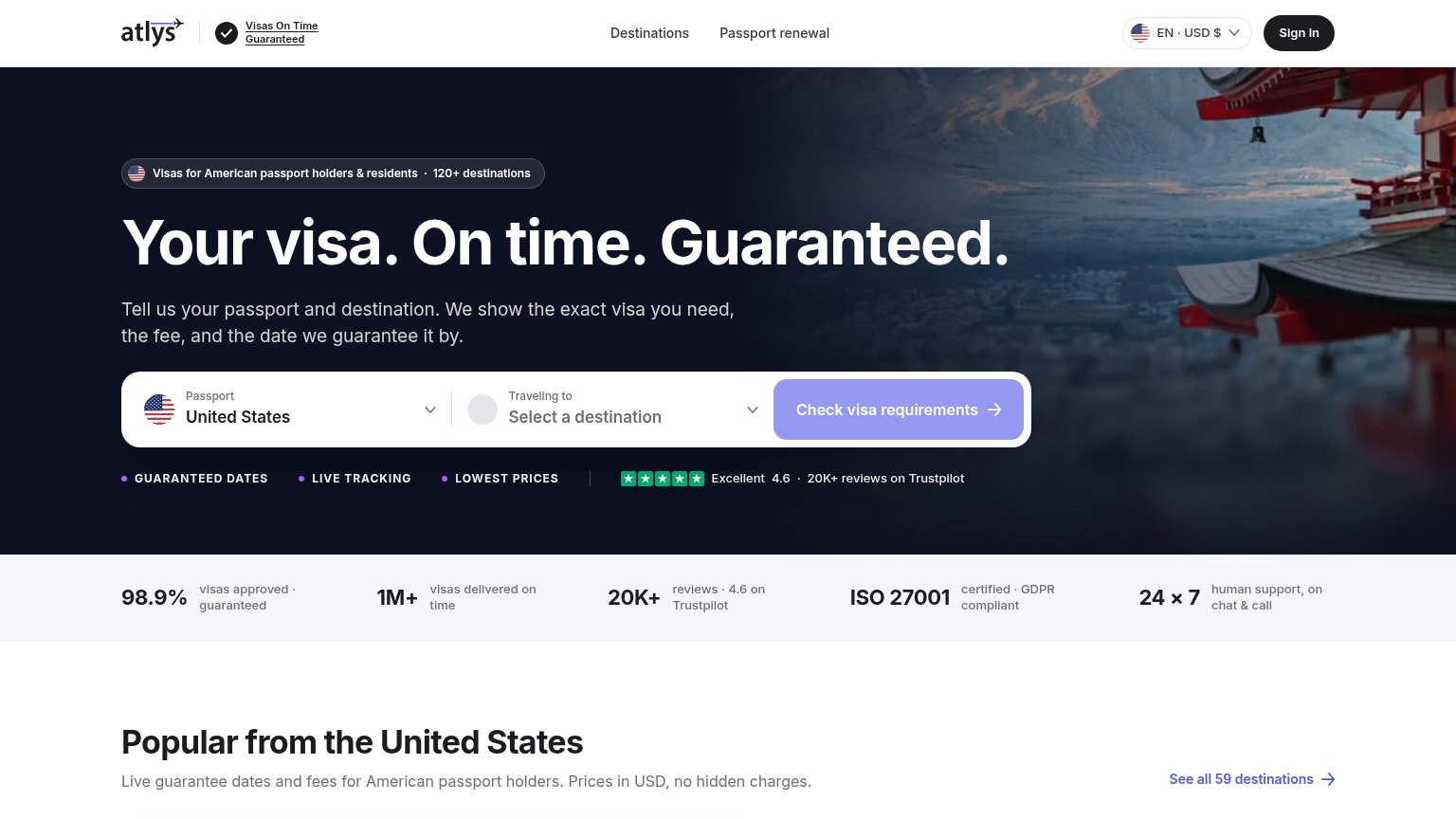
| Excellent 4.6 · 20K+ reviews on Trustpilot | |
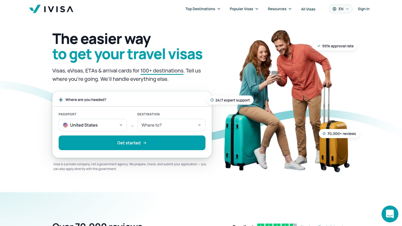
| "70,000+ reviews" pill alongside the Trustpilot star-rating strip beginning below the hero | |
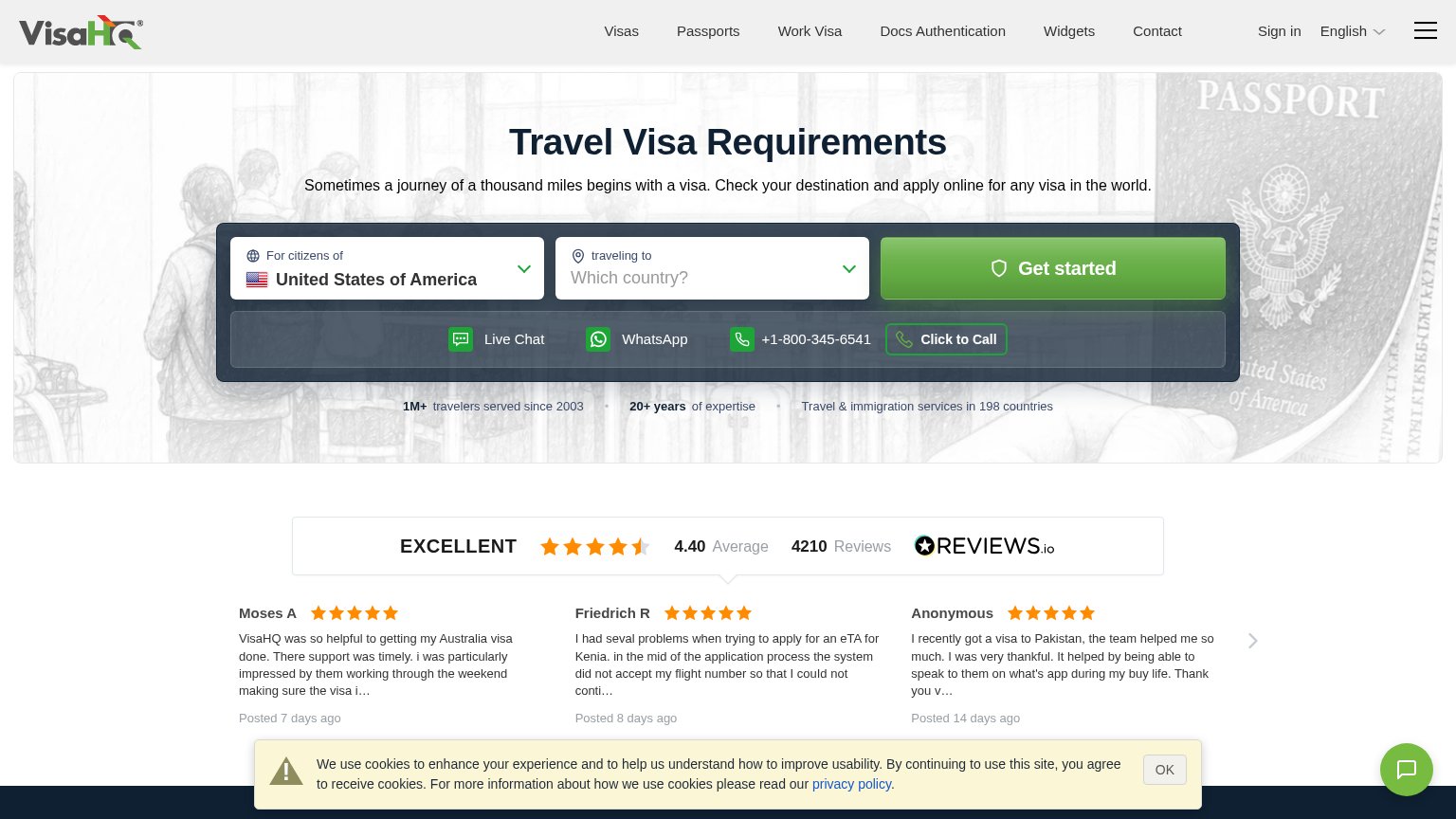
| REVIEWS.io widget: "EXCELLENT 4.40 Average · 4210 Reviews" with dated customer testimonials | |
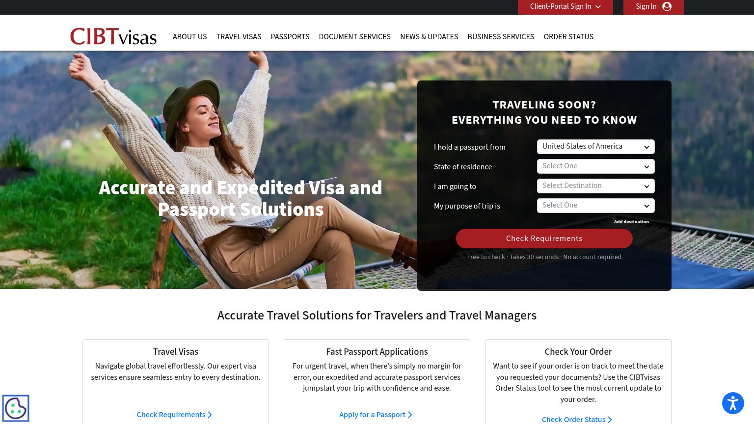
| "Free to check · Takes 30 seconds · No account required" microcopy under the Check Requirements button | |
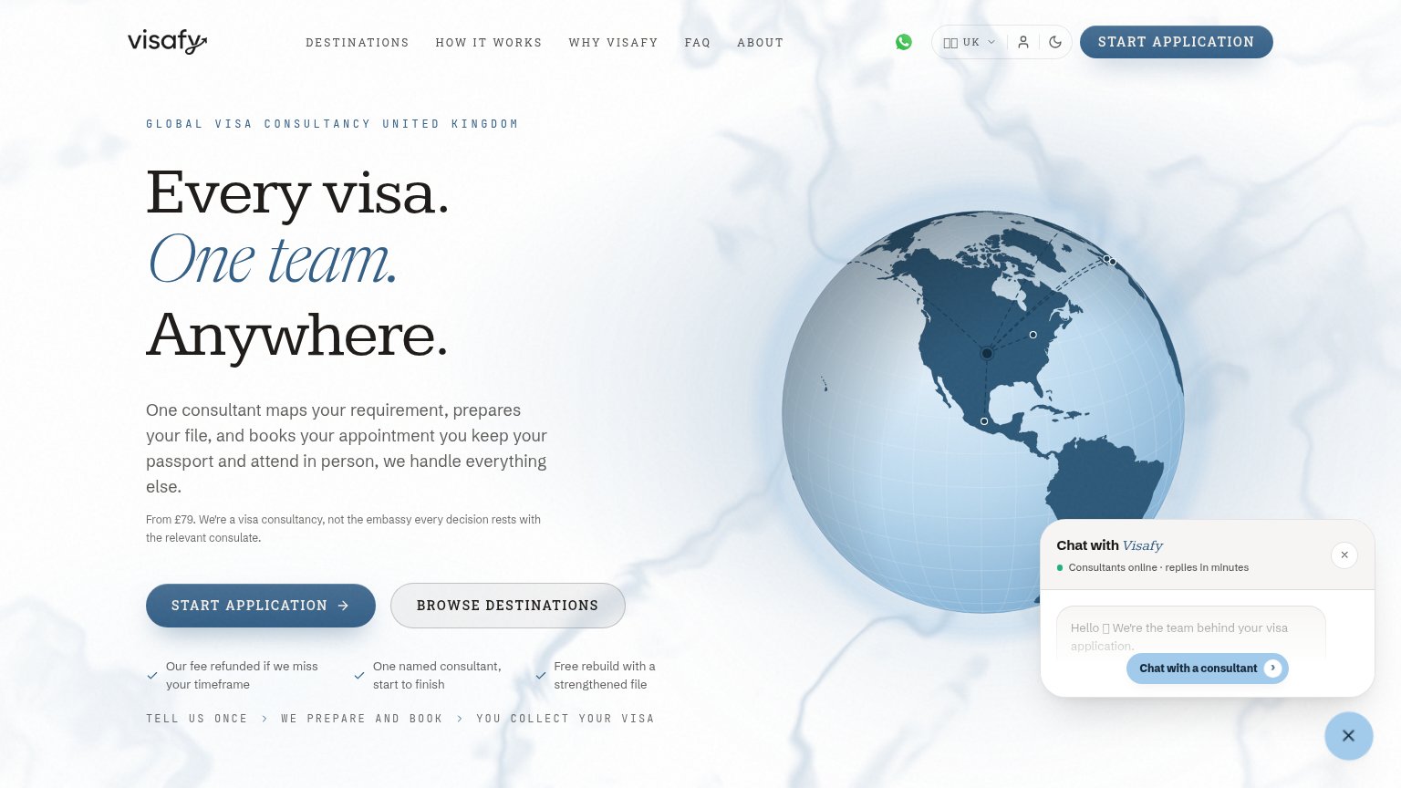
| Our fee refunded if we miss your timeframe |
Value props
84StrongTitle, subtitle, hero — do they sell the product's true value?
Veeza AI’s headline sells
Tell us the destination. We'll apply for your visa.
Upload your passport. We prepare your visa file and book your appointment.
Working
- One-input promise: destination in, visa out
- Subhead names three concrete steps
- Human-expert review defuses AI distrust
Could improve
- No numbers: speed, approvals, users
- Destination art decorates, never demonstrates
- No time-to-appointment claim