
Your landing page’s weakest score is Trust.
How iVisa ranks
Trust
76FairProof that the product is real, competent, and safe to try.
| Trust read | |
|---|---|
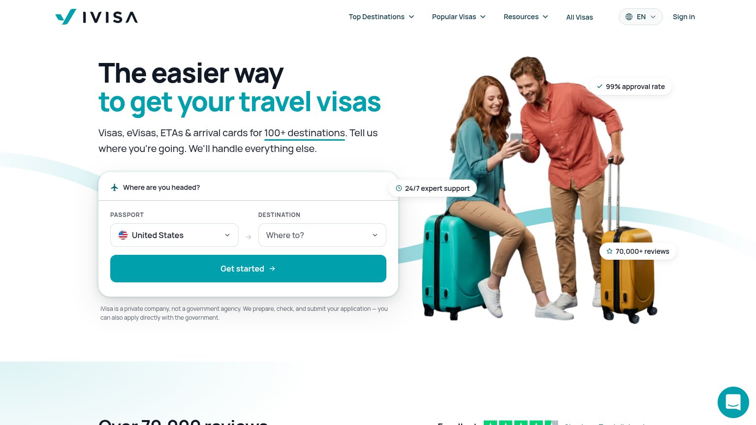
| iVisa | "70,000+ reviews" pill alongside the Trustpilot star-rating strip beginning below the hero |
| Backed by Y Combinator badge above the headline | |
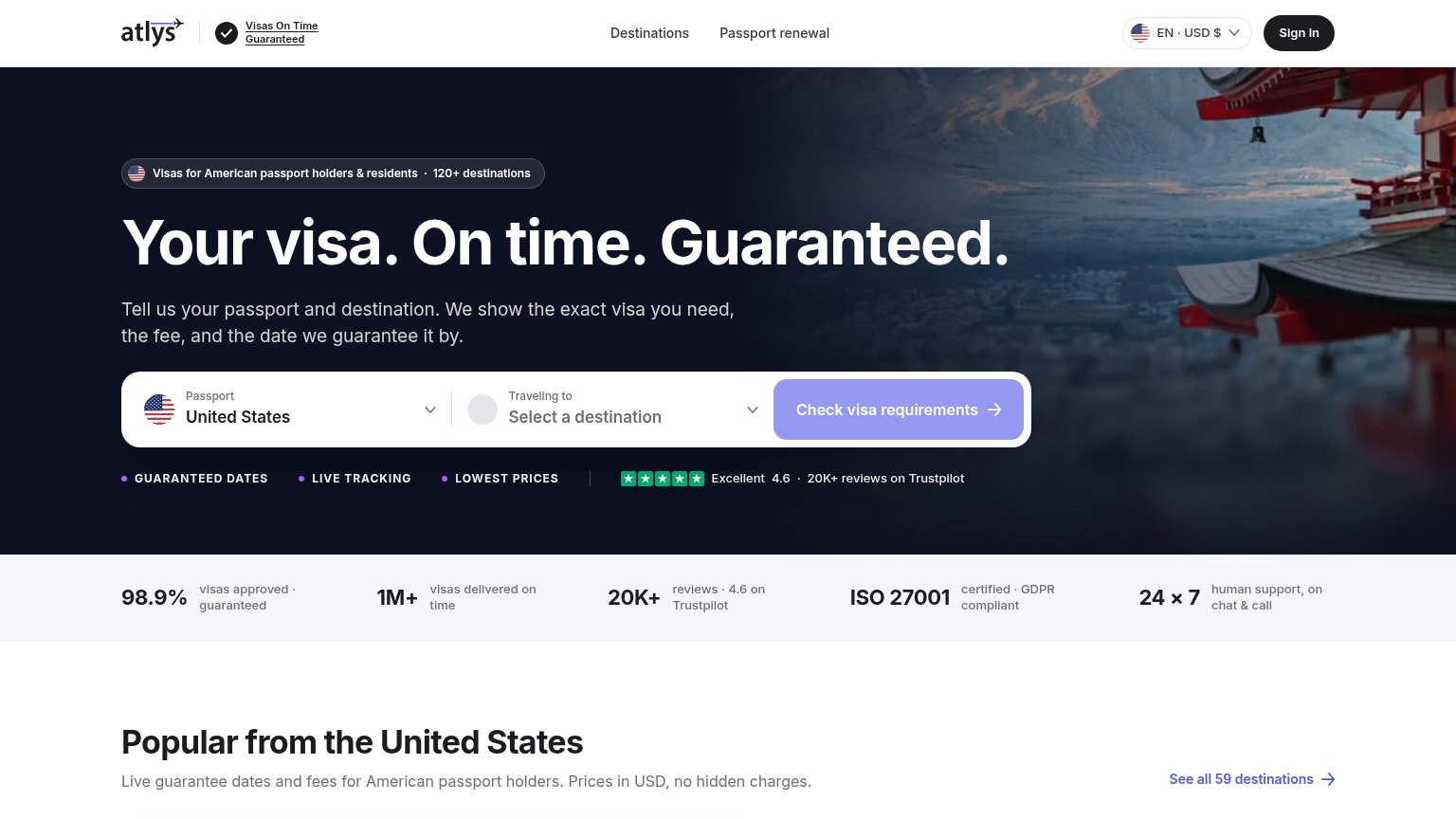
| Excellent 4.6 · 20K+ reviews on Trustpilot | |
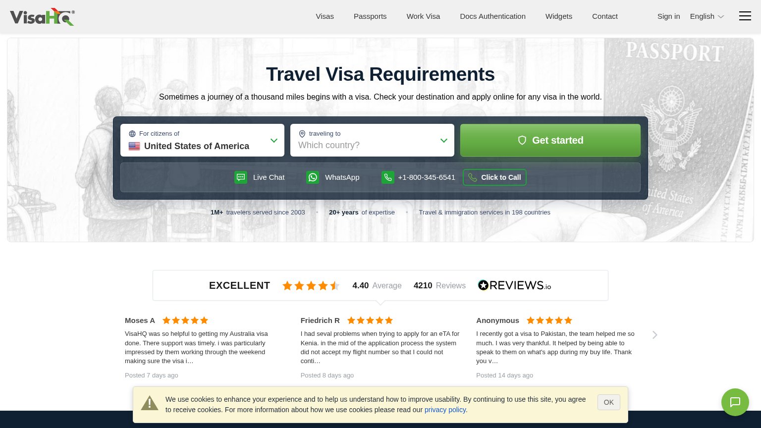
| REVIEWS.io widget: "EXCELLENT 4.40 Average · 4210 Reviews" with dated customer testimonials | |
| "Free to check · Takes 30 seconds · No account required" microcopy under the Check Requirements button | |
| Our fee refunded if we miss your timeframe |
Mobile web
78FairThe phone experience as a first-class citizen.
 12
- App install banner — Smart-app banner under the header pushes the hero and CTA down and routes the first tap to "Get" instead of the visa funnel.
- Chat bubble — Floating chat launcher adds a competing tap target low in the viewport with no conversion value at first load.
Information hierarchy
81StrongDoes the design help or inhibit what the page is trying to say?
What works
What to improve
CTA
82StrongCopy, size, verb, cost-feel — does the primary CTA earn the click?
How iVisa compares
Recommended rewrites
Value props
82StrongTitle, subtitle, hero — do they sell the product's true value?
iVisa’s headline
The easier way to get your travel visas
Visas, eVisas, ETAs & arrival cards for 100+ destinations. Tell us where you're going. We'll handle everything else.
Working
Could improve