
Your landing page’s weakest score is Mobile web.
How VisaHQ ranks
74Growth scoreupdated
category scores
category scoresShowHide
Mobile web
68FairThe phone experience as a first-class citizen.
 123
- Cookie consent banner — Dead blocker covering roughly a third of the viewport, hiding the trust strip and reviews with no conversion-valuable CTA.
- Contact options block — Live Chat, WhatsApp, phone number, and Click to Call stack four competing actions directly under the primary CTA, diluting focus.
- Header sign-in icon — Unlabeled circular arrow icon is ambiguous on mobile — its purpose is unclear without the desktop 'Sign in' text.
Information hierarchy
72FairDoes the design help or inhibit what the page is trying to say?
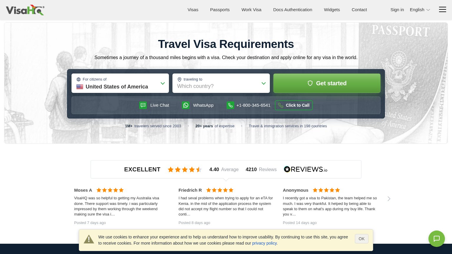 1234
- Cookie consent banner — Wide yellow warning-styled banner overlays reviews and drags the eye below the CTA with an alarm icon and dense legalese.
- Contact options bar — Live Chat, WhatsApp, phone, and Click to Call sit directly under Get started at similar weight, offering four exits before the primary action.
- Header nav row — Seven nav links plus Sign in, language, and hamburger create ten leak points above the search widget.
- Reviews carousel arrows — Carousel with truncated review text ('the visa i…') adds interaction cost and clipped proof mid-fold.
Value props
72FairTitle, subtitle, hero — do they sell the product's true value?
VisaHQ’s headline
Travel Visa Requirements
Sometimes a journey of a thousand miles begins with a visa. Check your destination and apply online for any visa in the world.
Working
Could improve
CTA
78FairCopy, size, verb, cost-feel — does the primary CTA earn the click?
How VisaHQ compares
Recommended rewrites
Trust
80StrongProof that the product is real, competent, and safe to try.
How VisaHQ compares
Trust read