
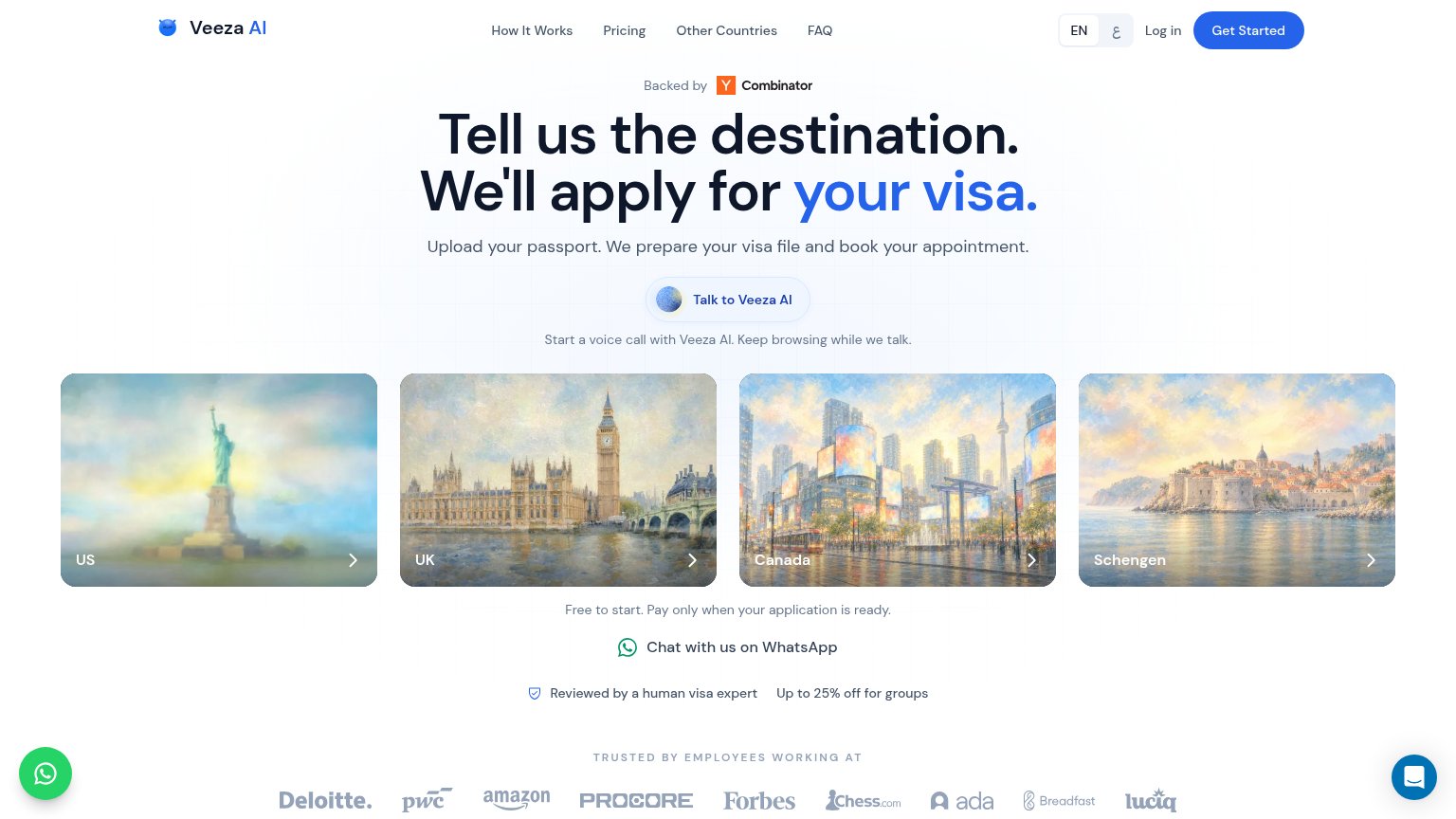
Your landing page’s weakest score is Trust.
How Visafy ranks
Trust
52FairProof that the product is real, competent, and safe to try.
| Trust read | |
|---|---|
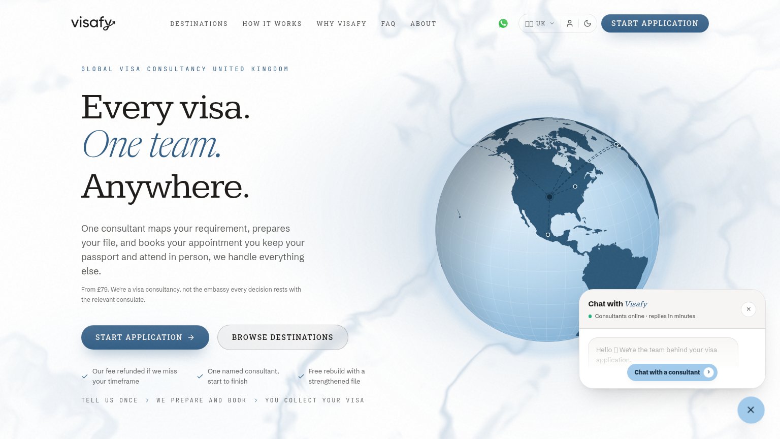
| Visafy | Our fee refunded if we miss your timeframe |
| Backed by Y Combinator badge above the headline | |
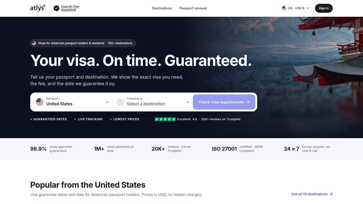
| Excellent 4.6 · 20K+ reviews on Trustpilot | |
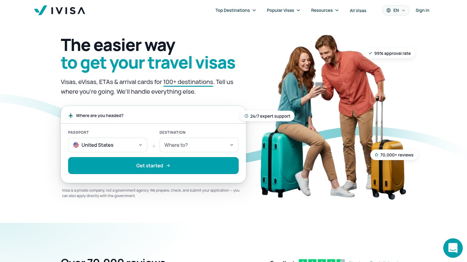
| "70,000+ reviews" pill alongside the Trustpilot star-rating strip beginning below the hero | |
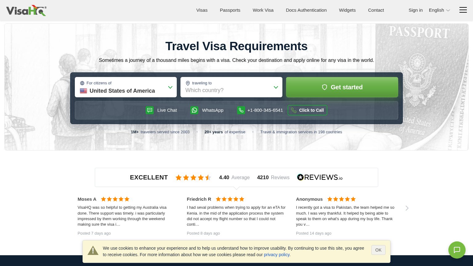
| REVIEWS.io widget: "EXCELLENT 4.40 Average · 4210 Reviews" with dated customer testimonials | |
| "Free to check · Takes 30 seconds · No account required" microcopy under the Check Requirements button |
Mobile web
52FairThe phone experience as a first-class citizen.
 123
- Auto-opened chat widget — Covers the START APPLICATION button and trust bullets right where a visitor would tap.
- Cut-off primary CTA — "START APPLICATION" is sliced by the chat card, making the main action look broken and hard to tap.
- Broken glyph in greeting — A placeholder box (▯) renders where an emoji should be; the same broken glyph appears in the nav flag.
Information hierarchy
68FairDoes the design help or inhibit what the page is trying to say?
What works
What to improve
CTA
72FairCopy, size, verb, cost-feel — does the primary CTA earn the click?
How Visafy compares
Recommended rewrites
Value props
72FairTitle, subtitle, hero — do they sell the product's true value?
Visafy’s headline
Every visa. One team. Anywhere.
One consultant maps your requirement, prepares your file, and books your appointment you keep your passport and attend in person, we handle everything else.
Working
Could improve