
Your landing page’s weakest score is Trust.
How Simulithic ranks
- 1.
Momentic82
- 2.
QA Wolf73
- 3.
Checkly73
- 4.
Simulithic72
- 5.
Ranger72
- 6.
Spur59
72Growth scoreupdated
category scores
category scoresShowHide
Score over time
Trust
44PoorProof that the product is real, competent, and safe to try.

| Trust read | |
|---|---|
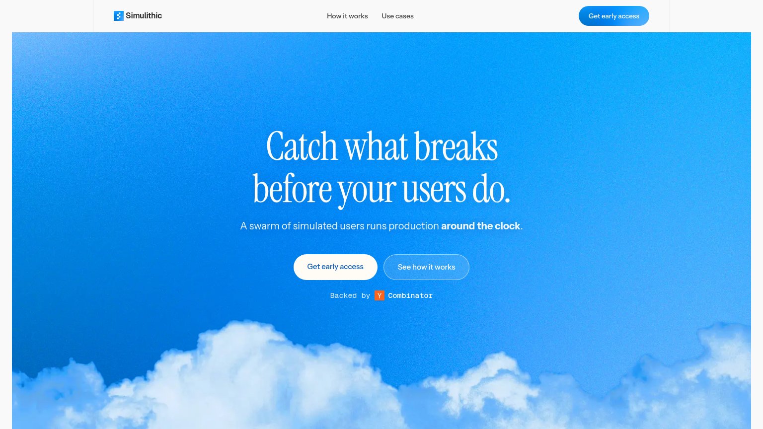
| Simulithic | "Backed by Y Combinator" badge under the hero CTA |
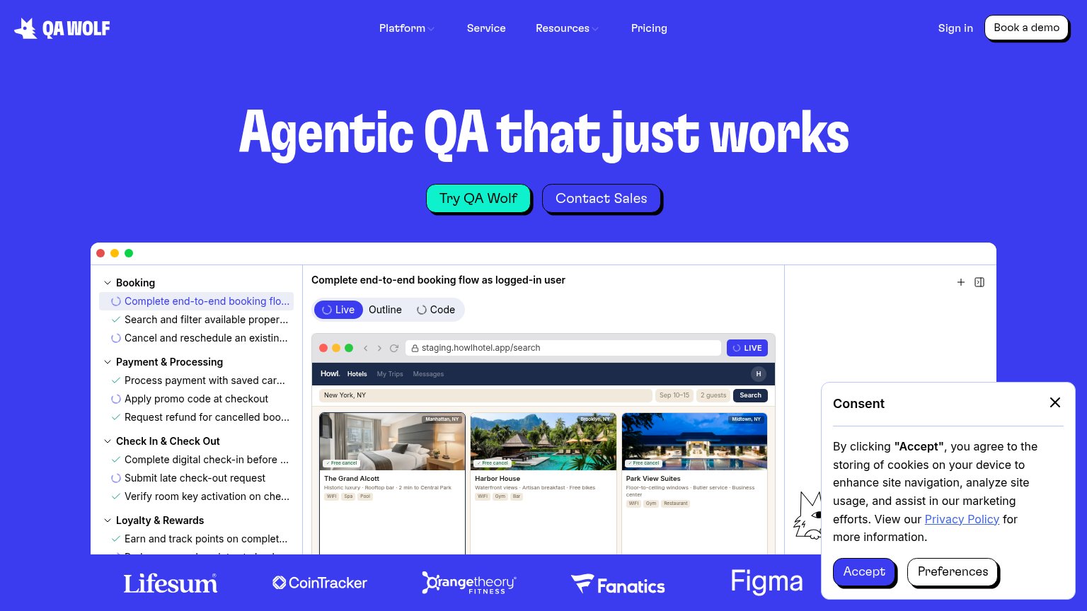
| Customer logo strip: Lifesum, CoinTracker, Orangetheory Fitness, Fanatics, Figma | |
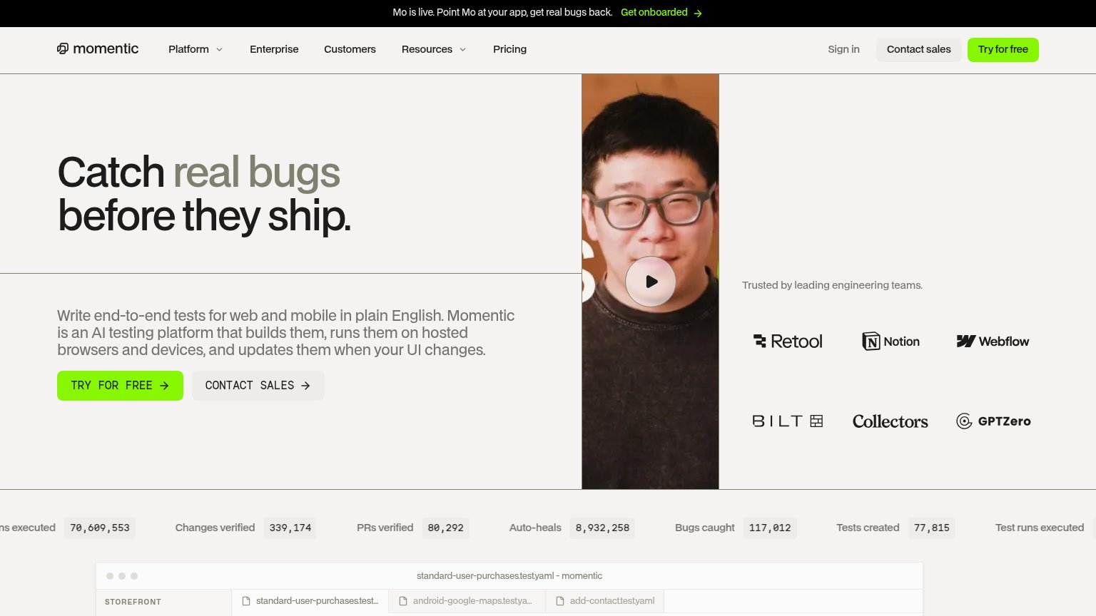
| "Trusted by leading engineering teams." logo wall with Retool, Notion, Webflow, Bilt, Collectors, GPTZero | |
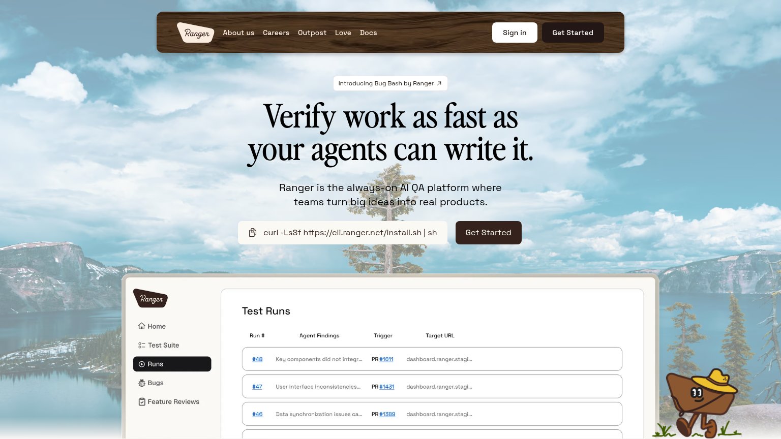
| "Test Runs" product dashboard screenshot showing agent findings, PR links, and target URLs | |
| No visible trust signal identified. | |
| Terminal demo showing "npx checkly test … 1 passed, 1 total" and "Successfully deployed to 4 locations" with region late |
CTA
72FairCopy, size, verb, cost-feel — does the primary CTA earn the click?
Problems
- 'early access' implies waitlist
- click delivers a form, not value
- no payoff word in the label
Value props
74FairTitle, subtitle, hero — do they sell the product's true value?
Simulithic’s headline sells
Catch what breaks before your users do.
A swarm of simulated users runs production around the clock.
Working
- Outcome-first headline, clear stakes
- Subhead explains the actual mechanism
- "Swarm" is vivid, not buzzwordy
Could improve
- No numbers or proof points anywhere
- Sky hero decorates, demonstrates nothing
- Doesn't say what kinds of breaks
Mobile web
84StrongThe phone experience as a first-class citizen.
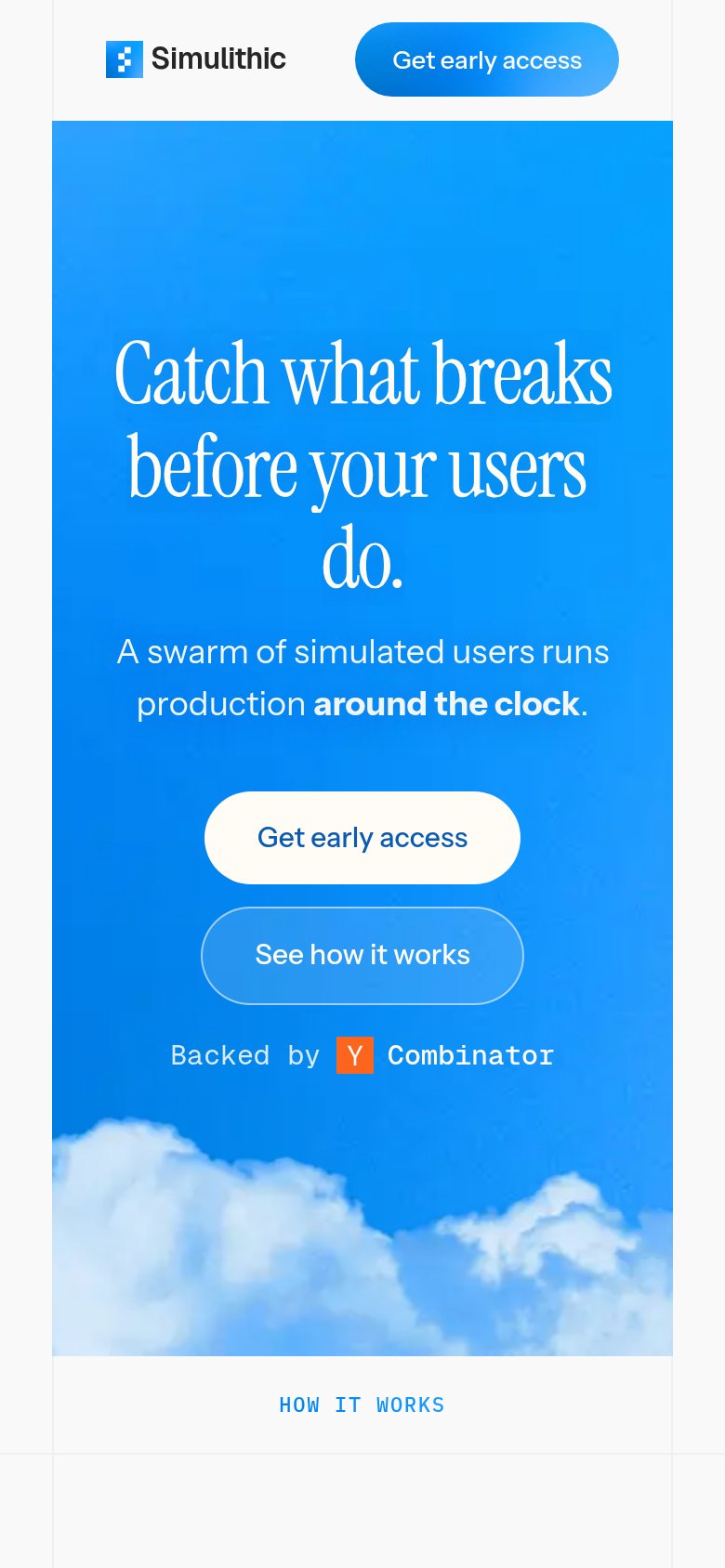 123
- Get early access button — Desktop-proportioned pill floating in the column instead of a full-width thumb-friendly tap target.
- Headline orphan line — The serif headline wraps into four lines, stranding "do." alone and stretching the message down the fold.
- Header CTA pill — Duplicates the hero's "Get early access" inches above it, splitting attention between two identical actions.
Information hierarchy
86StrongDoes the design help or inhibit what the page is trying to say?
12- See how it works — Styled at nearly the same size and shape as the hero CTA, forcing a coin-flip between converting and browsing.
- Hero Get early access — White-on-sky fill reads quieter than the nav pill, so the primary action is the less prominent of the two.