
Your landing page’s weakest score is Trust.
How Checkly ranks
73Growth scoreupdated
category scores
category scoresShowHide
Trust
58FairProof that the product is real, competent, and safe to try.

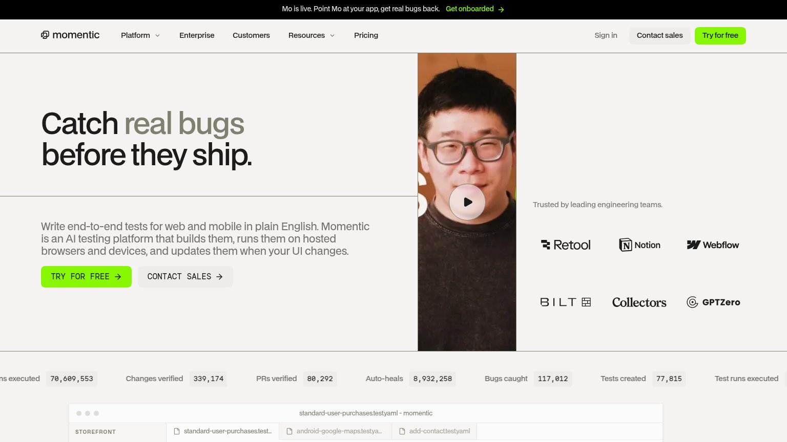
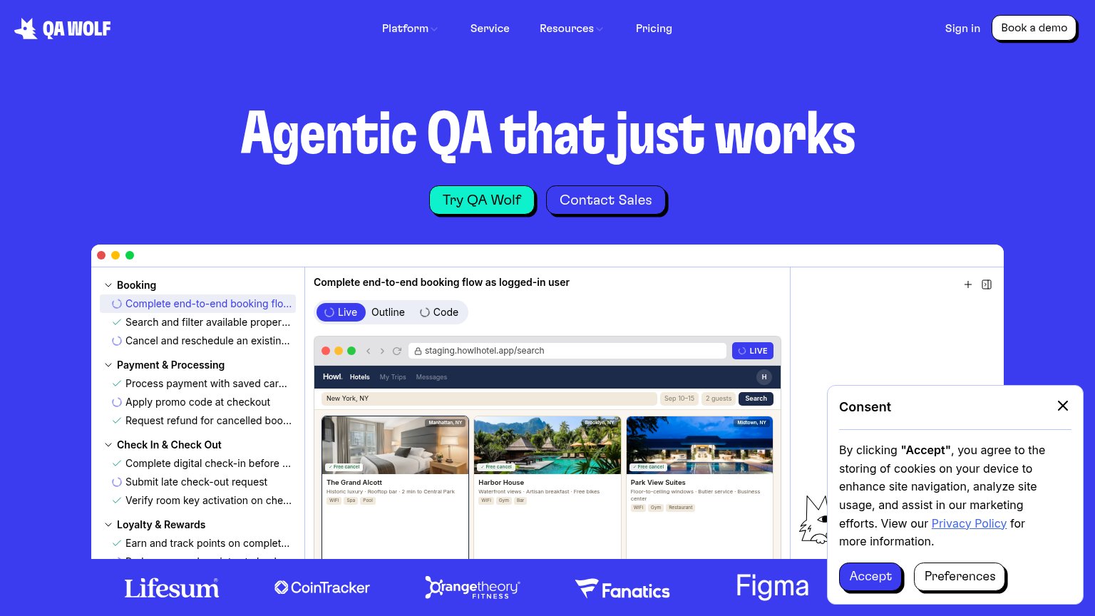
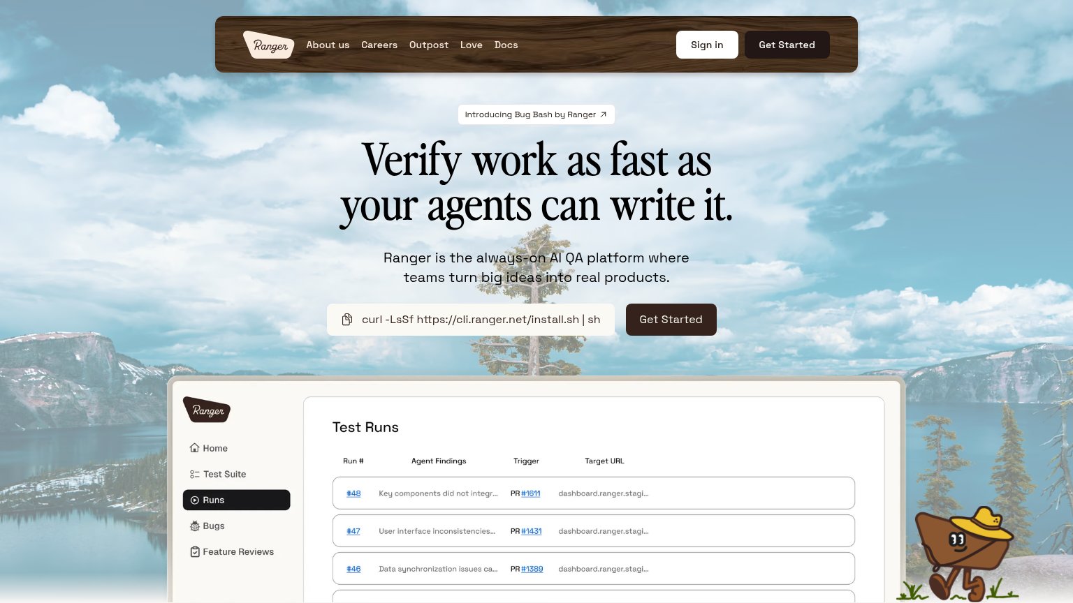
| Trust read | |
|---|---|
| Checkly | Terminal demo showing "npx checkly test … 1 passed, 1 total" and "Successfully deployed to 4 locations" with region late |
| "Backed by Y Combinator" badge under the hero CTA | |
| Customer logo strip: Lifesum, CoinTracker, Orangetheory Fitness, Fanatics, Figma | |
| "Trusted by leading engineering teams." logo wall with Retool, Notion, Webflow, Bilt, Collectors, GPTZero | |
| "Test Runs" product dashboard screenshot showing agent findings, PR links, and target URLs | |
| No visible trust signal identified. |
Information hierarchy
72FairDoes the design help or inhibit what the page is trying to say?
123- Three equal-weight CTAs — Book a demo, Start for free, and the npx snippet compete at the same visual weight — no single action wins the scan.
- Seven-item nav row — Five dropdowns plus Customers and Pricing offer eight exits before the hero CTA, diluting the conversion path.
- Duplicate Start for free — The nav repeats the hero CTA at equal prominence, splitting attention instead of reinforcing one target.
Mobile web
76FairThe phone experience as a first-class citizen.
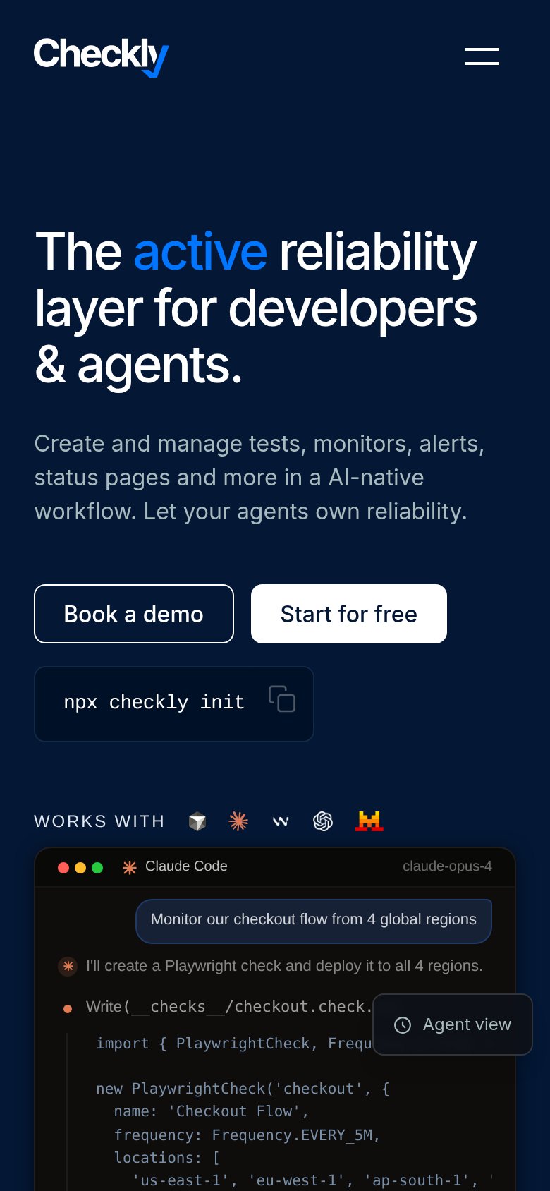
What works
What to improve
Value props
78FairTitle, subtitle, hero — do they sell the product's true value?
Checkly’s headline
The active reliability layer for developers & agents.
Create and manage tests, monitors, alerts, status pages and more in a AI-native workflow. Let your agents own reliability.
Working
Could improve
CTA
82StrongCopy, size, verb, cost-feel — does the primary CTA earn the click?
How Checkly compares
Recommended rewrites