
Your landing page’s weakest score is Trust.
How Lemma ranks
66Growth scoreupdated
category scores
category scoresShowHide
Score over time
Trust
44PoorProof that the product is real, competent, and safe to try.
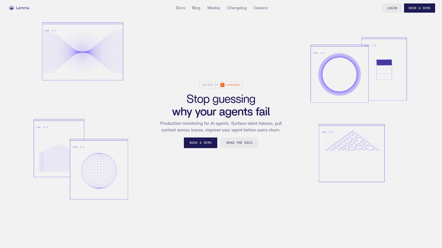
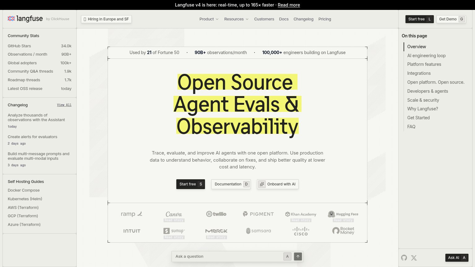
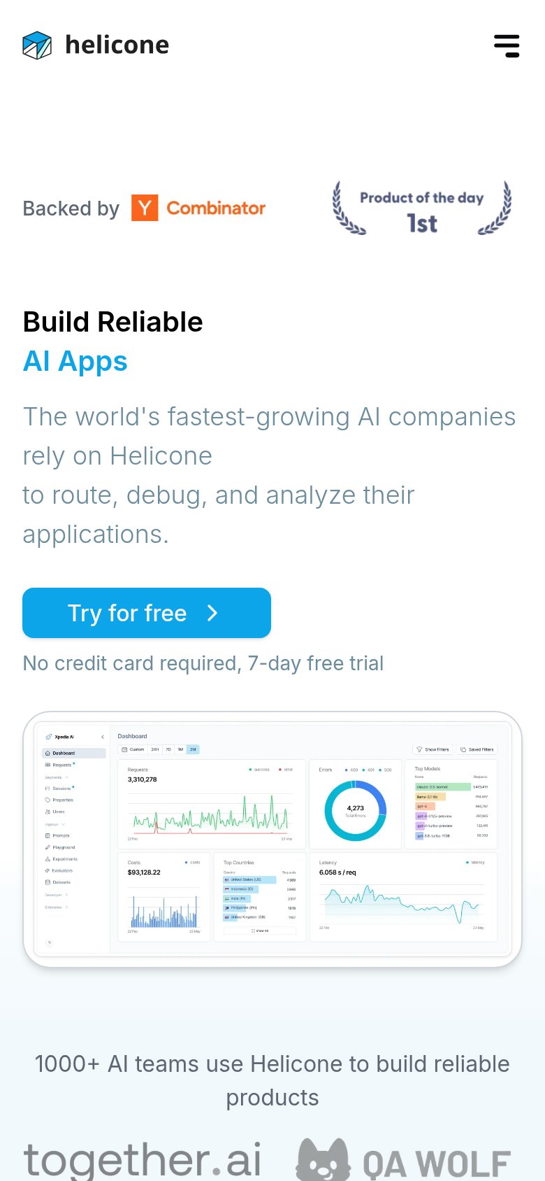

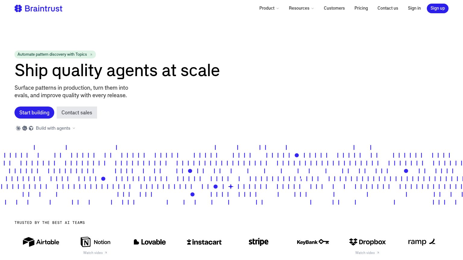
| Trust read | |
|---|---|
| Lemma | "BACKED BY Y Combinator" badge above the hero headline |
| Used by 21 of Fortune 50 · 90B+ observations/month · 100,000+ engineers building on Langfuse | |
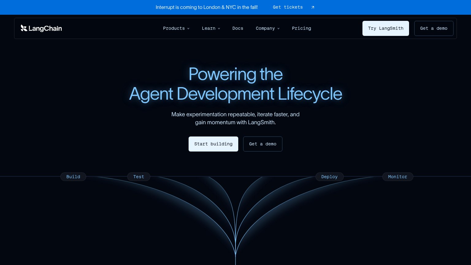
| 'Interrupt is coming to London & NYC in the fall!' conference banner | |
| Customer logo wall under "Powering the world's leading AI teams" (Uber, Spotify, Instacart, DoorDash, Booking.com) | |
| "TRUSTED BY THE BEST AI TEAMS" logo wall (Airtable, Notion, Stripe, Instacart, Dropbox, Ramp) | |
| "1000+ AI teams use Helicone to build reliable products" with customer logos (together.ai, QA Wolf) |
CTA
66FairCopy, size, verb, cost-feel — does the primary CTA earn the click?

Problems
- demo gate feels costly, sales-first
- no self-serve or product entry path
- click delivers a form, not value
Value props
72FairTitle, subtitle, hero — do they sell the product's true value?
Lemma’s headline sells
Stop guessing why your agents fail
Production monitoring for AI agents. Surface silent failures, pull context across traces, improve your agent before users churn.
Working
- Pain-first hook names the felt problem
- "Silent failures" and "churn" are concrete stakes
- YC badge adds credibility proof
Could improve
- No numbers or specifics anywhere in fold
- Hero art decorates, never shows the product
- Mobile drops the outcome half of subhead
Mobile web
72FairThe phone experience as a first-class citizen.
 12
- BOOK A DEMO button — Pushed below the first viewport and desktop-proportioned instead of full-width and thumb-friendly.
- Decorative wireframe cards — Three ornamental frames stack above the headline, pushing the value statement and CTA down the page.
Information hierarchy
74FairDoes the design help or inhibit what the page is trying to say?
123- Duplicate BOOK A DEMO — Nav-corner 'BOOK A DEMO' repeats the hero CTA at similar visual weight, splitting the one action across two targets.
- READ THE DOCS button — Secondary CTA sits at nearly the same size and shape as 'BOOK A DEMO', diluting the single-action scan path.
- Five-link nav row — Docs, Blog, Weekly, Changelog, Careers plus Login give six exits before the visitor reaches the demo CTA.