Past reportsShow past reportsHide past reports
- Sep 22, 202666LiveOverall +5 · Value props +26 · CTA −14Viewing
- Apr 10, 202661First tracked report — strongest CTA 72, weakest Trust 42View →

Your landing page’s weakest score is Trust.
How Scott AI ranks
category scores
Proof that the product is real, competent, and safe to try.
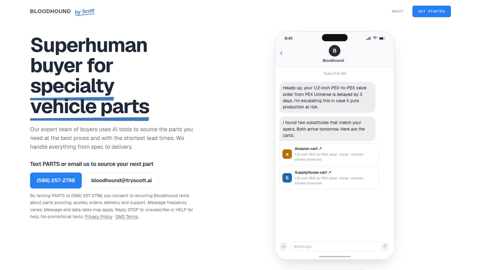
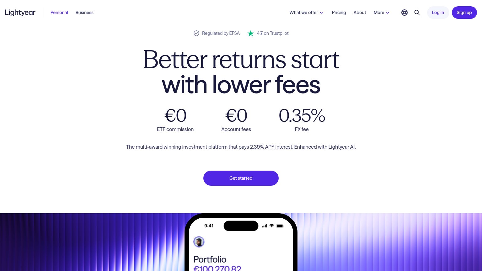


| Trust read | |
|---|---|
| Scott AI | iMessage demo showing a delayed 1/2-inch PEX-to-PEX valve order with Amazon and SupplyHouse substitute carts |
| Annotated component breakdown visual with callouts like "COMPONENT 53 — FABRICATION, EST COST: $207, MFG A IN FRANCE" | |
| Industry association logo bar (NECA, MCAA, ABC Tech Alliance, CFMA, SMACNA, IEC) below the hero | |
| Quote Comparison product UI showing line-item supplier prices and lead times, with mobile screen comparing $1,198.07 vs | |
| "Regulated by EFSA" badge paired with "4.7 on Trustpilot" above the headline |
Copy, size, verb, cost-feel — does the primary CTA earn the click?

Problems
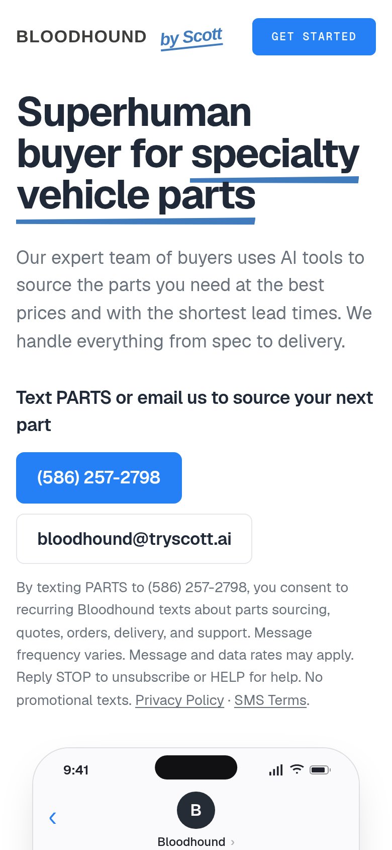
The phone experience as a first-class citizen.
 12
Does the design help or inhibit what the page is trying to say?
123Title, subtitle, hero — do they sell the product's true value?
Superhuman buyer for specialty vehicle parts
Our expert team of buyers uses AI tools to source the parts you need at the best prices and with the shortest lead times. We handle everything from spec to delivery.
Working
Could improve
You need a lazyweb account to add your product, do a growth audit, create backlog and more
Sign me in to my Lazyweb report hub. Fetch https://www.lazyweb.com/hub/agent/sign-in.md and follow its instructions exactly. If you can't fetch URLs, tell me and I'll paste the instructions instead.
Lazyweb MCP
Step 1 of 2 · your login
Where should we send your reports? This email becomes your login on lazyweb.com — everything your agent makes lands in your workspace.
That doesn't look like an email — check it and try again.
No password, no spam — one workspace link now, then your agent command.
Step 2 of 2 · your agent
Paste this into your agent. Claude Code, Codex, Cursor, or another MCP-capable agent opens the link and sets itself up. Data access is plan-dependent.
Generating your agent command...
Free account
We’ll add Scott AI as your product and bring this score into your workspace. You can change it later in Settings.