
Your landing page’s weakest score is Trust.
How Lexi ranks
66Growth scoreupdated
category scores
category scoresShowHide
Score over time
Trust
48PoorProof that the product is real, competent, and safe to try.
| Trust read | |
|---|---|
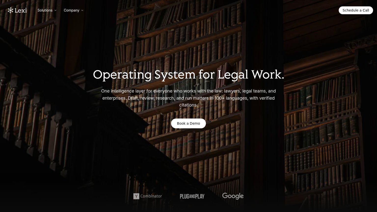
| Lexi | Logo strip with Y Combinator, Plug and Play, and Google beneath the hero |
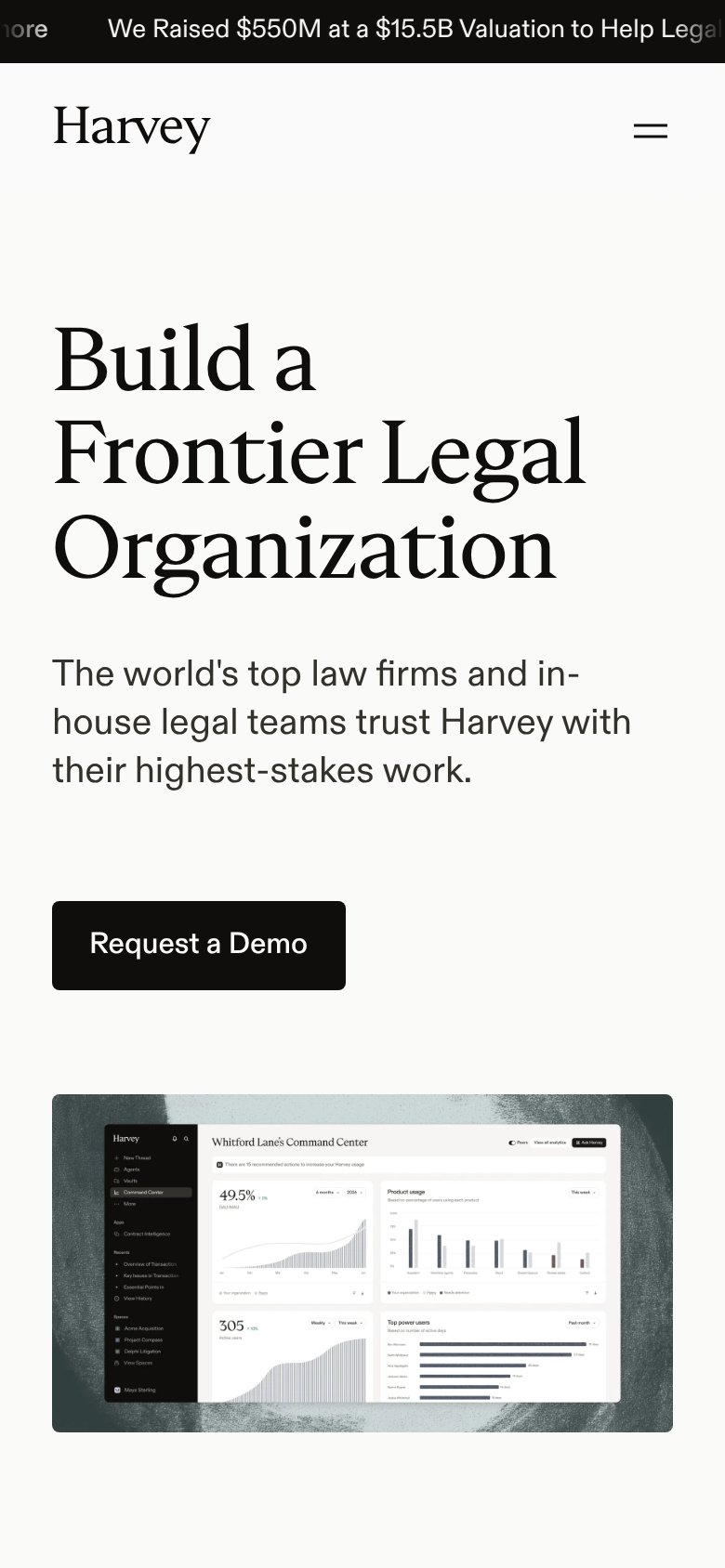
| "We Raised $550M at a $15.5B Valuation" announcement banner (mobile capture) | |
| No visible trust signal identified. | |
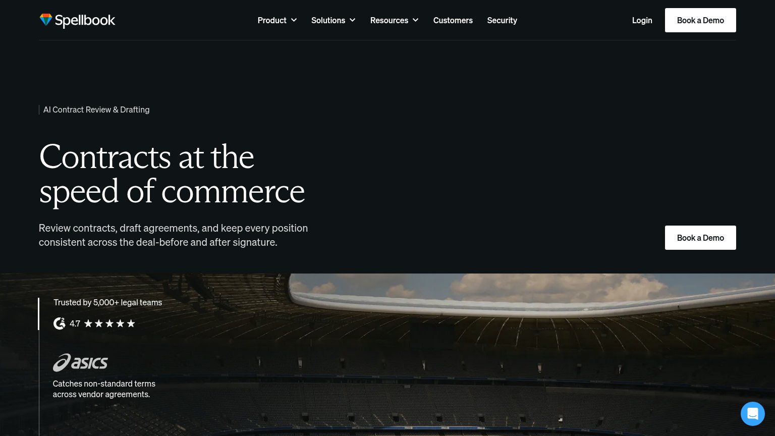
| "Trusted by 5,000+ legal teams" with G2 4.7-star rating badge | |
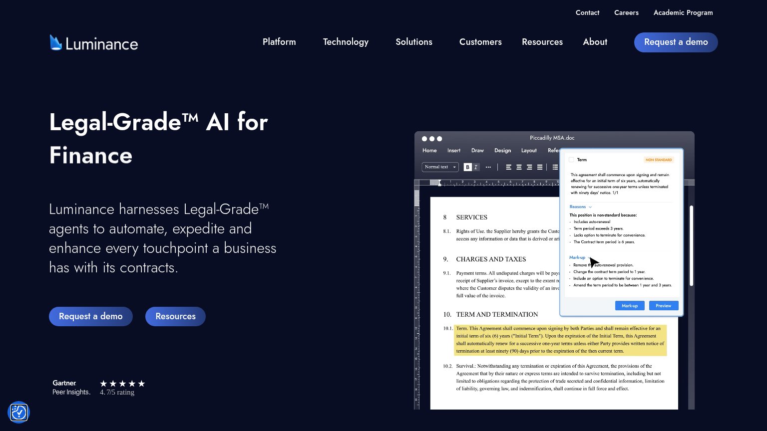
| Product chat UI screenshot answering "What are the different laws that govern each contract?" across "124 Documents" wit | |
| Gartner Peer Insights 4.7/5 rating badge |
CTA
68FairCopy, size, verb, cost-feel — does the primary CTA earn the click?
Problems
- click feels like a sales call
- three label variants on one page
- no product-value payoff in copy
Value props
68FairTitle, subtitle, hero — do they sell the product's true value?
Lexi’s headline undersells
Operating System for Legal Work.
One intelligence layer for everyone who works with the law: lawyers, legal teams, and enterprises. Draft, review, research, and run matters in 100+ languages, with verified citations.
Working
- Subhead names jobs: draft, review, research
- "Verified citations" defuses AI distrust
- "100+ languages" is a concrete differentiator
Could improve
- Headline is an abstract category claim
- Hero image decorates, never demonstrates
- No outcome or time-saved emotion in copy
Mobile web
72FairThe phone experience as a first-class citizen.
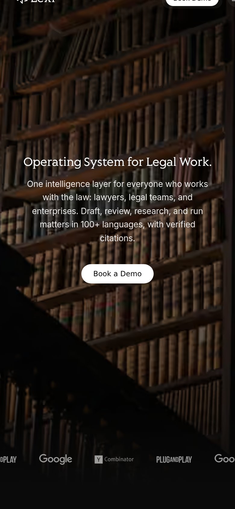 123
- Cropped header row — The top bar cuts off the Lexi logo and 'Book Demo' pill mid-glyph, making the header CTA unreadable and untappable.
- Book a Demo button — The primary 'Book a Demo' button keeps desktop proportions instead of stretching near full-width for the thumb.
- Logo strip clipping — Partner logos ('PLAY', 'Goo…') are clipped at both edges, signaling a carousel that wasn't tuned for the phone width.
Information hierarchy
76FairDoes the design help or inhibit what the page is trying to say?
123- Schedule a Call button — Second white CTA at equal weight competes with 'Book a Demo' and splits the conversion path with a different label.
- Book a Demo button — Small footprint and white-on-dark styling identical to the nav CTA; nothing marks it as the page's primary action.
- Hero headline — Thin serif at moderate contrast over busy bookshelf texture reduces one-second legibility of the core claim.