
Your landing page’s weakest score is Trust.
How Layers ranks
62Growth scoreupdated
category scores
category scoresShowHide
Score over time
Trust
32PoorProof that the product is real, competent, and safe to try.

| Trust read | |
|---|---|
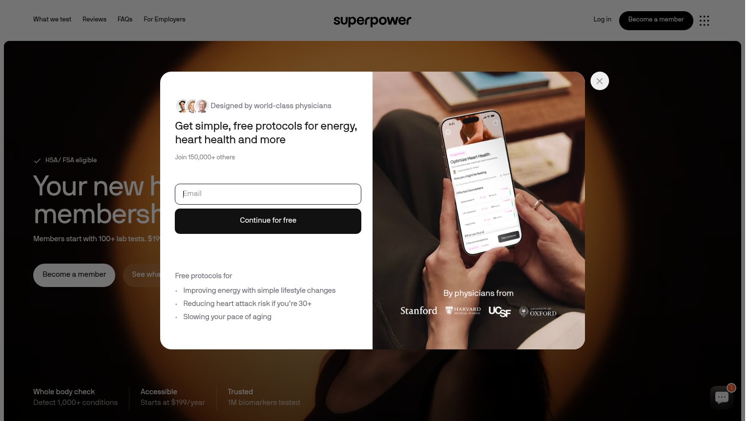
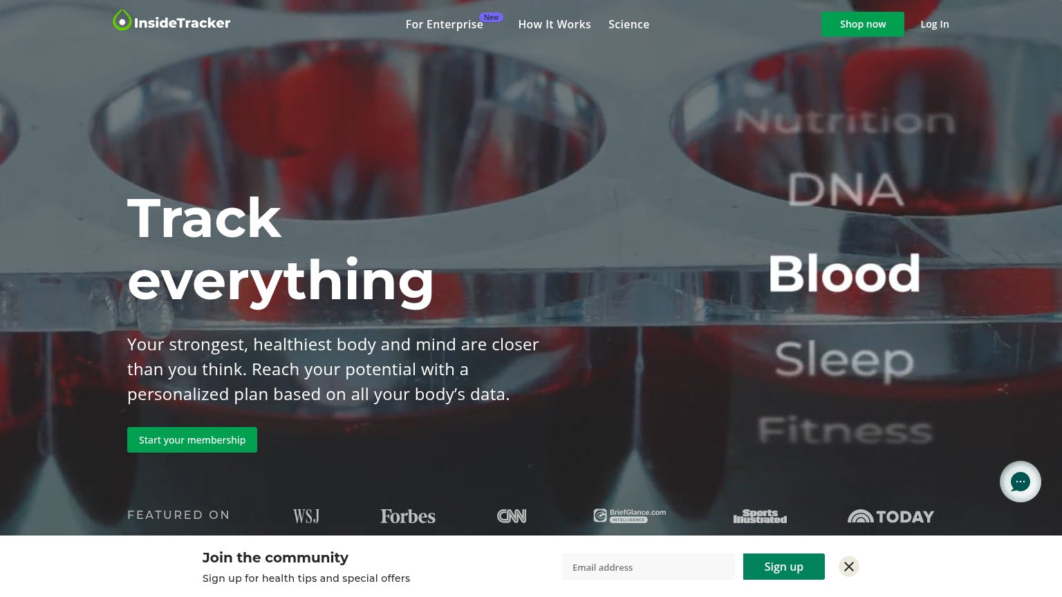
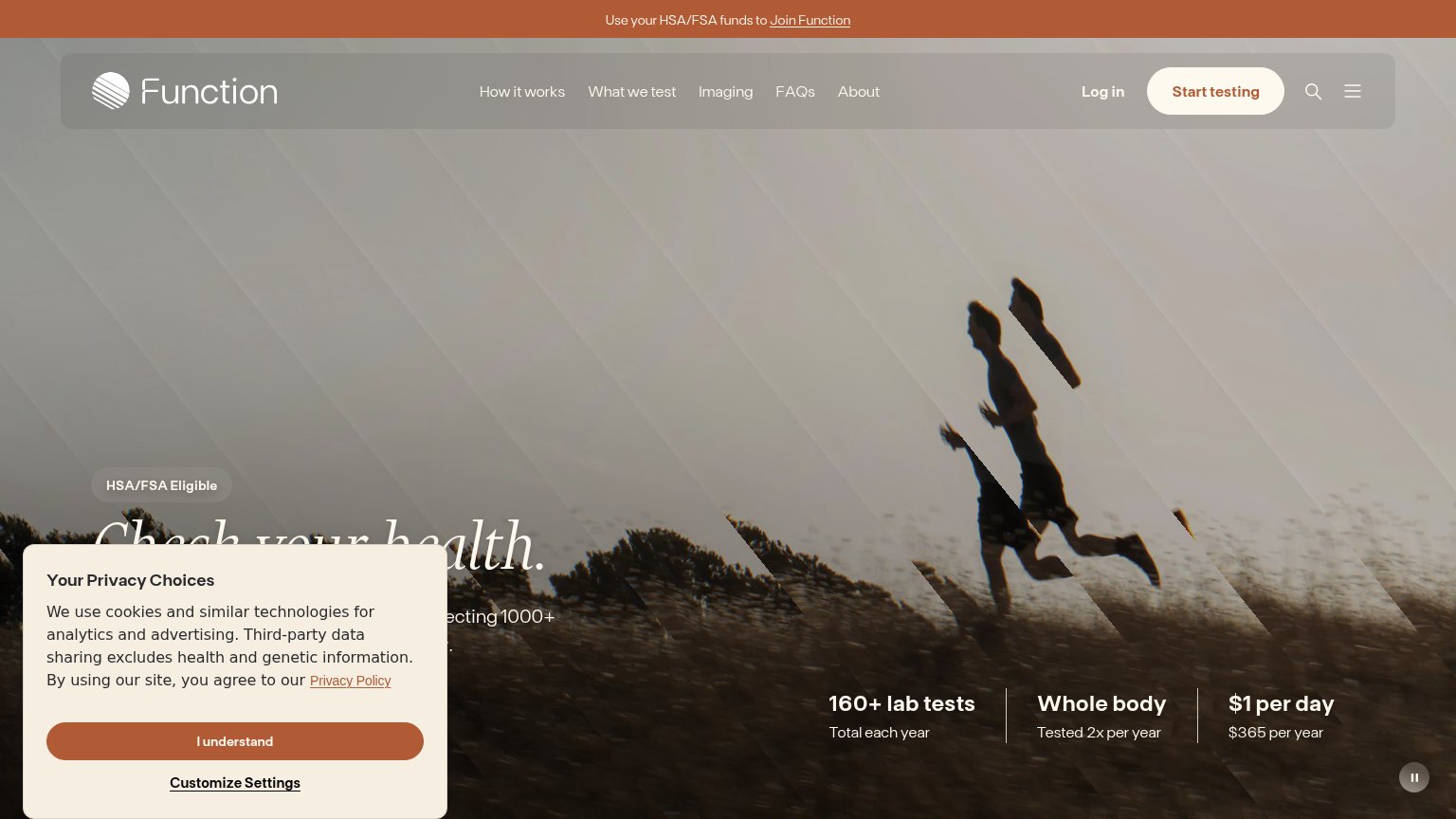
| Layers | No visible trust signal identified. |
| "HSA/FSA Eligible" badge above the headline | |
| "FEATURED ON" press bar with WSJ, Forbes, CNN, Sports Illustrated, and TODAY logos | |
| "By physicians from" logo strip: Stanford, Harvard Medical School, UCSF, University of Oxford | |
| "50,000+ Marek Health clients transformed" with avatar thumbnails |
Value props
52FairTitle, subtitle, hero — do they sell the product's true value?
Layers’s headline vague
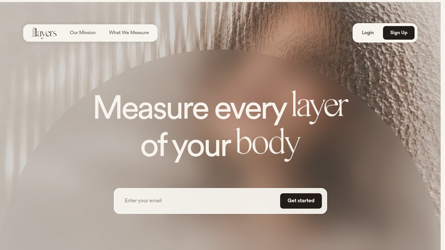
Measure every layer of your body
Working
- Concrete verb: "measure", not "unlock"
- On-brand wordplay ties to product name
- Short, memorable, easy to scan
Could improve
- No subhead explaining what "layers" means
- Hero image shows blur, not the product
- Zero numbers, proof, or named outcome
CTA
72FairCopy, size, verb, cost-feel — does the primary CTA earn the click?
Problems
- generic label, no payoff named
- email demanded before any value
- nav says 'Sign Up', hero 'Get started'
Information hierarchy
76FairDoes the design help or inhibit what the page is trying to say?
123- Hero headline contrast — Cream text over a mid-tone blur; the thin serif words 'layer' and 'body' nearly dissolve into the background.
- Sign Up button — Styled at the same dark weight as 'Get started', creating a second equal-rank CTA that splits the scan path.
- Empty email placeholder field — The wide low-contrast input reads as part of the background panel; visitors can miss that it is interactive.
Mobile web
78FairThe phone experience as a first-class citizen.
 12
- Clipped Sign Up pill — The Login/Sign Up pill overflows the right edge, cutting off the Sign Up button — a broken-looking header on every mobile visit.
- Low-contrast email field — The pale "Enter Layers's email" placeholder on a cream field reads faint next to the dark Get started button.