
Your landing page’s weakest score is Trust.
How Fernstone ranks
64Growth scoreupdated
category scores
category scoresShowHide
Score over time
Trust
48PoorProof that the product is real, competent, and safe to try.


| Trust read | |
|---|---|
| Fernstone | Product dashboard mockup showing "$2.4M Total Coverage", "98% Claims Processed", "23 mins Avg. Response Time" |
| No visible trust signal identified. | |
| "Top rated and trusted by thousands of businesses" section header | |
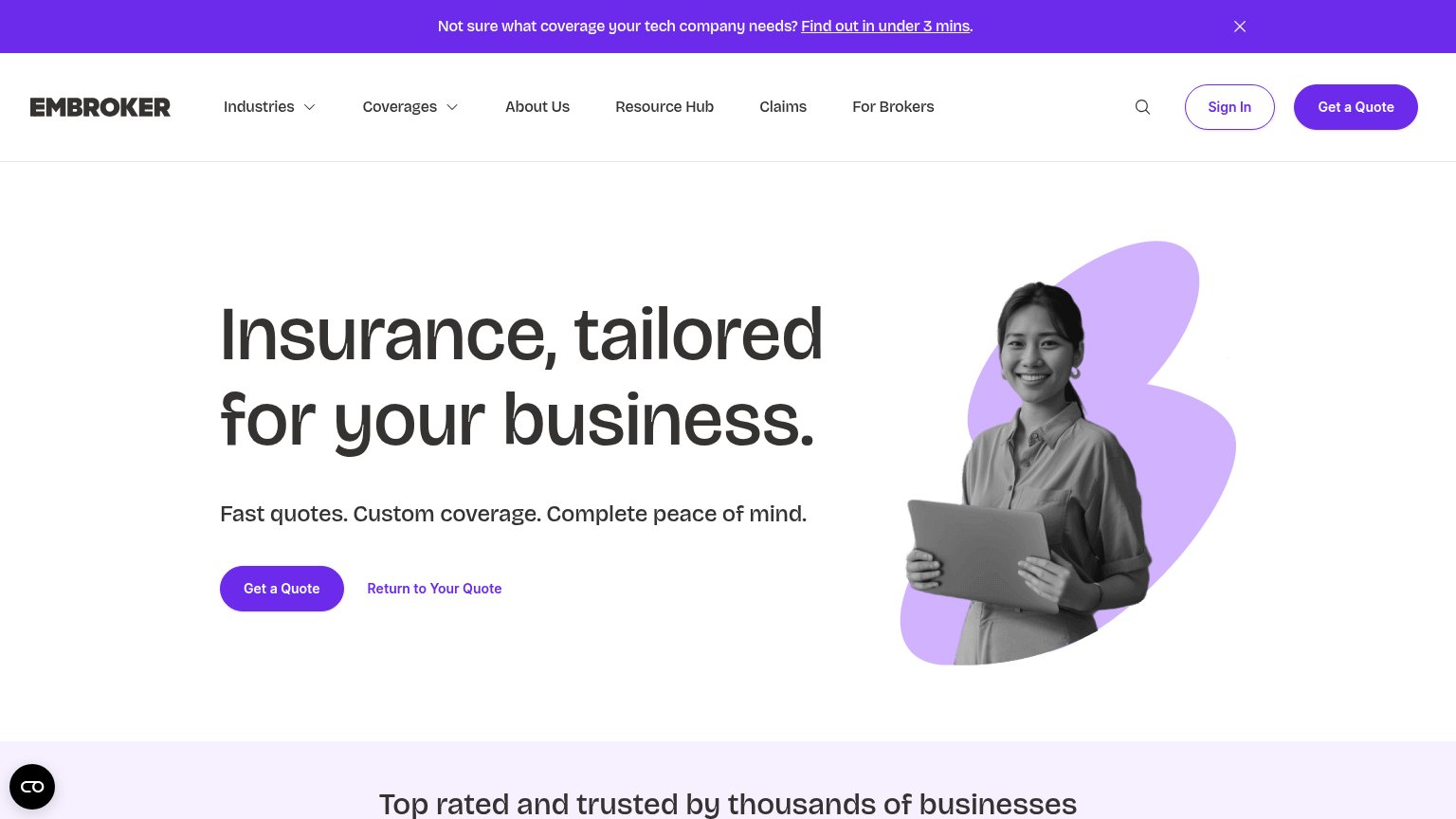
| Announcement banner: "Newfront has officially joined WTW, combining a technology-native approach with global expertise t | |
| "The Baldwin Group" parent-brand mark in the Founder Shield logo | |
| "4.7" customer rating with avatars and "50K+ policies sold" beneath the Get a quote CTA |
Value props
58FairTitle, subtitle, hero — do they sell the product's true value?
Fernstone’s headline undersells
Insurance for businesses that move fast.
Fernstone is an insurance brokerage for businesses.
Working
- Instantly clear category: business insurance
- Speed angle fits fast-moving buyers
- Hero mock shows real proof: 23 min vs 5.2 days
Could improve
- Subhead repeats headline, adds nothing
- Proof numbers buried in mock, not copy
- No outcome or emotion beyond 'fast'
CTA
68FairCopy, size, verb, cost-feel — does the primary CTA earn the click?

Problems
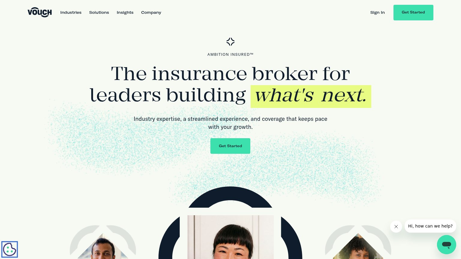
- secondary CTA gets the solid fill
- ghost style weakens primary
- quote implies forms/sales follow-up
- no speed or effort qualifier
Information hierarchy
72FairDoes the design help or inhibit what the page is trying to say?
1234- Talk to an expert — Filled primary styling outranks the outlined Get a quote beside it, splitting the fold's one action.
- Get a quote button — The named conversion action is styled as the secondary outline, third-in-line behind two other quote entry points.
- Seven-item nav row — Careers, Loss run FAQ, and a duplicate Get a quote link leak attention before the hero.
- One-line subtitle — "Fernstone is an insurance brokerage for businesses" restates the headline instead of adding a differentiator, wasting the second scan beat.
Mobile web
72FairThe phone experience as a first-class citizen.
 123
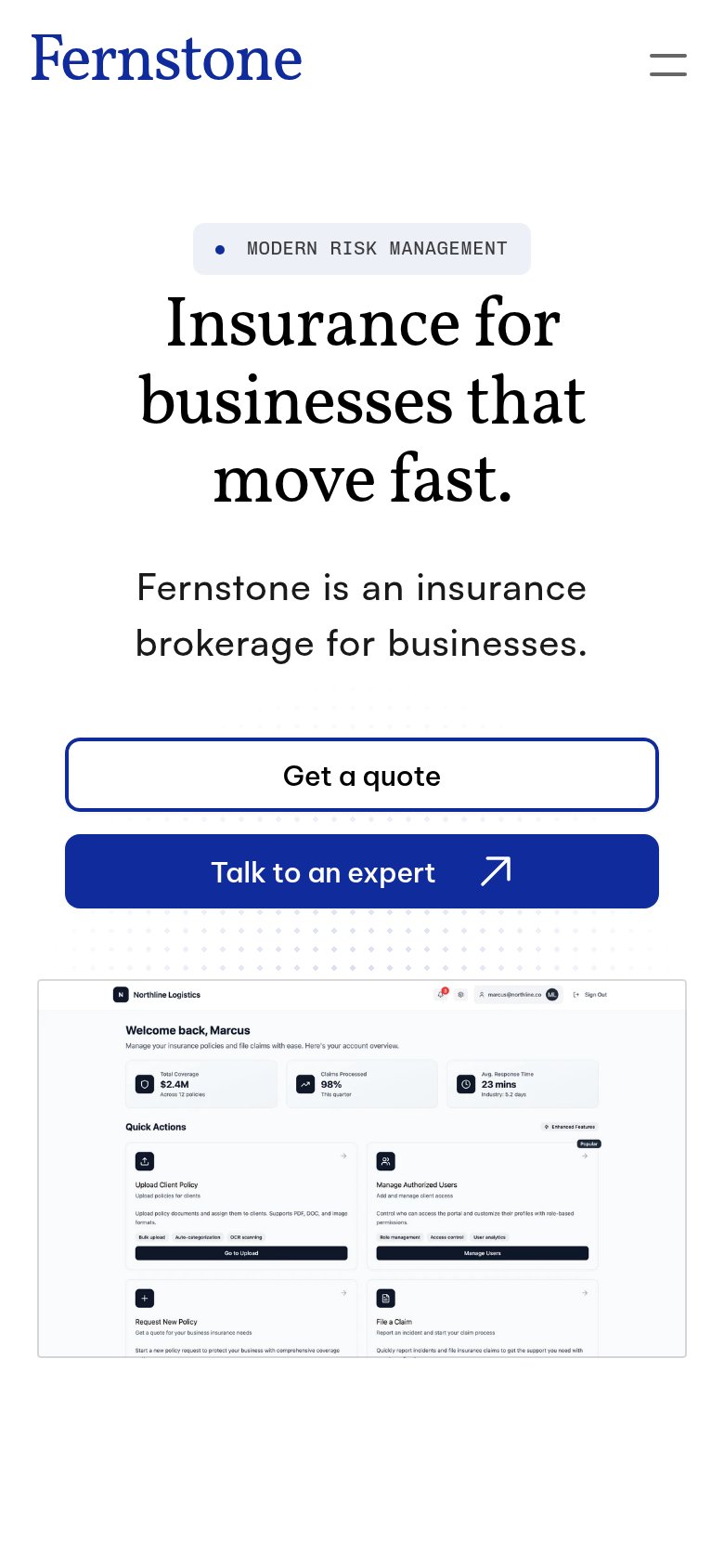
- Oversized hero headline — Serif headline barely scales down, wrapping into three tall lines that push the CTAs off the first viewport.
- Below-fold CTA pair — "Get a quote" and "Talk to an expert" sit past the first screen, so landing visitors see no tappable action.
- Unreadable dashboard screenshot — The desktop product mockup shrinks to illegible micro-text on a phone, adding noise instead of proof.