
Your landing page’s weakest score is Trust.
How Cranston AI ranks
- 1.
Cranston AI74
- 2.
Filed72
- 3.
TaxGPT71
- 4.
Black Ore70
- 5.
Basis60
74Growth scoreupdated
category scores
category scoresShowHide
Score over time
Trust
58FairProof that the product is real, competent, and safe to try.
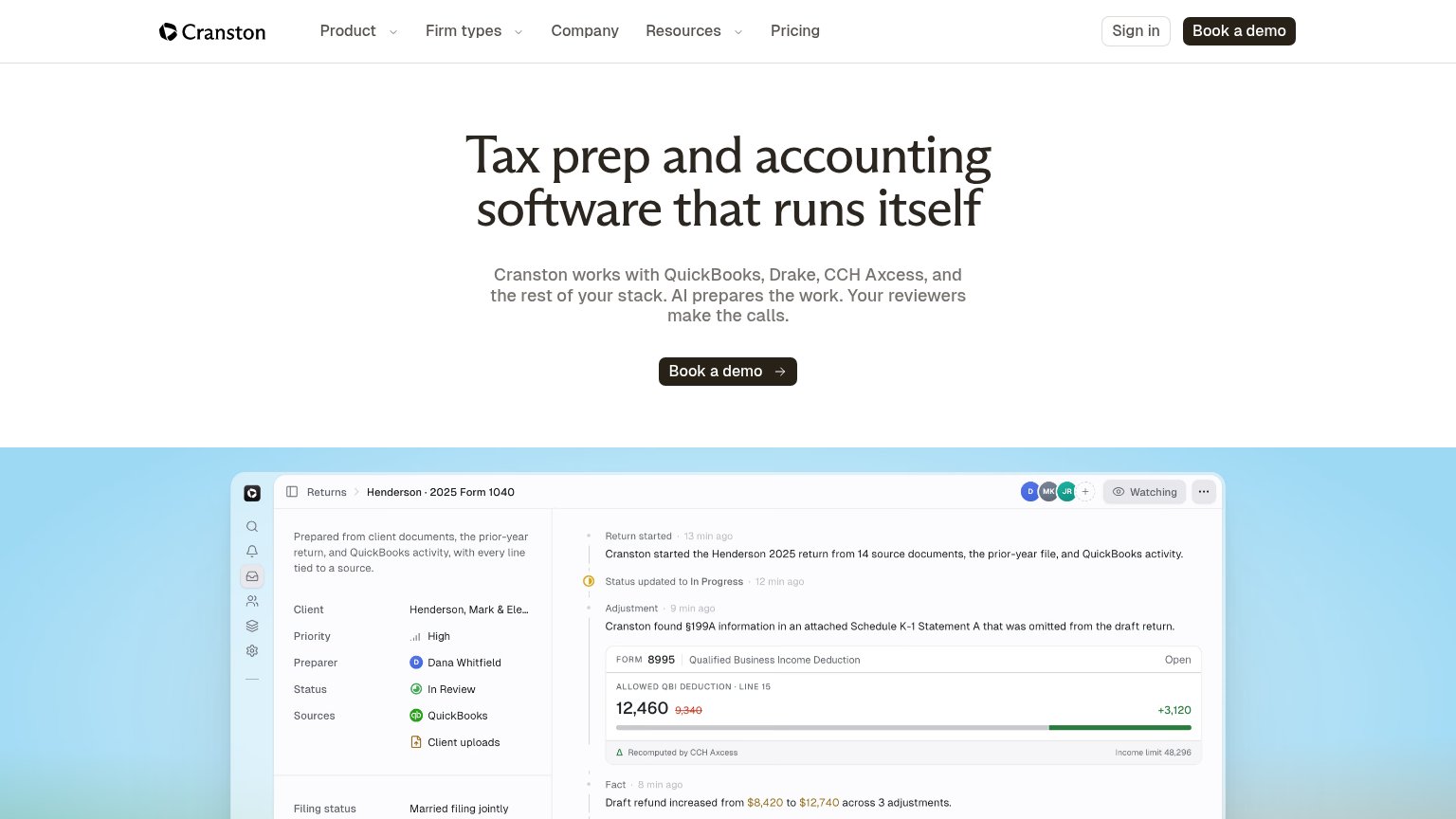
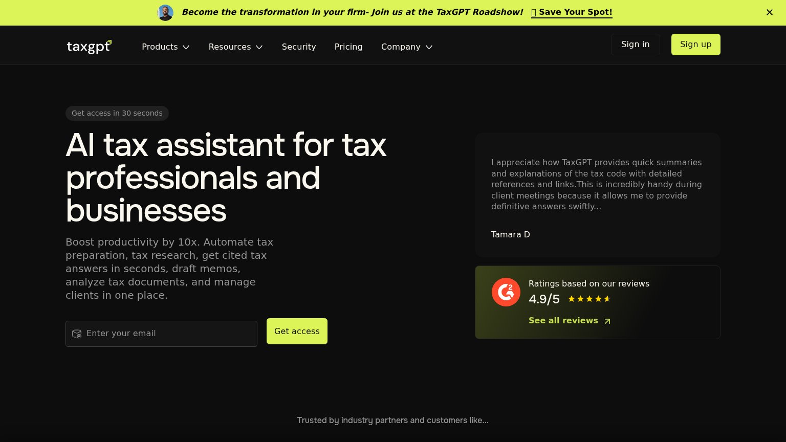
| Trust read | |
|---|---|
| Cranston AI | Product UI showing "Cranston found §199A information in an attached Schedule K-1 Statement A that was omitted from the d |
| "AI Tax Summit — Recap the Day from Nasdaq Tower" event banner | |
| Customer logo strip with named CPA firms (DWC, Schwarcz CPA, Stratax, Lagow CPA, Knapp, KSP) | |
| "TRUSTED BY LEADING TEAMS" logo bar with Baker Tilly, CohnReznick, Wiss, CitrinCooperman | |
| G2 card: "Ratings based on our reviews — 4.9/5" with star rating and "See all reviews" link |
CTA
72FairCopy, size, verb, cost-feel — does the primary CTA earn the click?
Problems
- 'Book' feels like a sales commitment
- no low-friction alternative path
- no value promised for the click
Value props
78FairTitle, subtitle, hero — do they sell the product's true value?
Cranston AI’s headline sells
Tax prep and accounting software that runs itself
Cranston works with QuickBooks, Drake, CCH Axcess, and the rest of your stack. AI prepares the work. Your reviewers make the calls.
Working
- Names real stack: QuickBooks, Drake, CCH Axcess
- Human-in-loop framing calms AI fear
- Hero shows product catching a §199A miss
Could improve
- No numbers or time-saved outcome in copy
- "Runs itself" clashes with reviewer framing
- Emotional payoff (relief, hours back) unstated
Mobile web
78FairThe phone experience as a first-class citizen.
 123
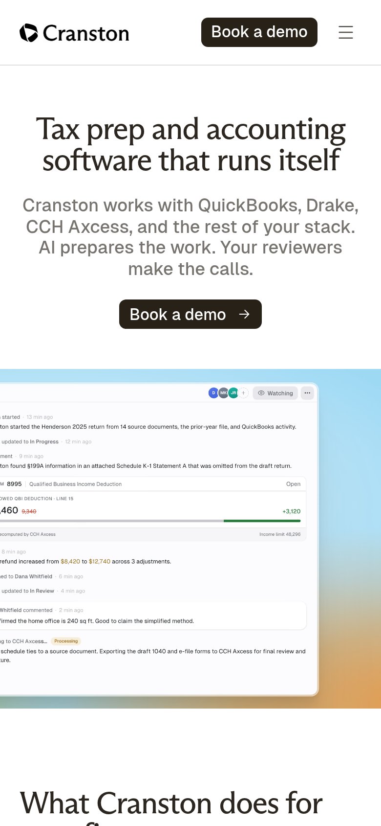
- Cropped product screenshot — The product UI screenshot bleeds off the left edge, cutting labels like 'ton started' and '.460' mid-word and reading as broken layout.
- Book a demo CTA — The primary button sits at desktop proportions, roughly a third of the column width, instead of near-full-bleed for the thumb.
- Duplicate header CTA — A second 'Book a demo' in the sticky header competes with the hero button and widens the header block.
Information hierarchy
84StrongDoes the design help or inhibit what the page is trying to say?
123- Header nav cluster — Five nav links plus Sign in give six exits before the hero CTA can act.
- Header Book a demo — Duplicates the hero CTA at equal visual weight, splitting the single action.
- Screenshot left panel — Client name truncates to "Mark & Ele…" and detail rows add dense small text at the fold edge.