
Your landing page’s weakest score is Trust.
How ComplyDo ranks
71Growth scoreupdated
category scores
category scoresShowHide
Score over time
Trust
54FairProof that the product is real, competent, and safe to try.
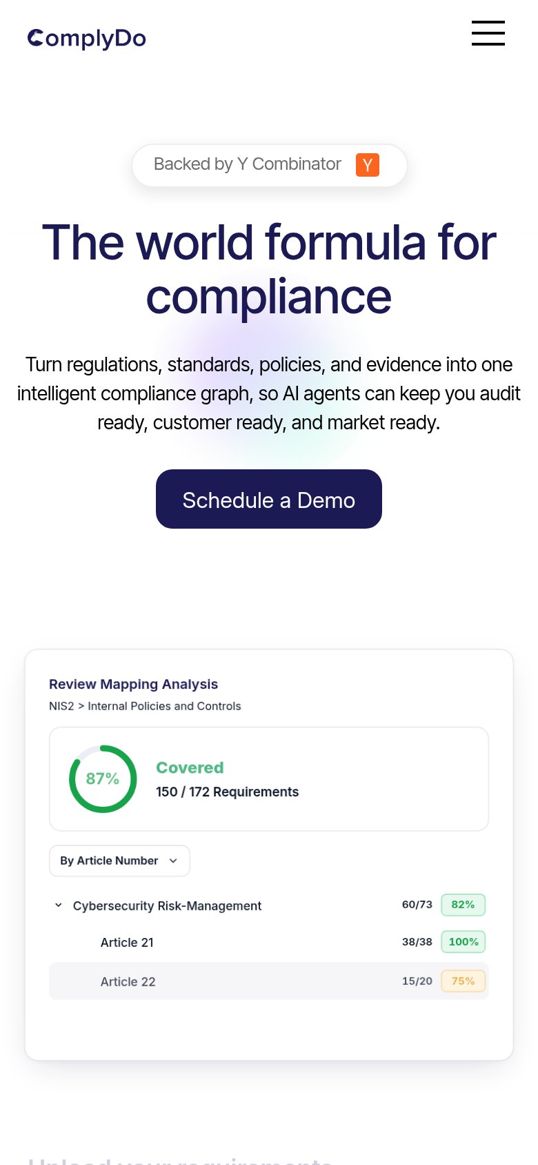


| Trust read | |
|---|---|
| ComplyDo | "Review Mapping Analysis" product UI card showing "87% Covered — 150 / 172 Requirements" for NIS2 |
| Customer logo strip: Ramp, Cursor, Snowflake, Clay, Lovable, Samsara | |
| TRUSTED BY 8,500+ GLOBAL CUSTOMERS with 4.8 / 5.0 G2 REVIEWS star rating | |
| "6000+ customers have saved millions of hours with Secureframe" (mobile capture) | |
| Framework badge strip (SOC 2, ISO, GDPR, HIPAA, PCI, HITRUST, CCPA) with "200+ FRAMEWORKS AND MORE" | |
| No visible trust signal identified. |
Value props
64FairTitle, subtitle, hero — do they sell the product's true value?
ComplyDo’s headline vague
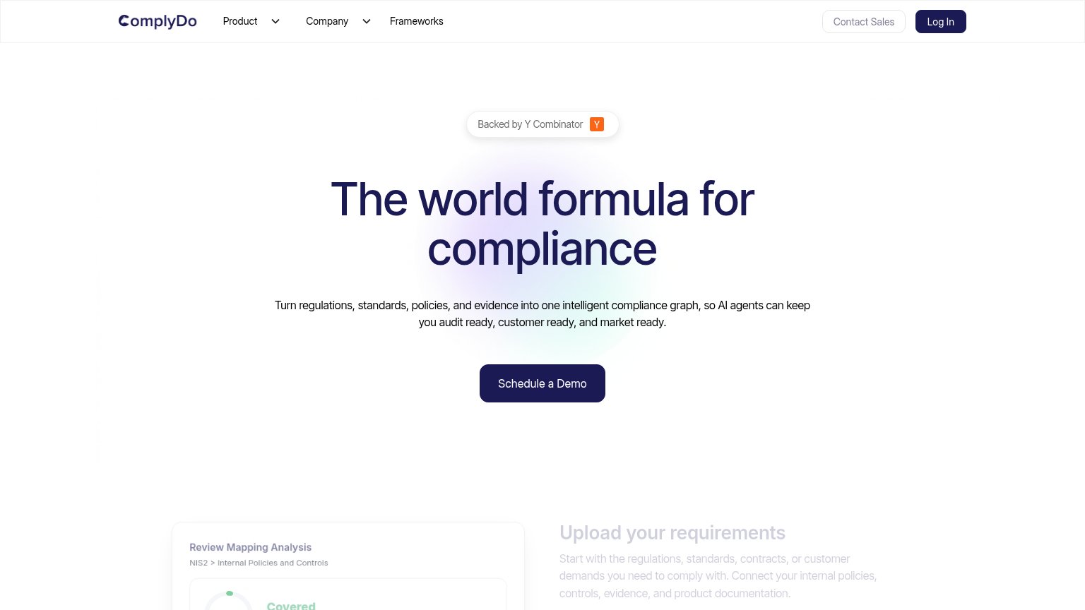
The world formula for compliance
Turn regulations, standards, policies, and evidence into one intelligent compliance graph, so AI agents can keep you audit ready, customer ready, and market ready.
Working
- Subhead names mechanism: compliance graph + AI agents
- Three concrete outcomes: audit/customer/market ready
- Mobile hero shows real coverage numbers (87%, 150/172)
Could improve
- Headline is a slogan, not a value claim
- 'World formula' parses as nothing specific
- Desktop fold hides the product demo screenshot
CTA
68FairCopy, size, verb, cost-feel — does the primary CTA earn the click?
Problems
- demo click feels costly, sales-gated
- no low-friction alternative path
- doesn't echo 'world formula' headline
Information hierarchy
82StrongDoes the design help or inhibit what the page is trying to say?
123- Ghosted section text — "Upload ComplyDo's requirements" and its paragraph render at low opacity, making the first proof section illegible in the fold.
- Faded product card — The Review Mapping Analysis card — the strongest product evidence — is cropped and washed out below the CTA instead of anchoring the hero.
- Contact Sales button — Very low-contrast gray outline makes the secondary sales path nearly invisible against the white nav.
Mobile web
86StrongThe phone experience as a first-class citizen.
12- Schedule a Demo button — Desktop-proportioned width; should stretch near full-bleed for an easy thumb tap.
- Y Combinator badge — Large pill sits above the headline and pushes the value statement and CTA lower.