
Your landing page’s weakest score is Information hierarchy.
How Vanta ranks
75Growth scoreupdated
category scores
category scoresShowHide
Information hierarchy
72FairDoes the design help or inhibit what the page is trying to say?
 123
- Chat widget panel — Auto-opened chatbot with three purple CTA buttons overlaps the mascot and competes directly with the demo form at equal visual weight.
- Announcement banner — 'Learn more' link plus full-width purple bar sits between nav and headline, adding an exit path before the value prop.
- Duplicate demo CTAs — 'Get a demo' in the nav duplicates the hero form button, splitting the primary action across two equal-weight purple pills.
Value props
72FairTitle, subtitle, hero — do they sell the product's true value?
Vanta’s headline undersells
Trust is everything
Earn and prove it with 35+ compliance frameworks, automated and continuously monitored.
Working
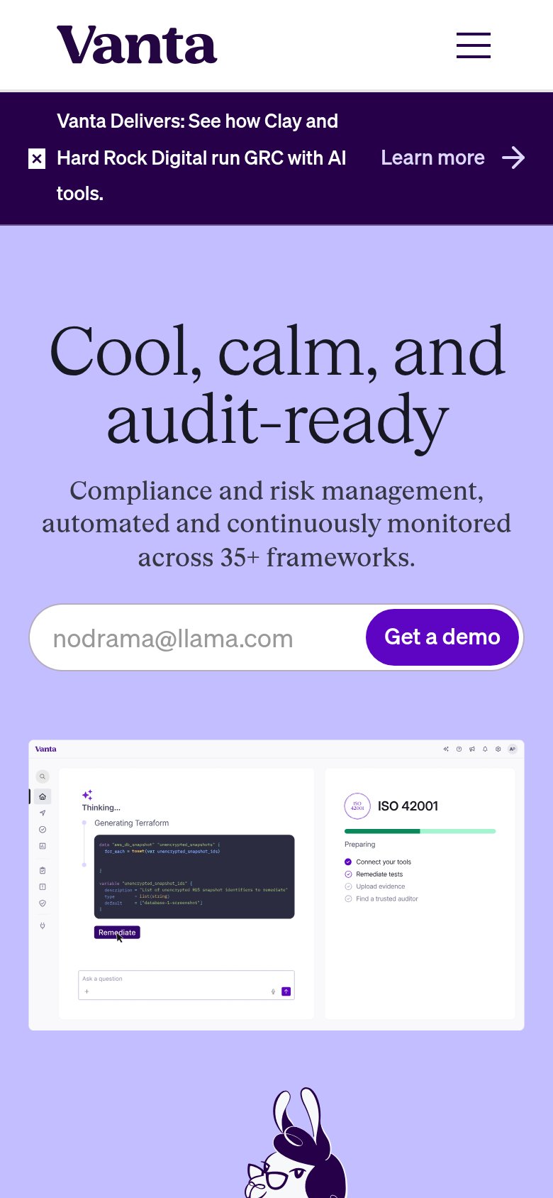
- Subhead cites 35+ frameworks
- Hero shows product remediating live
- Mobile H1 hits audit anxiety
Could improve
- Desktop H1 is an abstract slogan
- No outcome or time saved named in H1
- Desktop/mobile messaging inconsistent
CTA
76FairCopy, size, verb, cost-feel — does the primary CTA earn the click?
How Vanta compares
Recommended rewrites
Trust
76FairProof that the product is real, competent, and safe to try.
How Vanta compares
Trust read
Mobile web
78FairThe phone experience as a first-class citizen.
What works
What to improve