
Your landing page’s weakest score is Information hierarchy.
How Drata ranks
73Growth scoreupdated
category scores
category scoresShowHide
Information hierarchy
68FairDoes the design help or inhibit what the page is trying to say?
 1234
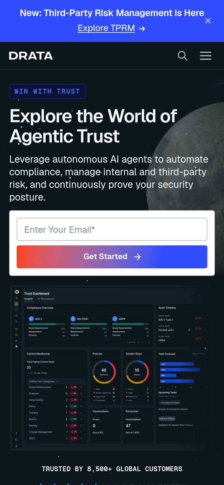
- Announcement banner TPRM link — Bright blue full-width bar with an underlined "Explore TPRM" link outranks the hero and siphons clicks before the value prop is read.
- Six-item dropdown nav — Products, Solutions, Customers, Partners, Resources, Company plus search open dozens of exit paths at the same scan height as the fold's message.
- Duplicate Get Started button — Nav "Get Started" competes at equal styling with the hero email-capture "Get Started", splitting the primary action into two targets.
- Dense dashboard screenshot — The Trust Dashboard packs 10+ micro-panels of tiny stats that reward squinting, not scanning, and pulls weight from the headline.
Value props
68FairTitle, subtitle, hero — do they sell the product's true value?
Drata’s headline vague
Explore the World of Agentic Trust
Leverage autonomous AI agents to automate compliance, manage internal and third-party risk, and continuously prove your security posture.
Working
- Subhead names concrete jobs: compliance, risk, proof
- Hero image shows real dashboard with framework data
- 8,500+ customers and 4.8 G2 rating in fold
Could improve
- Headline is category jargon, not a value
- "Explore the World of" invites browsing, not action
- No outcome numbers (time saved, audit speed)
CTA
72FairCopy, size, verb, cost-feel — does the primary CTA earn the click?
How Drata compares
Recommended rewrites
Trust
78FairProof that the product is real, competent, and safe to try.
How Drata compares
Trust read
Mobile web
78FairThe phone experience as a first-class citizen.
What works
What to improve