
Your landing page’s weakest score is Trust.
How Clerked ranks
72Growth scoreupdated
category scores
category scoresShowHide
Score over time
Trust
54FairProof that the product is real, competent, and safe to try.
| Trust read | |
|---|---|
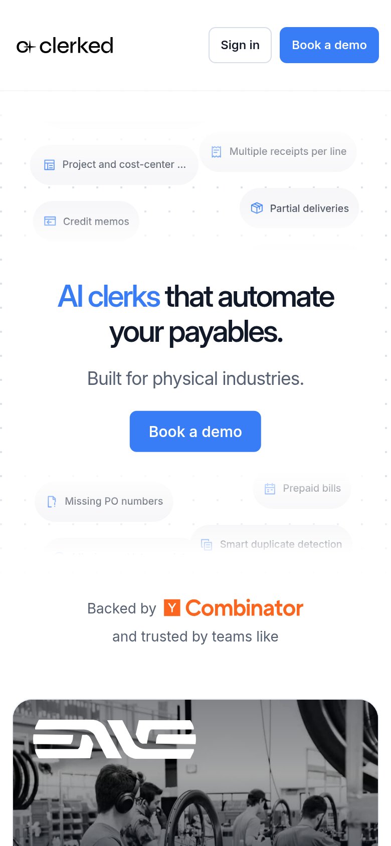
| Clerked | "Backed by Y Combinator" badge on the mobile capture |
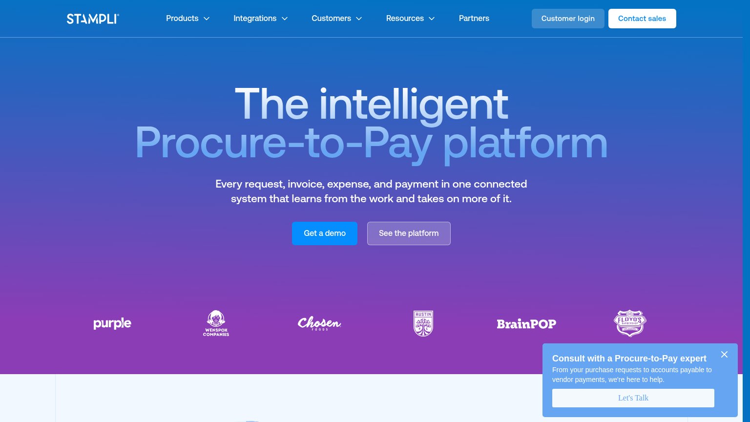
| Customer logo strip: Purple, Wenspok Companies, Chosen Foods, Austin FC, BrainPOP, Floyd's Barbershop | |
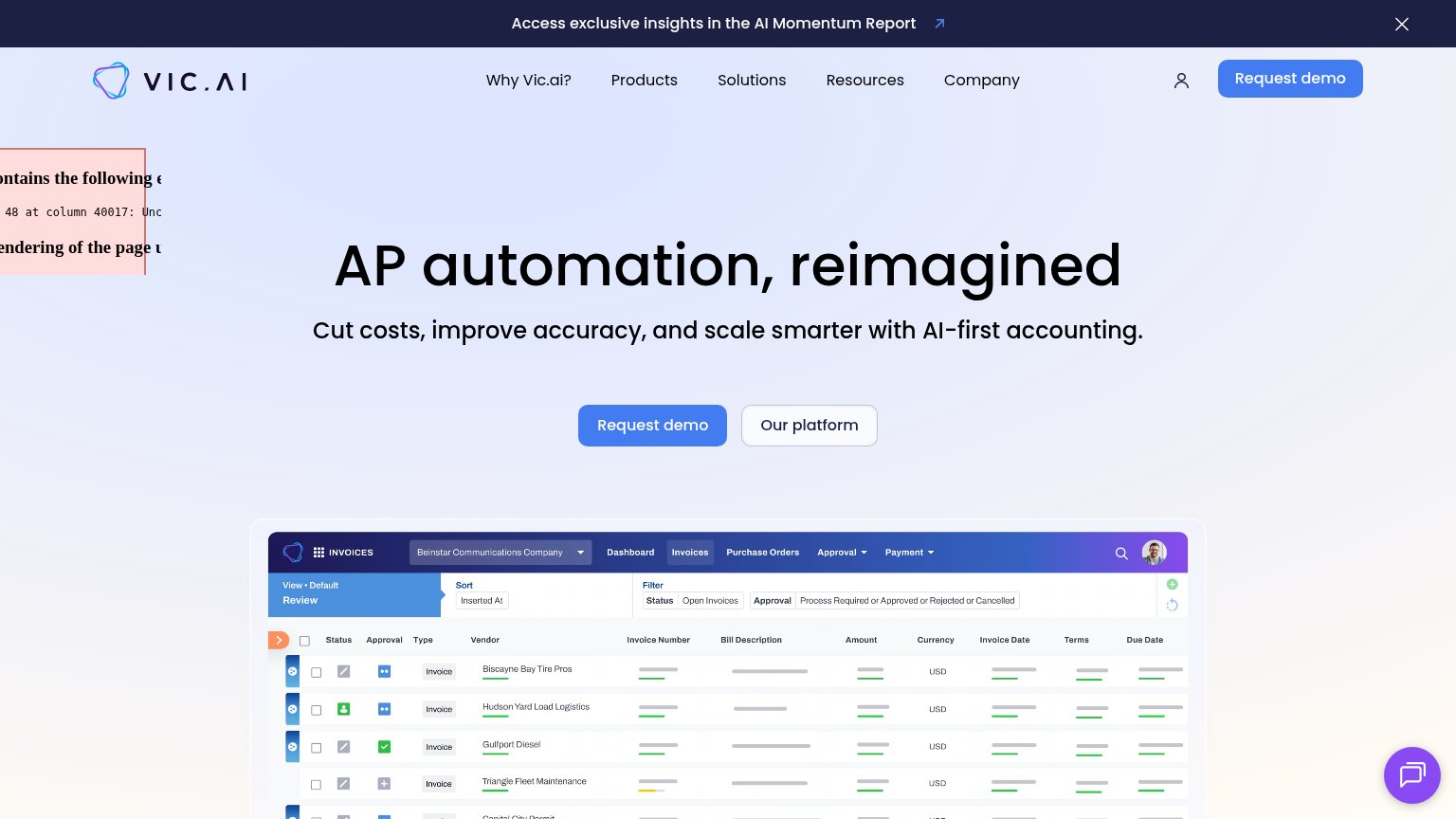
| Detailed invoices dashboard screenshot showing vendor rows, approval statuses, and filters | |
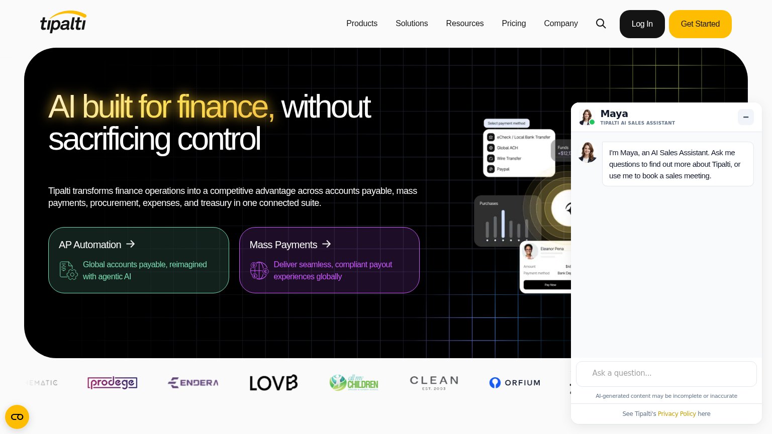
| Customer logo strip beneath the hero (Prodege, Endera, LOVB, All My Children, Clean, Orfium) | |
| "Sage Tech Partner Plus" badge in the hero image | |
| No visible trust signal identified. |
CTA
68FairCopy, size, verb, cost-feel — does the primary CTA earn the click?
Problems
- demo booking feels costly
- no value payoff in copy
- no low-friction alternative path
Value props
76FairTitle, subtitle, hero — do they sell the product's true value?
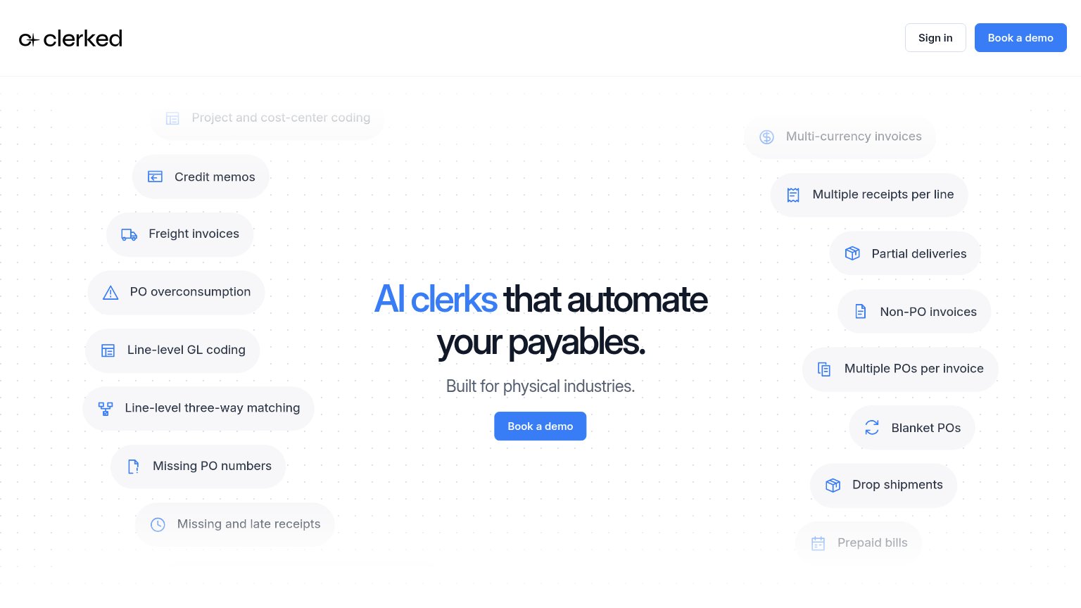
Clerked’s headline sells
AI clerks that automate your payables.
Built for physical industries.
Working
- Names the job plainly: AI automates payables
- Chips list real AP edge cases as proof
- Subhead targets a specific buyer segment
Could improve
- No numbers or quantified outcome anywhere
- No emotional payoff — flat, affectless claim
- No product visual showing the AI at work
Mobile web
80StrongThe phone experience as a first-class citizen.
1234- Hero Book a demo — Desktop-proportioned button floats narrow in the phone column instead of near-full-bleed.
- Truncated feature chip — "Project and cost-center ..." cuts off mid-phrase, signaling an unadapted desktop layout.
- Clipped duplicate chip — "Smart duplicate detection" chip is cut off at the section edge and reads as broken.
- Double header CTAs — "Sign in" plus "Book a demo" crowd the collapsed header and duplicate the hero CTA.
Information hierarchy
82StrongDoes the design help or inhibit what the page is trying to say?
1- Duplicate nav CTA — Second 'Book a demo' at identical weight splits the click target with the hero CTA below.