
Your landing page’s weakest score is Information hierarchy.
How Tipalti ranks
67Growth scoreupdated
category scores
category scoresShowHide
Information hierarchy
58FairDoes the design help or inhibit what the page is trying to say?
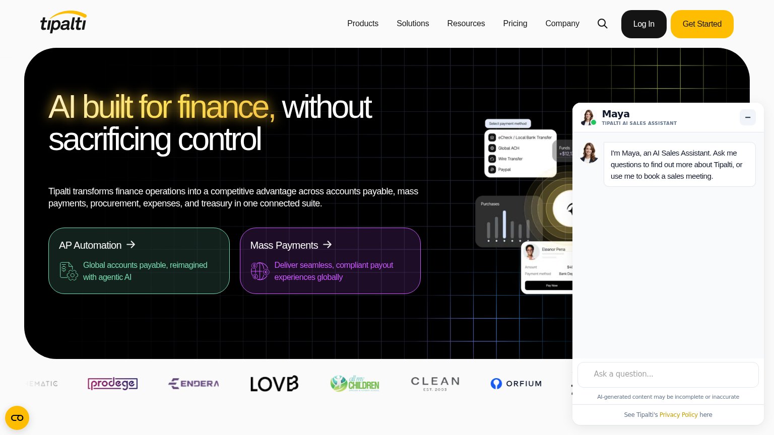 1234
- Maya AI chat panel — Auto-expanded chat window covers the entire right third of the fold, hiding the product visual and competing with the hero for attention.
- AP Automation card — Two equal-weight product cards act as the fold's only actions, splitting the visitor's path before any Get Started click; duplicate is the Mass Payments card beside it.
- Nav plus Log In — Five nav dropdowns, search, and a high-contrast Log In button create eight exits before the yellow Get Started.
- Obscured product screenshot — Payment-method UI mockup is half-buried behind the chat panel, so the strongest proof visual reads as clutter.
Mobile web
64FairThe phone experience as a first-class citizen.
 123
- Long body paragraph — Six-line desktop paragraph pushes both product cards and any CTA deep down the mobile fold.
- AI assistant avatar bubble — Maya chat avatar floats over content near the fold edge, adding a tap distraction with no conversion CTA.
- Chat launcher bubble — A second floating widget in the bottom-left corner duplicates interruption chrome and crowds the thumb zone.
CTA
68FairCopy, size, verb, cost-feel — does the primary CTA earn the click?
How Tipalti compares
Recommended rewrites
Value props
72FairTitle, subtitle, hero — do they sell the product's true value?
Tipalti’s headline
AI built for finance, without sacrificing control
Tipalti transforms finance operations into a competitive advantage across accounts payable, mass payments, procurement, expenses, and treasury in one connected suite.
Working
Could improve
Trust
72FairProof that the product is real, competent, and safe to try.
How Tipalti compares
Trust read