CaddyYC F25 landing page report.
← Back to YC F25

Your landing page’s weakest score is Trust.

Fix Trust

Score over time

807060504030Martin 70 on Mar 12 (Wayback)Martin 69 on Mar 25 (Wayback)Martin 68 on Apr 4 (Wayback)Martin 69 on Apr 23 (Wayback)Martin 70 on Aug 11 (Wayback)Martin 68 on Sep 4 (Live)Ohai 38 on Apr 20 (Wayback)Ohai 73 on May 18 (Wayback)Ohai 38 on Jun 15 (Wayback)Ohai 74 on Jul 27 (Live)Ohai 73 on Aug 12 (Wayback)Ohai 73 on Sep 17 (Wayback)Milo 41 on Feb 7 (Wayback)Milo 43 on Mar 17 (Wayback)Donna 66 on Apr 4 (Wayback)Donna 64 on Apr 13 (Wayback)Donna 58 on Jul 19 (Wayback)Donna 62 on Sep 21 (Live)Mindy 40 on Sep 21 (Live)Caddy 54 on Apr 30 (Wayback)Caddy 71 on Jul 19 (Wayback)Caddy 71 on Aug 30 (Wayback)Caddy 69 on Sep 21 (Live)Apr 30Jul 19Aug 30Sep 21
Past reportsShow past reportsHide past reports
  1. Sep 21, 202669LiveOverall −2 · Information hierarchy −8 · Value props −6Viewing
  2. Aug 30, 202671Trust −6 · Mobile web +5View →
  3. Jul 19, 202671Overall +17 · Value props +24 · Trust +18View →
  4. Apr 30, 202654First tracked report — strongest Information hierarchy 68, weakest Trust 30View →

Trust

44Poor

Proof that the product is real, competent, and safe to try.

Caddy
Martin
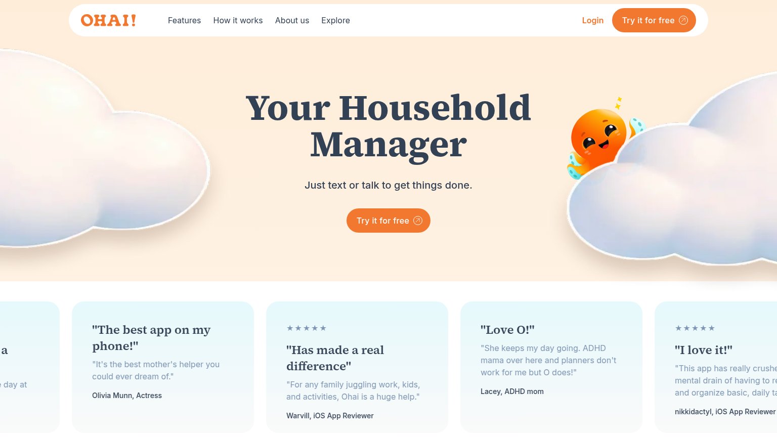
Ohai
Donna
Trust read
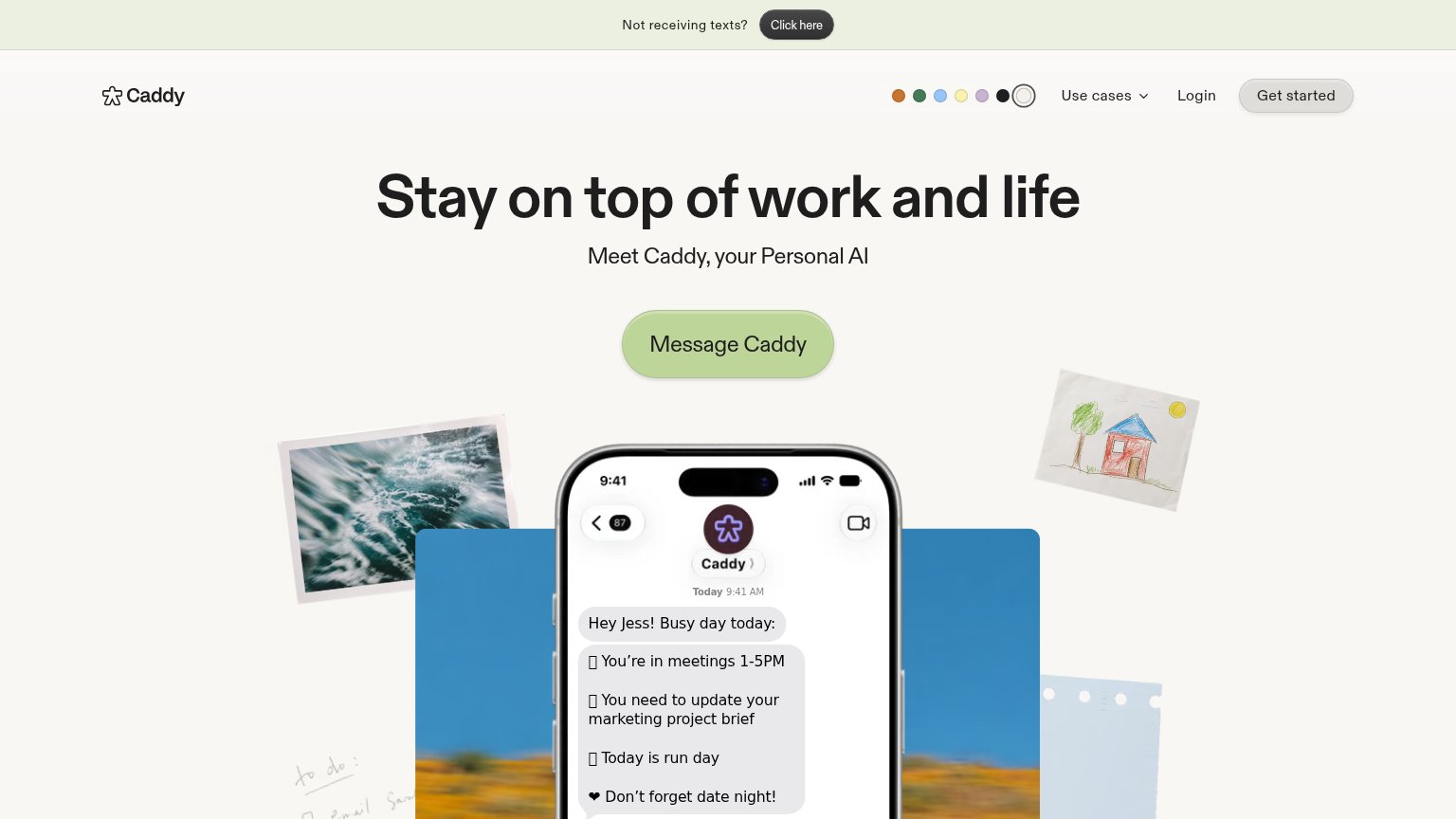
CaddyiMessage product demo showing Caddy texting "Hey Jess! Busy day today:" with a daily schedule digest
MartinProduct Hunt "#1 Product of the Day" badge above the headline
OhaiFive-star testimonial card: "The best app on my phone!" — Olivia Munn, Actress
MiloNo visible trust signal identified.
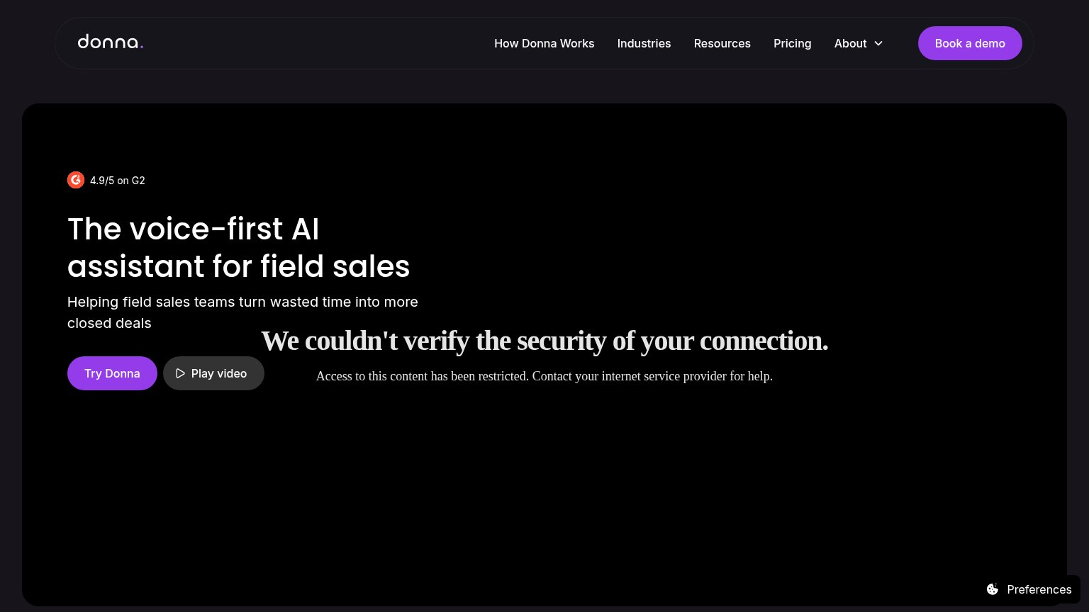
Donna"4.9/5 on G2" rating badge above the hero headline
MindyNo visible trust signal identified.

Value props

62Fair

Title, subtitle, hero — do they sell the product's true value?

Caddy’s headline undersellsStay on top of work and lifeMeet Caddy, your Personal AI

Working

  • Outcome-framed headline, not features
  • Hero mockup shows the product working
  • Real texted briefing demos the value

Could improve

  • Subhead adds zero specifics
  • "Personal AI" is a vague category label
  • No numbers or proof points in the fold

Information hierarchy

74Fair

Does the design help or inhibit what the page is trying to say?

Information hierarchy annotations on the desktop capture1234
  1. Not receiving texts banner — Top banner with its own dark 'Click here' button is the first tappable element visitors see, pulling attention before the headline and CTA.
  2. Color dot switcher — Seven unlabeled theme dots sit at equal nav weight next to 'Get started', adding clickable noise with no conversion purpose.
  3. Get started button — A second styled CTA in the nav competes with 'Message Caddy' and splits the primary action into two labels.
  4. Placeholder emoji glyphs — Broken tofu characters render before each list item in the chat mockup, making the hero demo look unfinished.

CTA

82Strong

Copy, size, verb, cost-feel — does the primary CTA earn the click?

Caddy
Ohai

Problems

  • competes with nav 'Get started'
  • banner adds third label 'Click here'
  • no cost signal (free unverified)

Mobile web

82Strong

The phone experience as a first-class citizen.

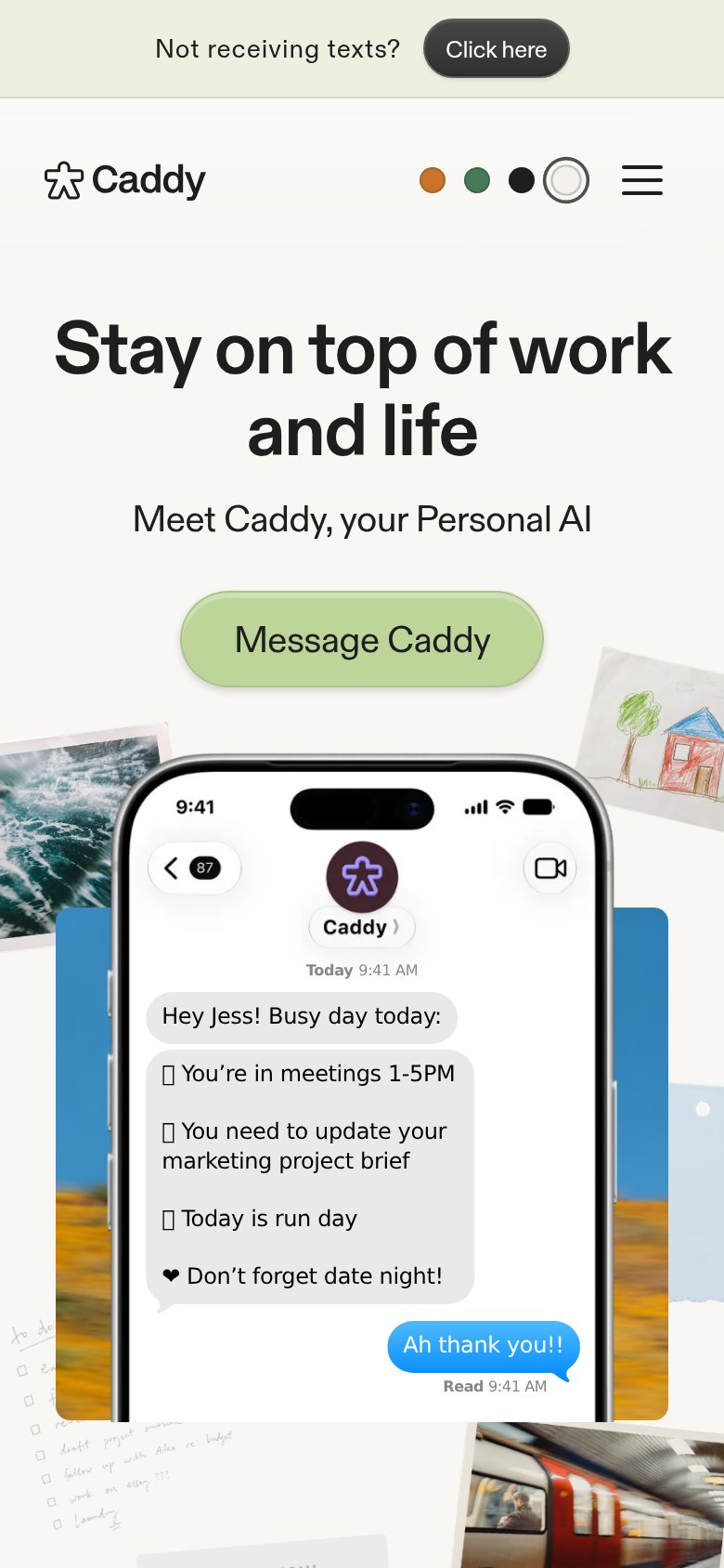
Mobile web annotations on the mobile capture123
  1. Support banner top — "Not receiving texts?" targets existing users, yet occupies the first pixels every new visitor sees and pushes the hero down.
  2. Message Caddy button — Primary CTA keeps its desktop pill proportions instead of stretching near-full-bleed for an easy thumb tap.
  3. Color dot picker — Theme-swatch row in the header is a decorative distraction competing with the hamburger and hero for attention.

Competitors

inferred from product, audience, and value prop