Past reportsShow past reportsHide past reports
- Mar 17, 202643ArchivedOverall +2 · Mobile web +10 · Value props +6Viewing
- Feb 7, 202641First tracked report — strongest Information hierarchy 48, weakest Trust 22View →
 Lazyweb
Complete both scorecards to calculate your growth score.
Graded against Lazyweb’s growth rubrics.
Your landing page’s weakest score is Trust.
How Milo ranks
category scores
Proof that the product is real, competent, and safe to try.
| Trust read | |
|---|---|
| Milo | No visible trust signal identified. |
Copy, size, verb, cost-feel — does the primary CTA earn the click?
Problems
Does the design help or inhibit what the page is trying to say?
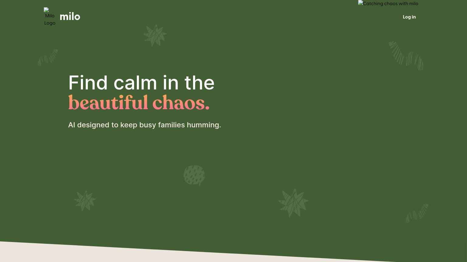
Milo's fold nails value-prop visibility and density: "Find calm in the beautiful chaos." and "AI designed to keep busy families humming." sit alone on a warm green field, readable in under a second. The fatal weakness is primary-CTA visibility — the only interactive element in the entire fold is a small "Log in" link, so a convinced visitor has nowhere to act; adding a signup CTA beneath the subhead is the single biggest lever. Brand communication is also wounded: the hero illustration renders as a broken-image placeholder ("Catching chaos with milo" alt text) and the logo image fails next to the wordmark, leaving only faint scribble motifs to carry the brand — the illustration should be restored, not removed, since it is the fold's intended emotional anchor.
Title, subtitle, hero — do they sell the product's true value?
Find calm in the beautiful chaos.
AI designed to keep busy families humming.
Working
Could improve
The phone experience as a first-class citizen.
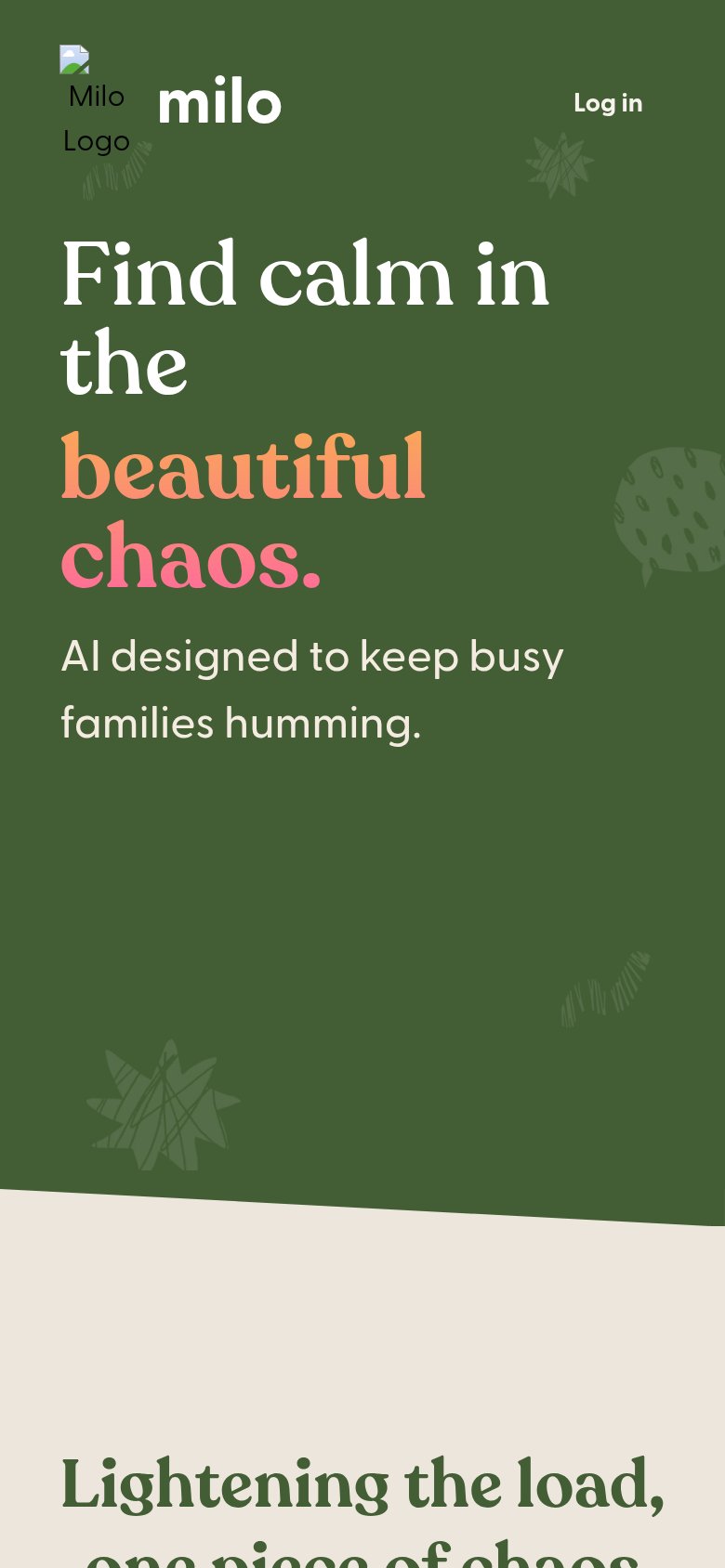
Milo's mobile fold reads cleanly — the headline "Find calm in the beautiful chaos." scales down to comfortable line lengths, the nav collapses to just the logo and a "Log in" link, and there are no pop-ups or banners. The fatal gap is that no primary CTA exists anywhere in the first viewport: the only tappable action is the small "Log in" link, which serves existing users, not new visitors, so mobile traffic has nothing to convert against. The logo also renders as a broken image with visible "Milo Logo" alt text, undercutting trust at the very top of the page. The single biggest lever is adding a full-width, thumb-friendly signup or waitlist button directly under the subheadline.
Graded against Lazyweb’s growth rubrics.
SEO / AEO · joinmilo.com
See your search and AI visibility, agent readiness score, and prioritized fixes with Lazyweb Pro.
Try Pro FreeFree account
We’ll add Milo as your product and bring this score into your workspace. You can change it later in Settings.