AbsurdYC F25 landing page report.
← Back to YC F25

Your landing page’s weakest score is Trust.

Fix Trust

Score over time

9080706050403020Flora 68 on Sep 19 (Wayback)Flora 74 on Sep 22 (Live)Krea 72 on Jul 16 (Live)Krea 72 on Jul 21 (Wayback)Krea 68 on Aug 3 (Wayback)Krea 68 on Aug 16 (Wayback)Krea 64 on Sep 2 (Wayback)Krea 40 on Sep 14 (Wayback)Krea 41 on Sep 27 (Wayback)Freepik Spaces 69 on Apr 28 (Wayback)Freepik Spaces 76 on Sep 22 (Live)Weavy 73 on Mar 25 (Wayback)Weavy 68 on Sep 22 (Live)Flow (by Google) 67 on Mar 15 (Wayback)Flow (by Google) 63 on Mar 26 (Wayback)Flow (by Google) 66 on Apr 14 (Wayback)Flow (by Google) 70 on May 11 (Wayback)Flow (by Google) 72 on May 23 (Wayback)Flow (by Google) 67 on Jul 9 (Wayback)Flow (by Google) 70 on Jul 21 (Live)Absurd 31 on Apr 16 (Wayback)Absurd 32 on May 18 (Wayback)Absurd 66 on Aug 30 (Wayback)Absurd 66 on Sep 22 (Live)Apr 16May 18Aug 30Sep 22
Past reportsShow past reportsHide past reports
  1. Sep 22, 202666LiveTrust +10 · Information hierarchy −4Viewing
  2. Aug 30, 202666Overall +34 · CTA +44 · Value props +38View →
  3. May 18, 202632Overall +1 · Value props +6 · CTA −5View →
  4. Apr 16, 202631First tracked report — strongest Information hierarchy 38, weakest Value props 22View →

Trust

52Fair

Proof that the product is real, competent, and safe to try.

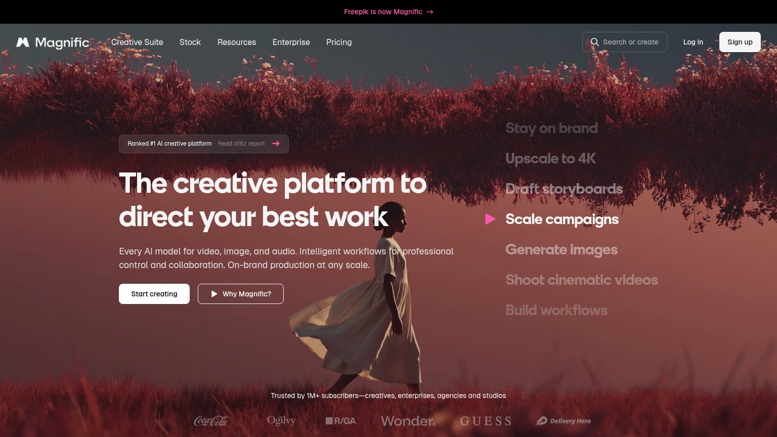
Freepik Spaces
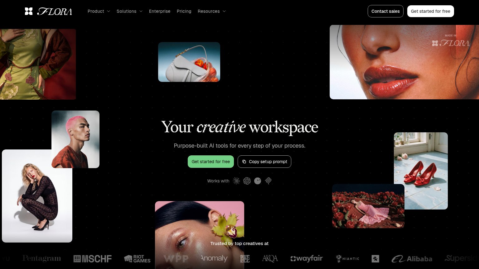
Flora
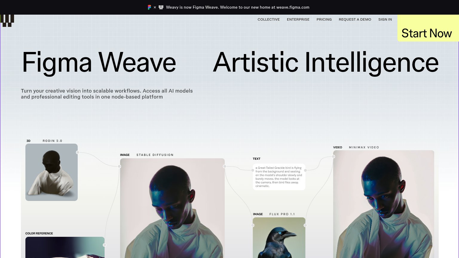
Weavy
Trust read
AbsurdNo visible trust signal identified.
Flora"Trusted by top creatives at" logo wall (Pentagram, MSCHF, Riot Games, WPP, Wayfair, Niantic, Alibaba)
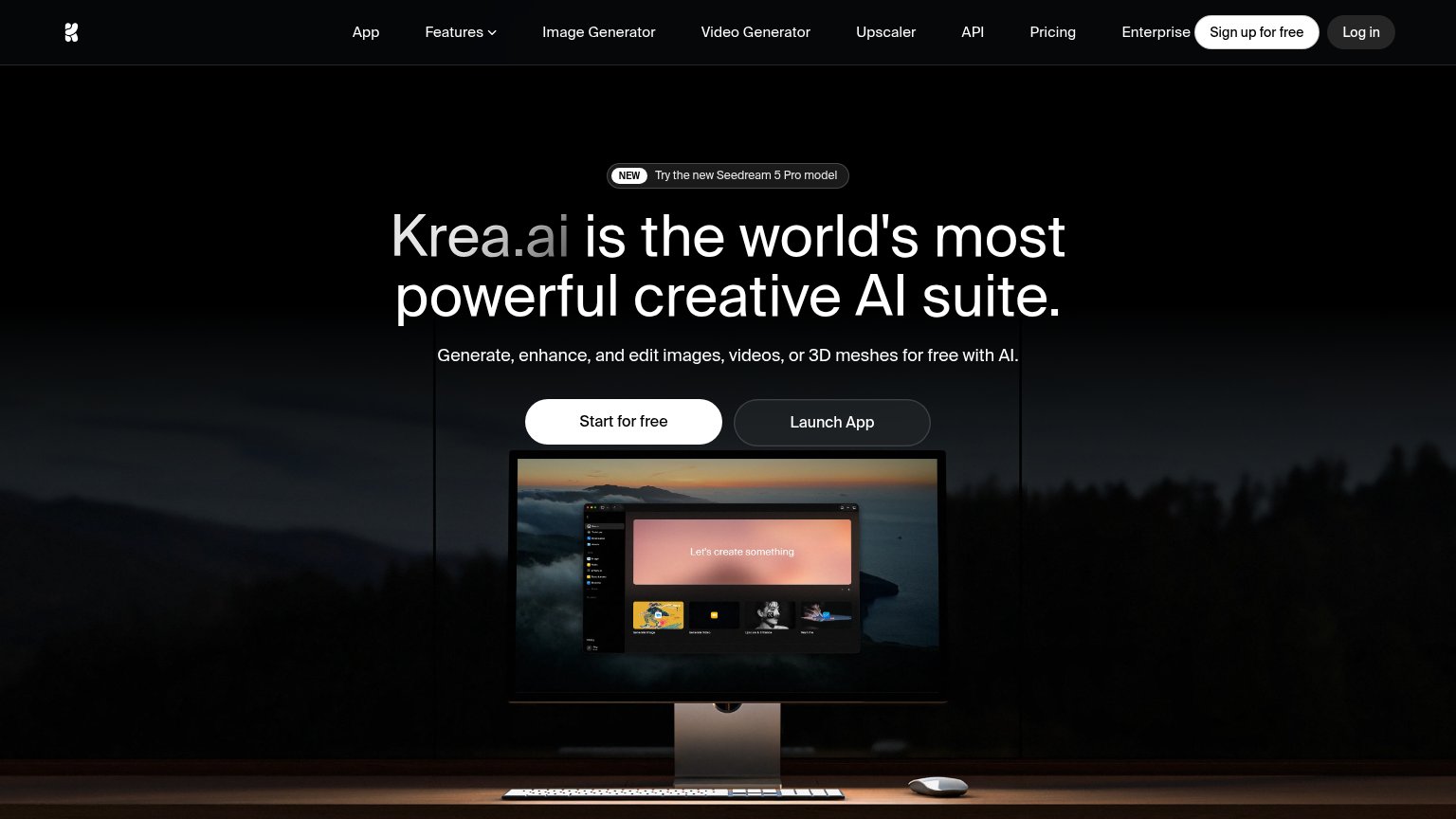
KreaProduct screenshot of the Krea app interface ("Let's create something") on the monitor
Freepik Spaces"Trusted by 1M+ subscribers—creatives, enterprises, agencies and studios" above the Coca-Cola/Ogilvy/GUESS logo row
WeavyBanner: "Weavy is now Figma Weave. Welcome to our new home at weave.figma.com"
Flow (by Google)No visible trust signal identified.

Value props

68Fair

Title, subtitle, hero — do they sell the product's true value?

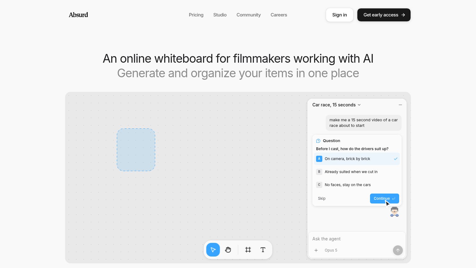
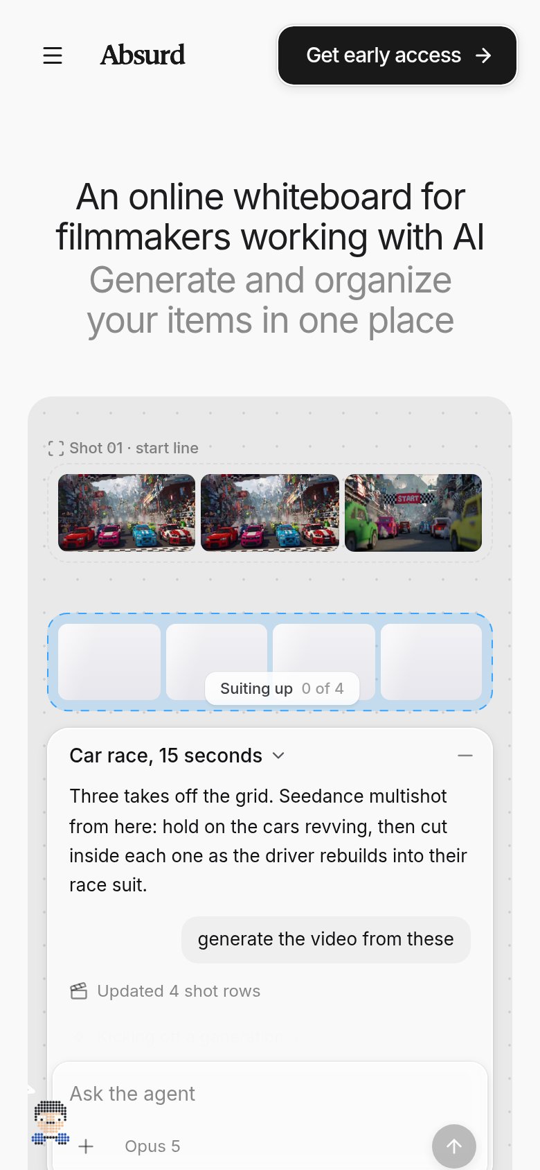
Absurd’s headline sellsAn online whiteboard for filmmakers working with AIGenerate and organize your items in one place

Working

  • Names the exact audience: filmmakers using AI
  • Clear category anchor: online whiteboard
  • Hero demo shows real prompt-to-shots workflow

Could improve

  • "Items" is vague — say shots, scenes, or films
  • No numbers or proof points anywhere in fold
  • Subhead states no emotional or time payoff

Information hierarchy

70Fair

Does the design help or inhibit what the page is trying to say?

Information hierarchy annotations on the desktop capture123
  1. Nav link row — Pricing, Studio, Community, Careers plus Sign in offer five exits before the visitor reaches "Get early access".
  2. Agent panel Continue — The bright blue Continue button inside the demo panel is the highest-contrast color element in the fold, outshining the real CTA.
  3. Empty canvas demo — The whiteboard demo shows only a dashed placeholder rectangle on desktop, so the product outcome the headline promises never gets visualized.

CTA

70Fair

Copy, size, verb, cost-feel — does the primary CTA earn the click?

Absurd
Flora
Krea
Freepik Spaces
Try it now
Flow (by Google)
Weavy

Problems

  • 'early access' implies waitlist gate
  • no payoff — access to what?
  • demo teases product button can't deliver

Mobile web

72Fair

The phone experience as a first-class citizen.

Mobile web annotations on the mobile capture123
  1. Clipped status text — "Kicking off...generation" line is cut off and overlapped by the composer, looking broken.
  2. Seven-line headline stack — Headline plus subhead wrap into seven lines, pushing the product demo deep into the fold.
  3. Avatar bleeding off-screen — Pixel-art avatar is half-cropped by the left edge, overlapping the composer like a rendering bug.