
Your landing page’s weakest score is Value props.
How Freepik Spaces ranks
- 1.
Freepik Spaces76
- 2.
Flora74
- 3.
Krea72
- 4.
Weavy68
- 5.
atlas.design66
- 6.
ComfyUI65
76Growth scoreupdated
category scores
category scoresShowHide
Value props
72FairTitle, subtitle, hero — do they sell the product's true value?
Freepik Spaces’s headline undersells
The creative platform to direct your best work
Every AI model for video, image, and audio. Intelligent workflows for professional control and collaboration. On-brand production at any scale.
Working
- Subhead names AI models for video/image/audio
- 1M+ subscribers plus Coca-Cola, GUESS logos
- Use-case list makes capabilities concrete
Could improve
- H1 is a generic abstraction
- Hero image decorates, never demos product
- No emotional hook for the user's pain
Information hierarchy
76FairDoes the design help or inhibit what the page is trying to say?
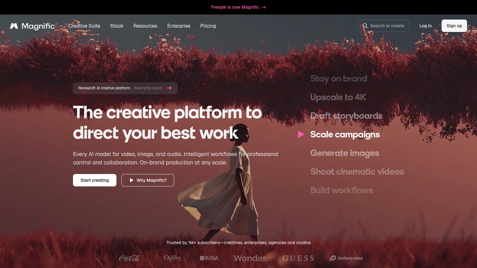 1234
- Sign up button — Same white-pill weight as 'Start creating', splitting the primary action into two competing buttons.
- Use-case text column — Seven same-weight lines ('Stay on brand' through 'Build workflows') compete with the headline for the first scan.
- Rebrand announcement banner — Pink 'Freepik is now Magnific' link occupies the top scan line and leaks attention before the value prop.
- a16z report chip — 'Read a16z report' link sits directly above the headline, adding an exit path in the hero's hottest zone.
CTA
78FairCopy, size, verb, cost-feel — does the primary CTA earn the click?
How Freepik Spaces compares
Recommended rewrites
Trust
78FairProof that the product is real, competent, and safe to try.
How Freepik Spaces compares
Trust read
Mobile web
78FairThe phone experience as a first-class citizen.

What works
What to improve