
Your landing page’s weakest score is Mobile web.
How Weavy ranks
68Growth scoreupdated
category scores
category scoresShowHide
Mobile web
62FairThe phone experience as a first-class citizen.
 123
- Rebrand announcement banner — Two-line black banner consumes the top of the fold before any product message appears.
- Uncollapsed nav row — PRICING and SIGN IN links crammed inline instead of a hamburger, crowding the CTA.
- START NOW button — Desktop-proportioned corner button instead of a full-width thumb-friendly CTA.
Information hierarchy
64FairDoes the design help or inhibit what the page is trying to say?
 1234
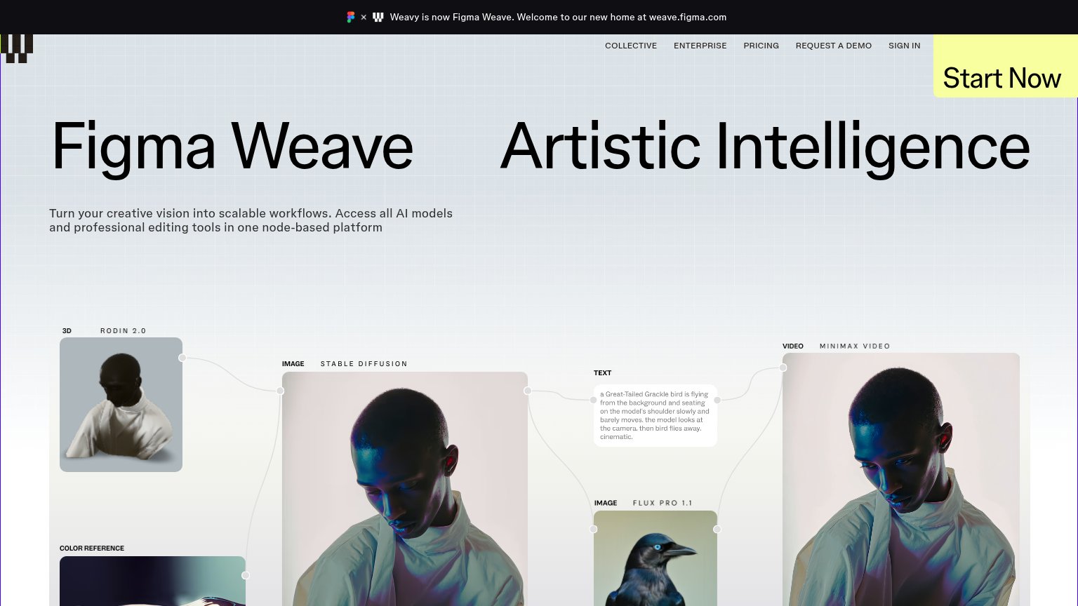
- Split hero headline — "Figma Weave" and "Artistic Intelligence" sit as two equal-weight headlines, forcing the visitor to reconcile which one is the message.
- Announcement banner — The rebrand banner is the first thing scanned and pushes the fold down while adding a message unrelated to the conversion.
- Start Now button — The yellow CTA is pinned to the extreme top-right corner, outside the natural scan path down the headline and subhead — no CTA repeats in the hero itself.
- Node canvas montage — Five labeled node cards (Rodin, Stable Diffusion, Flux, Minimax, text prompt) compete at once with dense micro-labels instead of one legible product story.
Value props
68FairTitle, subtitle, hero — do they sell the product's true value?
Weavy’s headline
Figma Weave — Artistic Intelligence
Turn your creative vision into scalable workflows. Access all AI models and professional editing tools in one node-based platform
Working
Could improve
Trust
68FairProof that the product is real, competent, and safe to try.
How Weavy compares
Trust read
CTA
76FairCopy, size, verb, cost-feel — does the primary CTA earn the click?
How Weavy compares
Recommended rewrites