What are the default design-token values for a modern product in 2026?
Across 520 audited design systems, the modal modern product ships: 16px base body text (73%), a system or Inter-class sans (56% system stack), a blue primary brand color (34%), and either a pill or 7-12px rounded button (32% and 27%) [1][2][3][4]. Theme is the one token with no default — it is a near coin flip decided by platform.
The modal 2026 design system: 16px body (73% of 518), blue brand (34% of 519), pill buttons (32% of 514), July 2026.
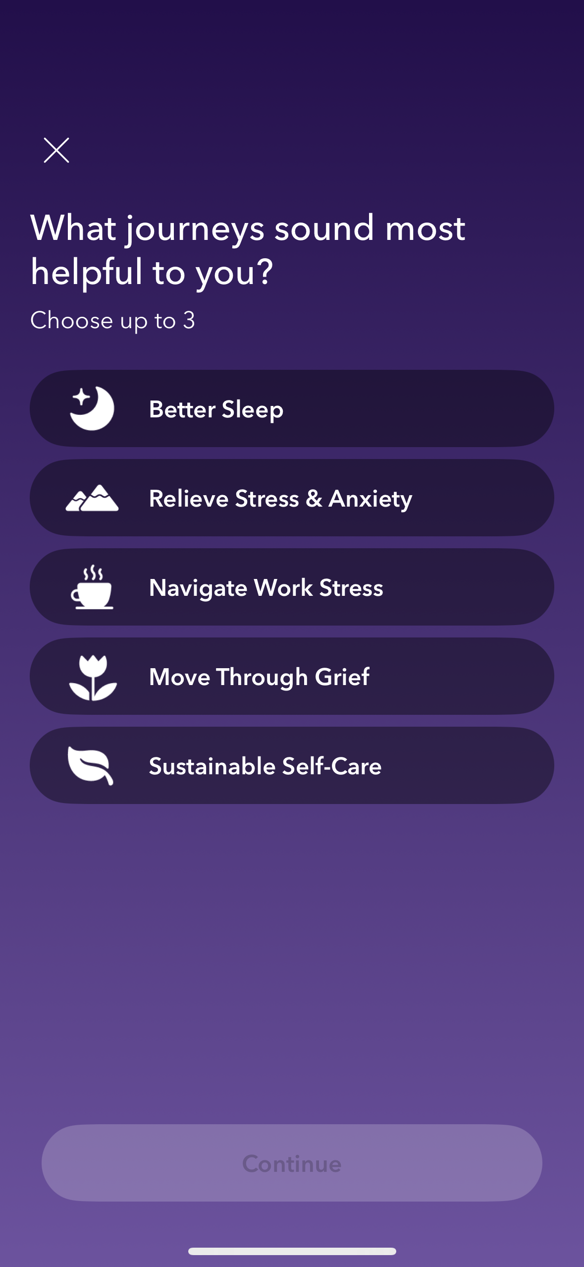
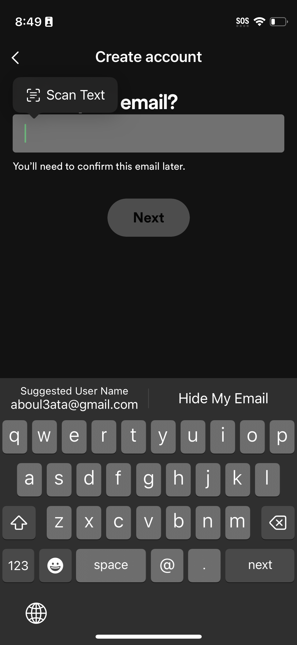
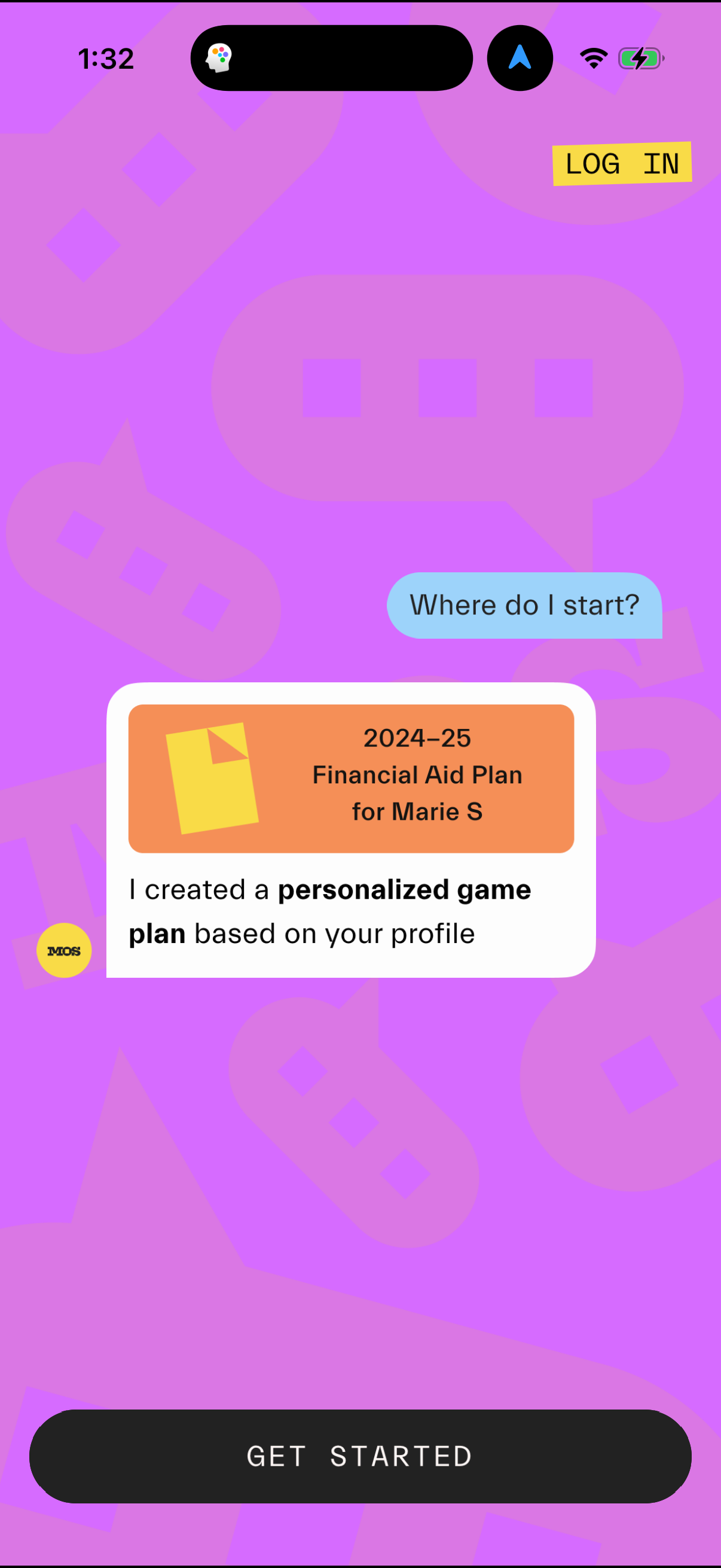
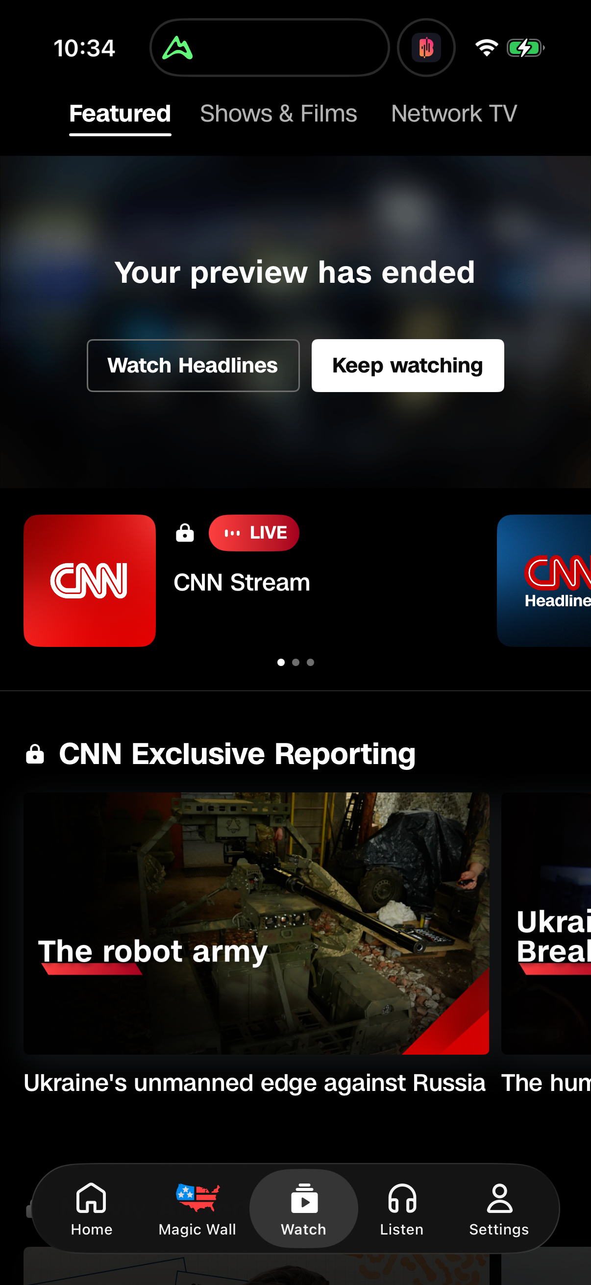
| Item | Share |
|---|---|
| Base body size | 73.0% |
| Primary font | 56.4% |
| Brand hue | 34.1% |
| Button radius | 32.3% |
| Theme | 51% dark |
The default-token cheat sheet
The most common value for each token, with its share [1][2][3][4][5].
| Token | Modal value | Share | n |
|---|---|---|---|
| Base body size | 16px | 73.0% | 518 |
| Primary font | System/native stack | 56.4% | 488 |
| Brand hue | Blue | 34.1% | 519 |
| Button radius | 40+px pill | 32.3% | 514 |
| Theme | (no default) | 51% dark | 520 |
Four of five tokens have a clear modal value; theme is the exception at 51/49 [1][2][3][4][5].
How to apply it
Use this as a sanity check, not a spec: if your product diverges from the modal value on a token, make sure it is a deliberate brand or platform decision rather than an accident. Theme is the one place to look outward — set it from your platform (dark on mobile, light on web) and category, not from any aggregate default [5].
Caveats
Every token has a slightly different denominator because not all 520 systems specify every token (fonts 488, radius 514, base size 518, brand hue 519) [1][2][3][4]. Values are LLM-extracted design tokens from captured screens, presented as observed defaults, not authoritative brand specs [5].
The numbers
| Stat | Computed from |
|---|---|
| 16px base 73.0% of 518 | base_font_size |
| system stack 56.4% of 488 | primary_font_class |
| blue brand 34.1% of 519 | primary_brand_hue_overall |
| pill 40+px buttons 32.3% of 514 | button_corner_radius |
| theme 51.3% dark of 520 | theme_overall |
Sources & citations
- [1] Lazyweb Research analysis of 518 design systems (base size non-null), July 2026. Modal base body size across the corpus. ↩
- [2] Lazyweb Research analysis of 488 design systems (systems with a primary font), July 2026. System vs custom font-class majority. ↩
- [3] Lazyweb Research analysis of 519 design systems (systems with a brand color), July 2026. Modal brand hue across the corpus. ↩
- [4] Lazyweb Research analysis of 514 design systems (systems with a button radius), July 2026. Modal button radius bucket across the corpus. ↩
- [5] Lazyweb Research analysis of 520 design systems (audited design_systems corpus), July 2026. Theme census and the note that tokens are LLM-extracted observed defaults. ↩
Source: Lazyweb Research — proprietary analysis of real, in-market app screens. Cite as Lazyweb Research, 2026-07-07.