Design-system and theme benchmarks
11 data-backed questions on Design-system and theme benchmarks, from Lazyweb Research — each answer cites proprietary analysis of real, in-market app screens.
What percentage of products default to dark mode?
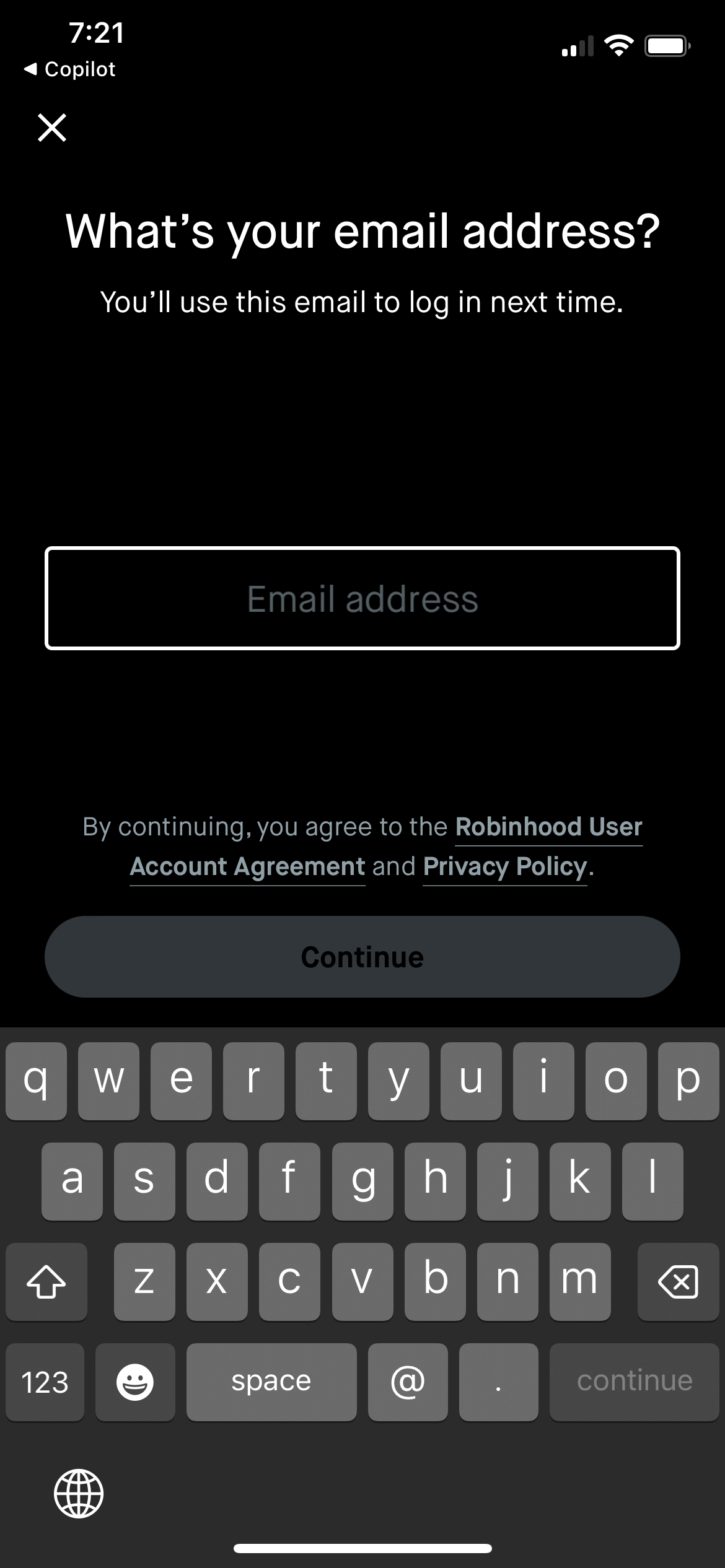
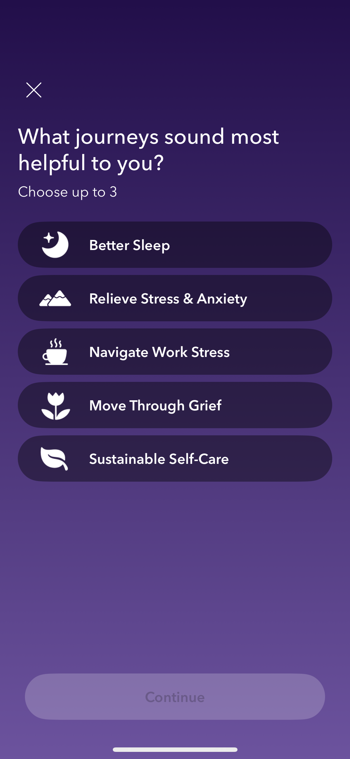
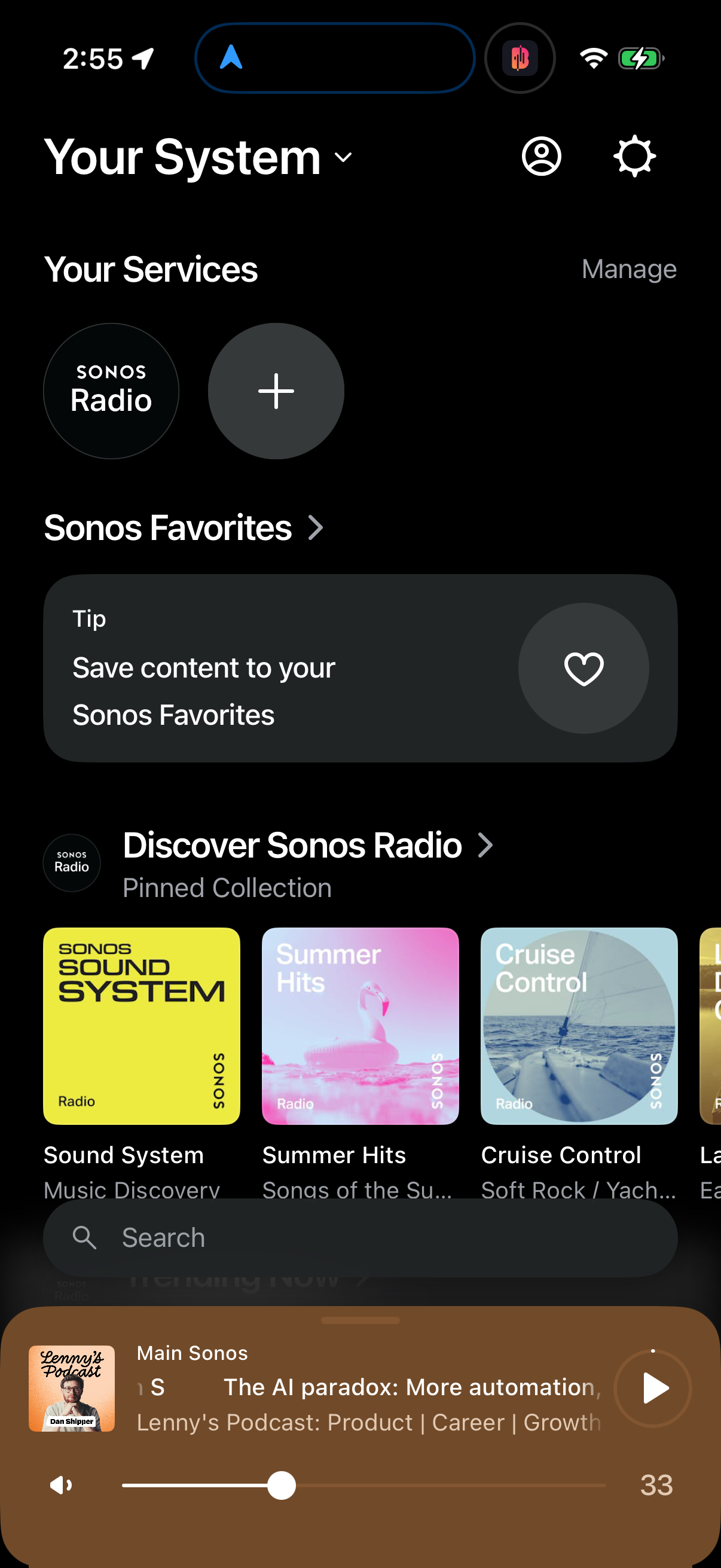
51.3% of 520 audited design systems ship a dark default versus 48.7% light [1] — effectively a coin flip. The split only becomes decision-useful once you cut by platform: mobile is 71% dark while web…
 Read page TLDR
Do mobile and web apps default to different themes?
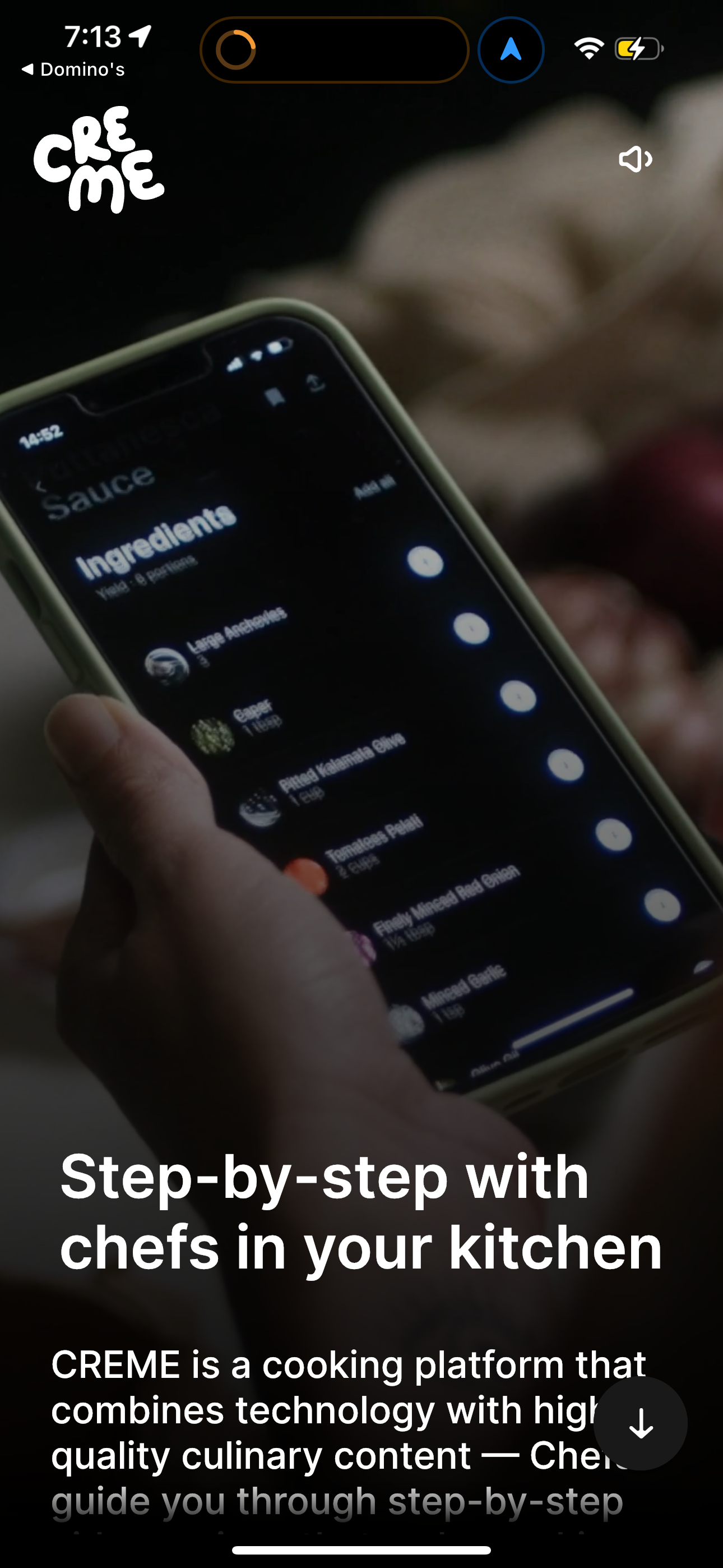
Yes, sharply. 71.0% of 259 audited mobile design systems default to dark, while 68.2% of 261 web design systems default to light [1]. This platform split is the single largest divergence in the whole…
 Read page TLDR
Which app categories default to dark mode and which default to light?
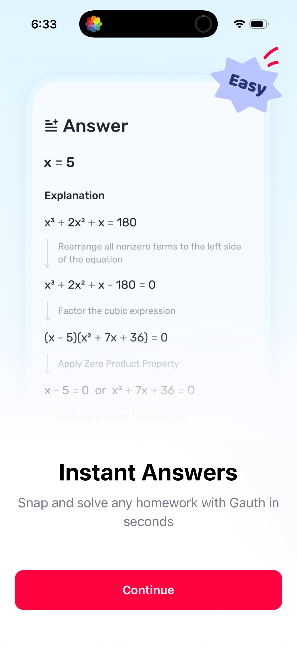
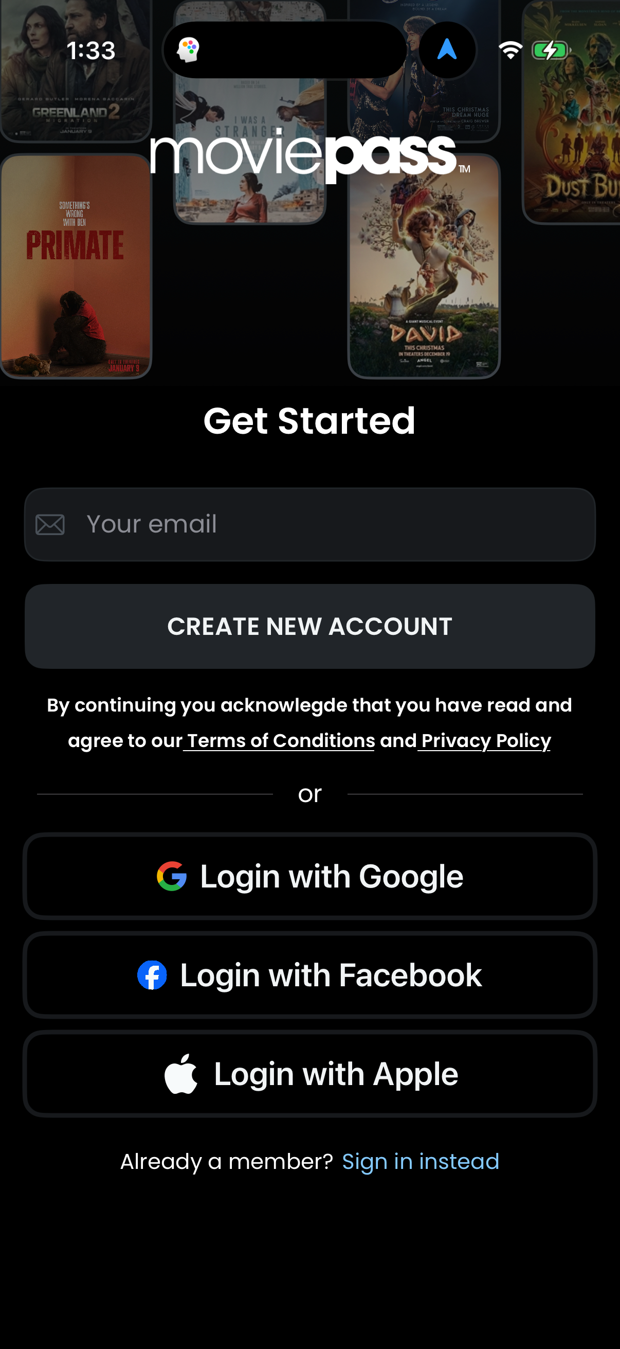
Dark defaults concentrate in Entertainment (38 of 42 systems, 90%), Music (19 of 24, 79%) and Developer Tools (13 of 18) [1]. Light dominates Food & Drink (33 of 40, 83%), Medical (17 of 19) and Life…
 Read page TLDR
What theme do finance and fintech apps launch with?
Finance is a near-even split: 22 of 42 audited Finance design systems default to light and 20 default to dark [1]. Unlike Entertainment (90% dark), there is no fintech consensus — theme is a brand de…
 Read page TLDR
What theme do health and fitness apps default to?
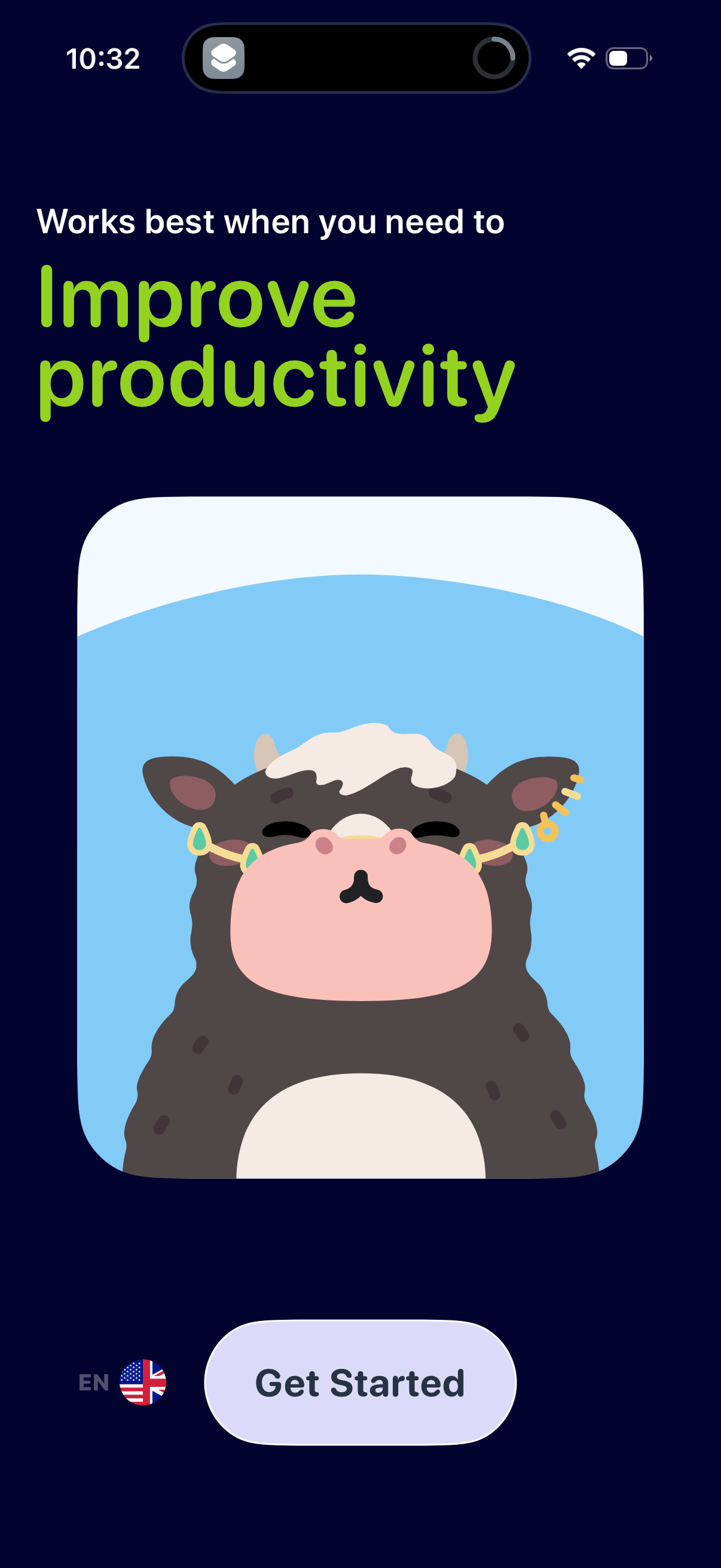
Health & Fitness is the largest single category in the benchmark (71 systems) and splits almost evenly: 39 dark to 32 light [1]. At 55% dark it leans slightly darker than the 51% overall census but n…
 Read page TLDR
What is the most common primary brand color in modern design systems?
Blue is the single most common primary brand hue: 34.1% of 519 audited design systems with a brand color use it [1]. Add neutral black/gray marks (18.9%) and just those two buckets cover 53% of all p…
 Read page TLDR
What primary brand colors dominate finance and entertainment design systems?
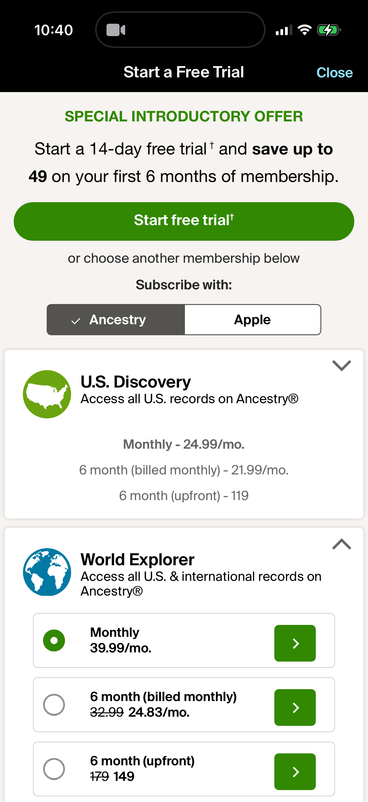
Blue leads every category, but the second color diverges: in Finance, green ties for second (17 blue, 9 neutral, 9 green of 42) — the money-green pattern [1]. In Entertainment, red jumps to second (1…
 Read page TLDR
Do most products use a system font or a custom typeface?
The platform system stack wins, but only just: 56.4% of 488 audited design systems with a primary font use a native stack (SF Pro, system-ui, Roboto, etc.) versus 43.6% on a custom/branded typeface […
 Read page TLDR
What base font size do modern products use for body text?
16px is the overwhelming default: 73.0% of 518 audited design systems set a 16px base body size [1]. The only meaningful runners-up are 17px (10.4%, the iOS body size) and 14px (7.9%) [1]. Anything b…
 Read page TLDR