
Your landing page’s weakest score is Trust.
How Intro ranks
Trust
62FairProof that the product is real, competent, and safe to try.
| Trust read | |
|---|---|
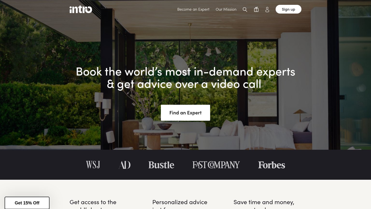
| Intro | Press logo bar: WSJ, AD, Bustle, Fast Company, Forbes |
| No visible trust signal identified. | |
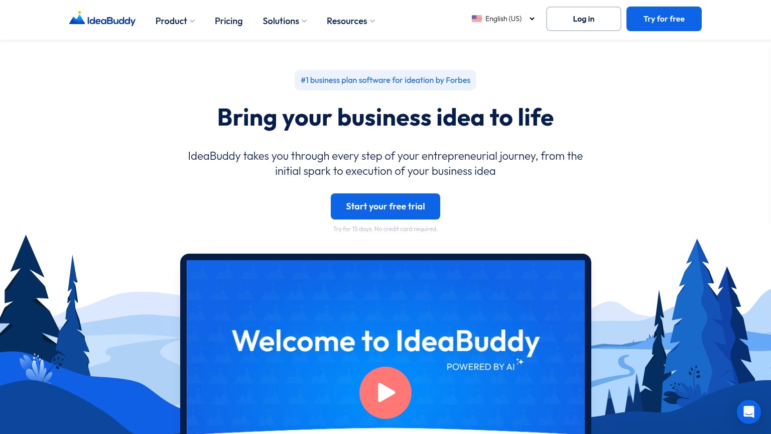
| "#1 business plan software for ideation by Forbes" badge above the headline | |
| Embedded survey demo UI: "Which logo do you prefer for a coffee brand?" with Option A/B vote results and "Collecting res | |
| implicit context Wynter may benefit from pre-existing familiarity among its target audience. | |
| "VERIFIED EXPERT — Kate Kendall, Founder and CEO of CloudPeeps. Created The Fetch." |
Mobile web
66FairThe phone experience as a first-class citizen.
 12
- Find an Expert button — Button sits boxed at roughly half the column width instead of a full-bleed, thumb-friendly bar.
- Four-icon header row — Search, gift, and account icons compete with Sign up; no hamburger consolidates them.
Value props
68FairTitle, subtitle, hero — do they sell the product's true value?
Intro’s headline
Book the world’s most in-demand experts & get advice over a video call
Working
Could improve
Information hierarchy
76FairDoes the design help or inhibit what the page is trying to say?
What works
What to improve
CTA
76FairCopy, size, verb, cost-feel — does the primary CTA earn the click?
How Intro compares
Recommended rewrites