
Your landing page’s weakest score is Trust.
How Workrise ranks
- 1.
BuildOps68
- 2.
Workrise61
- 3.
Kebra60
- 4.
BlueRecruit58
Trust
52FairProof that the product is real, competent, and safe to try.
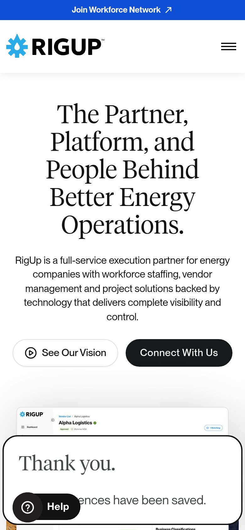
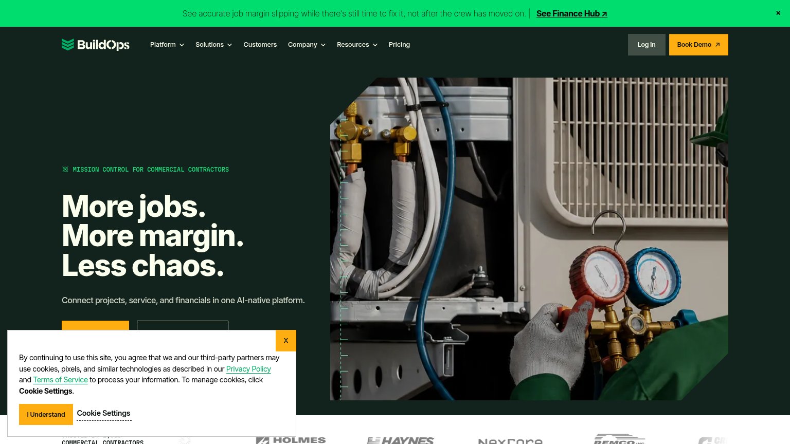
| Trust read | |
|---|---|
| Workrise | Vendor Management product screenshot showing "Alpha Logistics — Approved, Workrise MSA" record UI |
| "BACKED BY Y Combinator" badge above the headline | |
| Customer logo strip (Holmes, Haynes, NexCore, Remco) with a partial "TRUSTED BY... COMMERCIAL CONTRACTORS" count at the | |
| No visible trust signal identified. |
Mobile web
54FairThe phone experience as a first-class citizen.
1234- Thank Workrise modal — Orphaned 'preferences saved' confirmation stays open mid-page with no visible close control — pure dead friction.
- Oversized serif headline — Headline wraps into six tall lines, pushing the subhead and both CTAs out of the first viewport.
- Help chat bubble — Chat launcher overlaps the modal's corner, doubling the clutter blocking the scroll path.
- Subhead paragraph — Five lines of desktop-length copy add more scroll distance before the primary CTA appears.
Value props
64FairTitle, subtitle, hero — do they sell the product's true value?
Workrise’s headline
The Partner, Platform, and People Behind Better Energy Operations.
RigUp is a full-service execution partner for energy companies with workforce staffing, vendor management and project solutions backed by technology that delivers complete visibility and control.
Working
Could improve
Information hierarchy
68FairDoes the design help or inhibit what the page is trying to say?
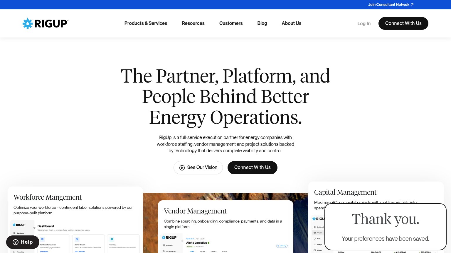
What works
What to improve
CTA
68FairCopy, size, verb, cost-feel — does the primary CTA earn the click?
How Workrise compares
Recommended rewrites