
Your landing page’s weakest score is CTA.
How Wordly ranks
74Growth scoreupdated
category scores
category scoresShowHide
CTA
68FairCopy, size, verb, cost-feel — does the primary CTA earn the click?
Problems
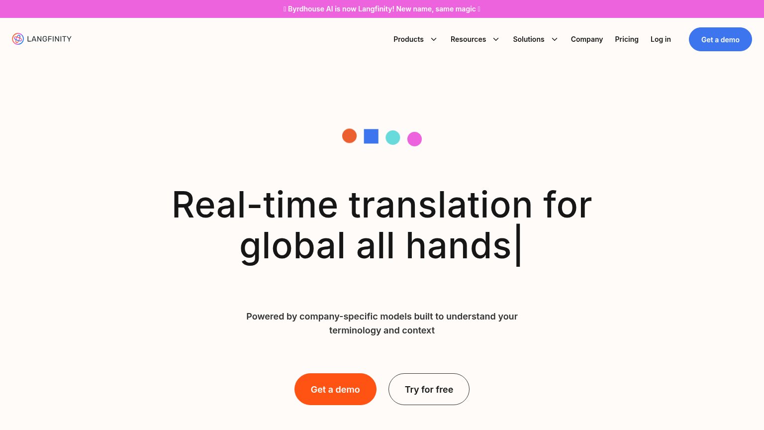
- demo ask feels costly, sales-gated
- competes with nav's 'Try it now'
- self-serve trial buried in nav
- mobile drops 'Try it now' entirely
Information hierarchy
72FairDoes the design help or inhibit what the page is trying to say?
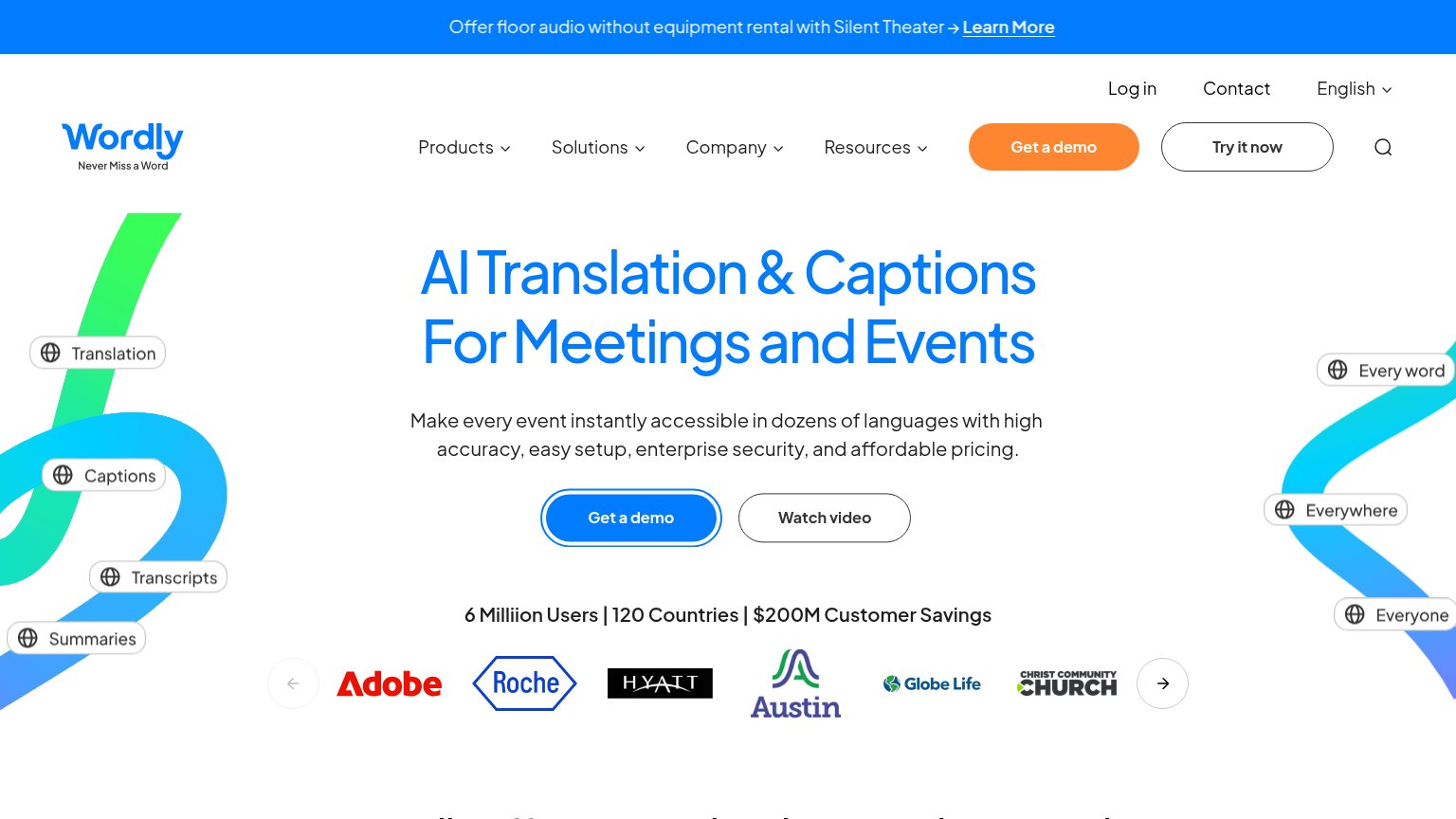
1234- Duplicate demo CTAs — Orange nav "Get a demo" competes with the blue hero "Get a demo" at equal weight, splitting the primary action.
- Try it now button — A third pill-styled CTA beside "Get a demo" in the nav gives three same-region buttons and no single obvious action.
- Promo announcement banner — Bright blue "Silent Theater → Learn More" bar is the first thing scanned and routes attention away before the value prop.
- Floating caption pills — Six "Translation/Captions/Transcripts" pills scattered along both edges add same-weight noise around the hero without a reading order.
Trust
76FairProof that the product is real, competent, and safe to try.
How Wordly compares
Trust read
Mobile web
76FairThe phone experience as a first-class citizen.
What works
What to improve
Value props
78FairTitle, subtitle, hero — do they sell the product's true value?
Wordly’s headline
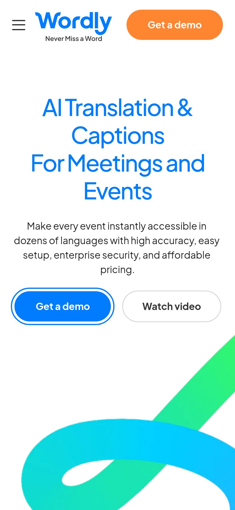
AI Translation & Captions For Meetings and Events
Make every event instantly accessible in dozens of languages with high accuracy, easy setup, enterprise security, and affordable pricing.
Working
Could improve