
Your landing page’s weakest score is Trust.
How Byrdhouse ranks
Trust
32PoorProof that the product is real, competent, and safe to try.
| Trust read | |
|---|---|
| Byrdhouse | No visible trust signal identified. |
| No visible trust signal identified. | |
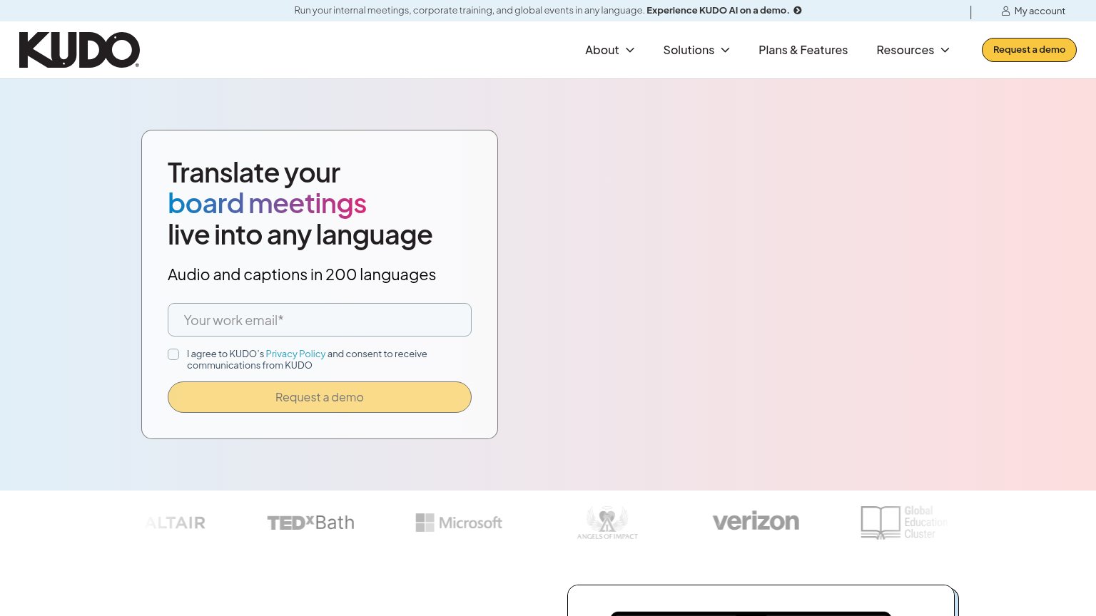
| Customer logo strip featuring Microsoft, Verizon, Altair, TEDxBath, Angels of Impact, and Global Education Cluster | |
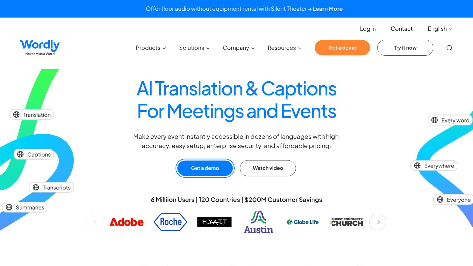
| Customer logo row (Adobe, Roche, Hyatt, Austin, Globe Life) under "6 Milliion Users | 120 Countries | $200M Customer Sav | |
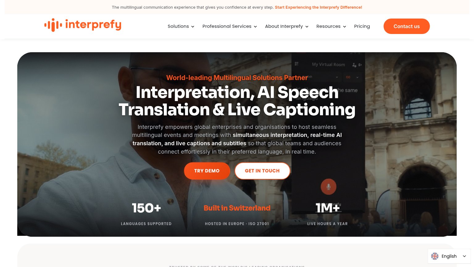
| "1M+ LIVE HOURS A YEAR" / "150+ LANGUAGES SUPPORTED" / "HOSTED IN EUROPE · ISO 27001" stat bar | |
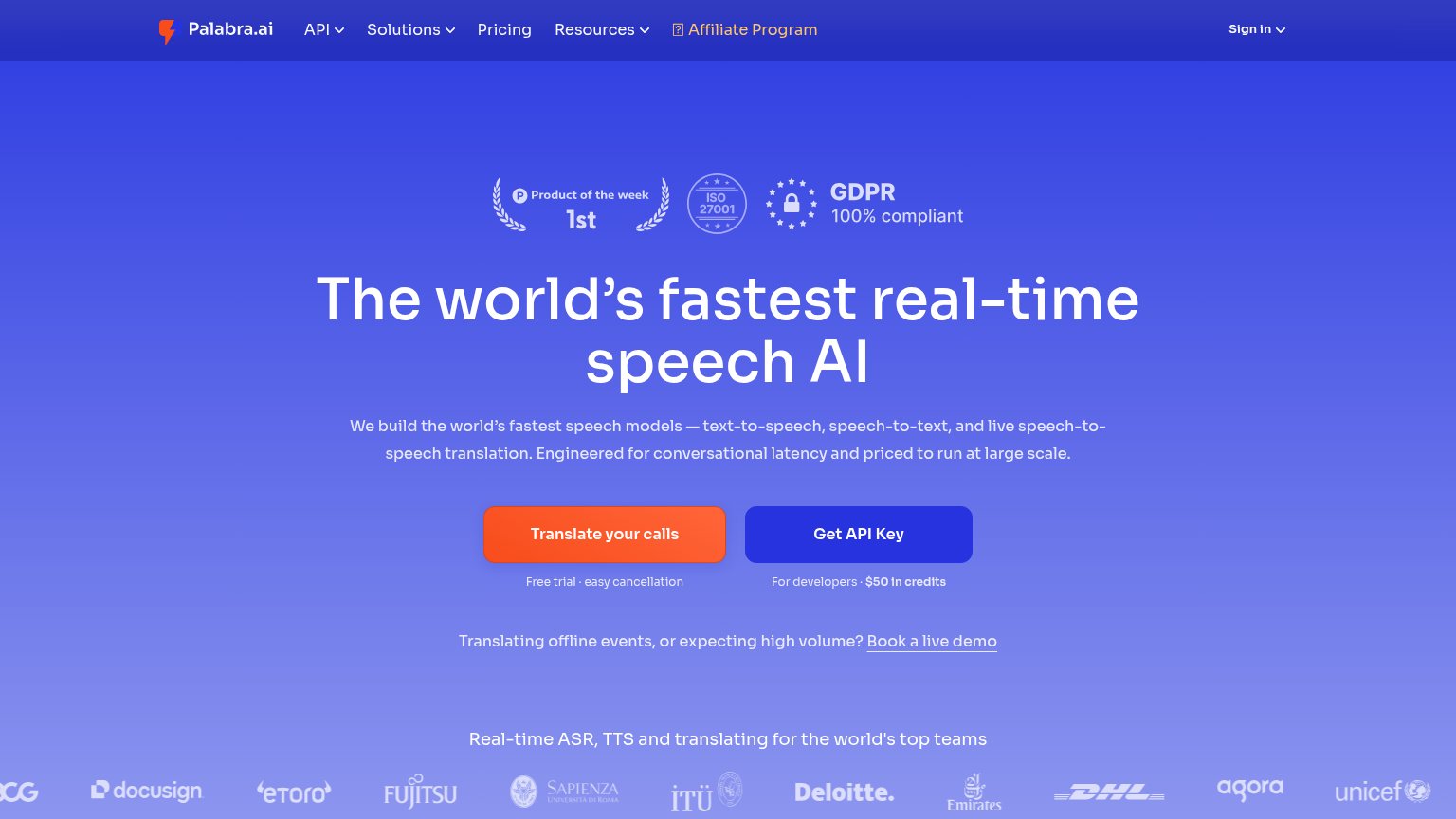
| Customer logo strip (Deloitte, DHL, Fujitsu, Docusign, eToro, UNICEF) under "Real-time ASR, TTS and translating for the |
Mobile web
62FairThe phone experience as a first-class citizen.
 123
- Truncated hero headline — Headline cuts off mid-word at "for g" — the animated text scales poorly and the value proposition never reads complete.
- Announcement banner glyphs — Emoji render as empty tofu boxes on both sides of the rebrand message, signaling an untested mobile build.
- Split CTA pair — "Get a demo" and "Try for free" share one row as half-width buttons instead of a full-bleed thumb-friendly primary.
Information hierarchy
68FairDoes the design help or inhibit what the page is trying to say?
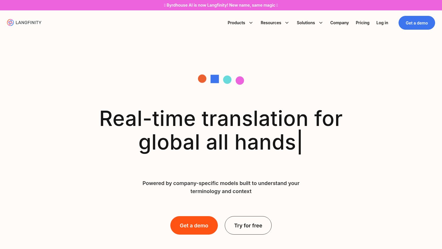
What works
What to improve
Value props
68FairTitle, subtitle, hero — do they sell the product's true value?
Byrdhouse’s headline
Real-time translation for global all hands
Powered by company-specific models built to understand your terminology and context
Working
Could improve
CTA
72FairCopy, size, verb, cost-feel — does the primary CTA earn the click?
How Byrdhouse compares
Recommended rewrites