
Your landing page’s weakest score is Trust.
How Kudo ranks
72Growth scoreupdated
category scores
category scoresShowHide
Trust
64FairProof that the product is real, competent, and safe to try.
| Trust read | |
|---|---|
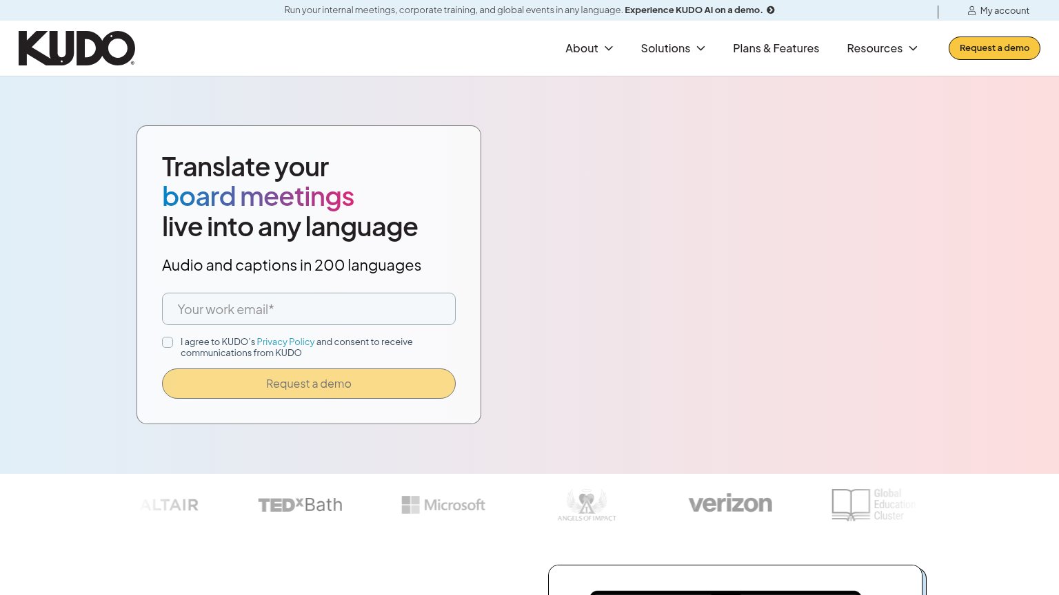
| Kudo | Customer logo strip featuring Microsoft, Verizon, Altair, TEDxBath, Angels of Impact, and Global Education Cluster |
| No visible trust signal identified. | |
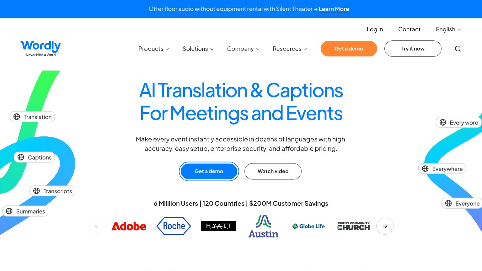
| Customer logo row (Adobe, Roche, Hyatt, Austin, Globe Life) under "6 Milliion Users | 120 Countries | $200M Customer Sav | |
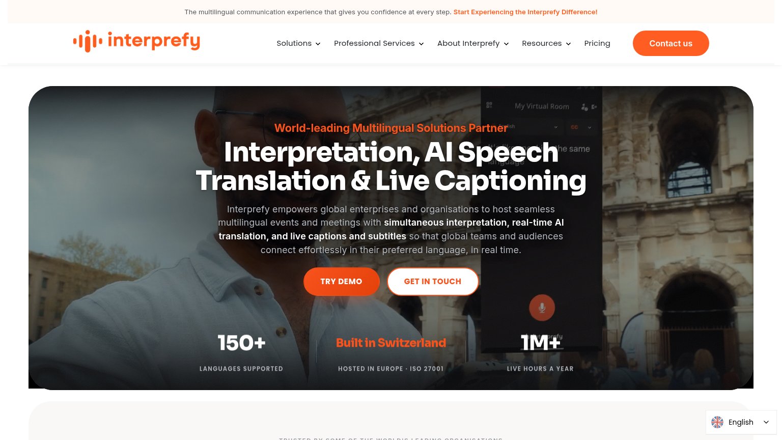
| "1M+ LIVE HOURS A YEAR" / "150+ LANGUAGES SUPPORTED" / "HOSTED IN EUROPE · ISO 27001" stat bar | |
| No visible trust signal identified. | |
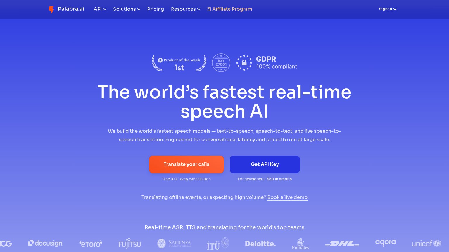
| Customer logo strip (Deloitte, DHL, Fujitsu, Docusign, eToro, UNICEF) under "Real-time ASR, TTS and translating for the |
Information hierarchy
68FairDoes the design help or inhibit what the page is trying to say?
1234- Duplicate demo CTAs — Header "Request a demo" button competes at equal weight with the form's identical CTA, splitting the fold's single action.
- Right-side hero visual — The gradient-only right half carries no product story; the fold's argument leans entirely on the small form card.
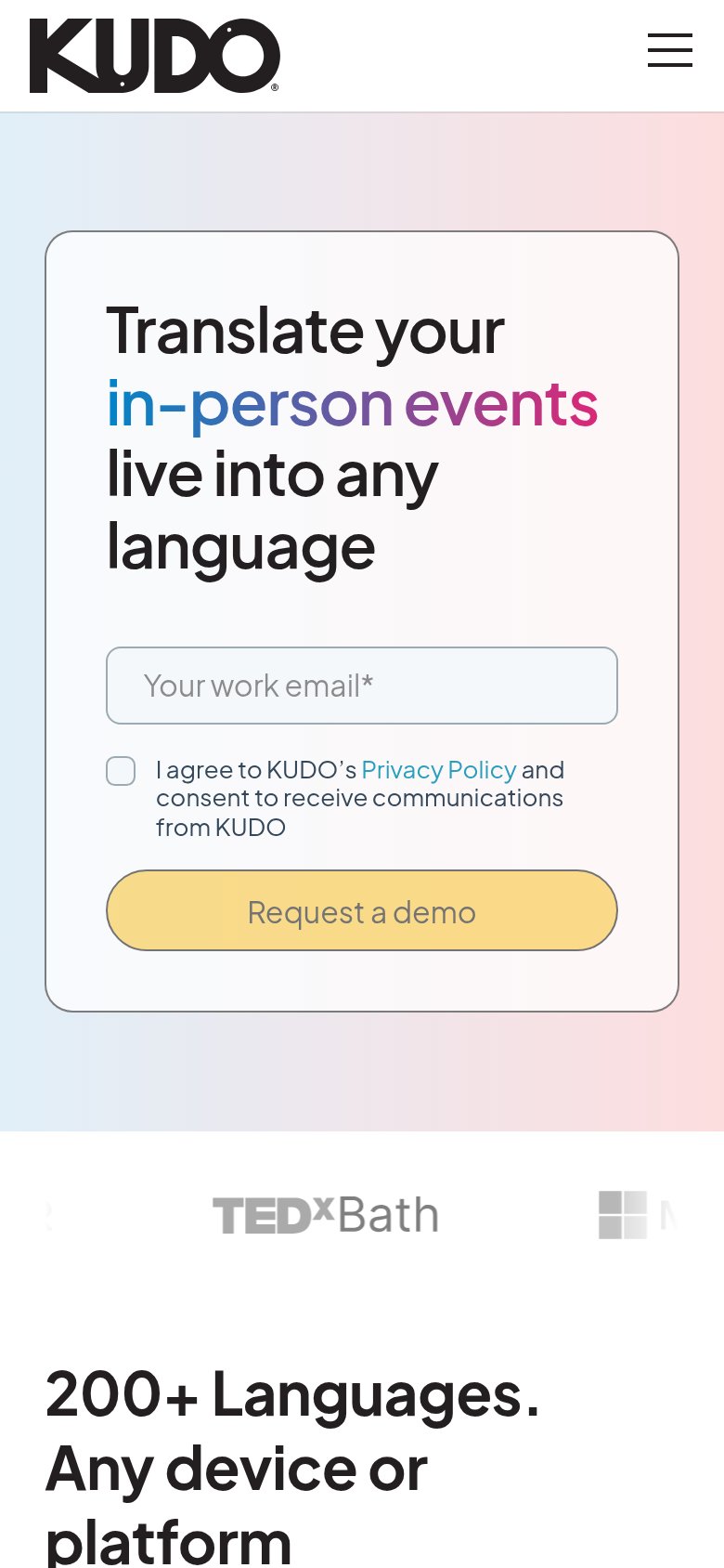
- Rotating headline keyword — "board meetings" cycles (mobile shows "in-person events"), so the core promise changes mid-read and blurs positioning.
- Top announcement banner — "Experience KUDO AI on a demo" link adds a third demo path above the nav, one more exit before the form.
CTA
68FairCopy, size, verb, cost-feel — does the primary CTA earn the click?
How Kudo compares
Recommended rewrites
Value props
78FairTitle, subtitle, hero — do they sell the product's true value?
Kudo’s headline
Translate your board meetings live into any language
Audio and captions in 200 languages
Working
Could improve
Mobile web
83StrongThe phone experience as a first-class citizen.
What works
What to improve