
Your landing page’s weakest score is Value props.
How Western Digital My Cloud Home ranks
- 1.
Umbrel67
- 2.
Synology BeeStation61
- 3.
Oki60
- 4.
Western Digital My Cloud Home56
- 5.
UGREEN NASync48
56Growth scoreupdated
category scores
category scoresShowHide
Value props
42PoorTitle, subtitle, hero — do they sell the product's true value?
Western Digital My Cloud Home’s headline vague
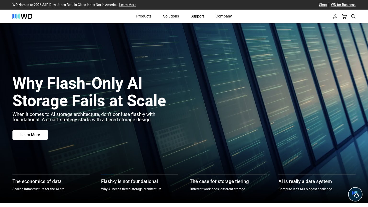
Why Flash-Only AI Storage Fails at Scale
When it comes to AI storage architecture, don't confuse flash-y with foundational. A smart strategy starts with a tiered storage design.
Working
- Takes a clear contrarian stance
- Targets a real enterprise pain point
- Wordplay (flash-y) is memorable
Could improve
- Never mentions My Cloud Home
- No consumer outcome or benefit
- Hero image shows racks, not product
Information hierarchy
58FairDoes the design help or inhibit what the page is trying to say?
 1234
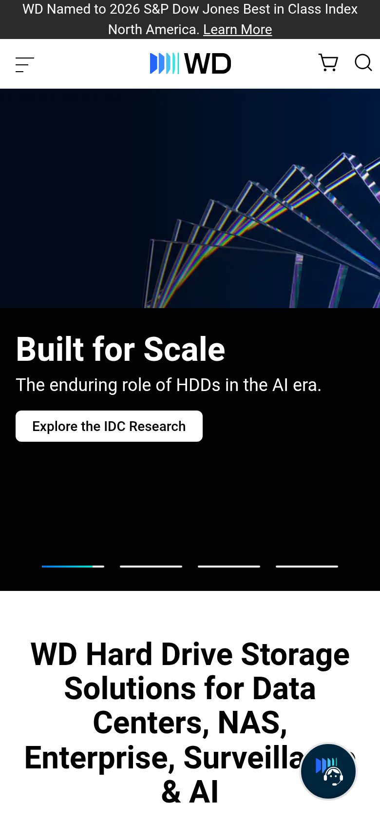
- Hero carousel headline — Rotating slides mean the value prop changes per visit — mobile shows a different message entirely, so no single argument lands.
- Learn More button — Small, generic white button with a vague label; it neither names the payoff nor dominates the scan path.
- Four teaser cards — Four equal-weight carousel tabs compete with the headline and CTA, splitting attention across four messages at once.
- Top utility banner — S&P index announcement with its own Learn More link plus Shop and WD for Business add three exits before the hero.
CTA
58FairCopy, size, verb, cost-feel — does the primary CTA earn the click?
How Western Digital My Cloud Home compares
Recommended rewrites
Trust
58FairProof that the product is real, competent, and safe to try.
How Western Digital My Cloud Home compares
Trust read
Mobile web
62FairThe phone experience as a first-class citizen.
What works
What to improve