
Your landing page’s weakest score is Information hierarchy.
How UGREEN NASync ranks
48Growth scoreupdated
category scores
category scoresShowHide
Information hierarchy
42PoorDoes the design help or inhibit what the page is trying to say?
 123
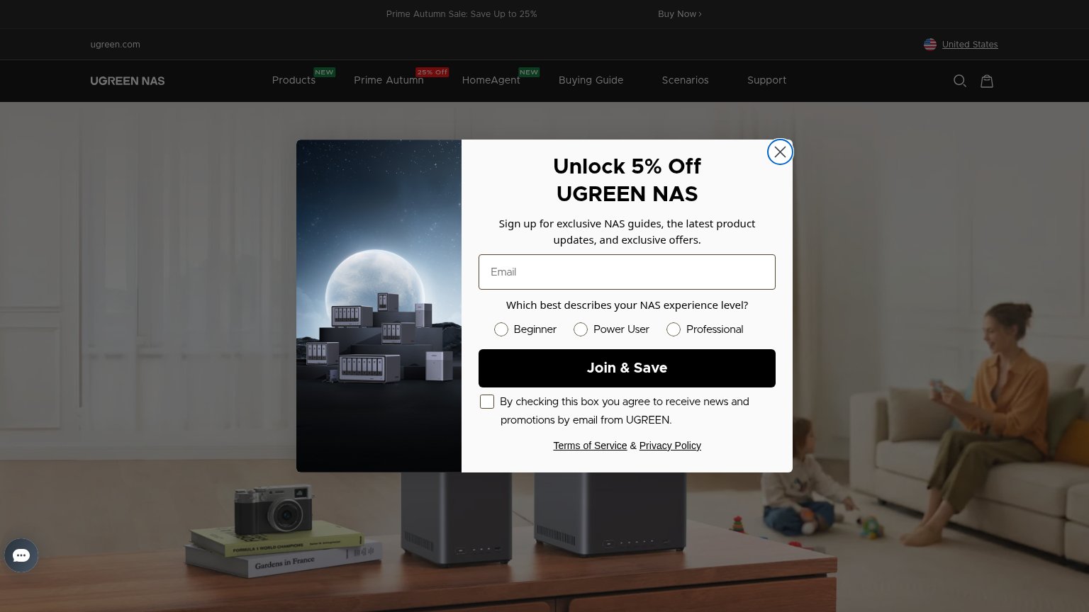
- Email popup modal — Full-screen newsletter modal hijacks the fold before the hero headline or any product CTA is seen.
- Top nav row — Seven equal-weight nav items plus search and cart leak attention with no primary CTA visible to anchor them.
- Sale banner Buy Now — The only visible purchase CTA is a small low-contrast text link buried in the promo strip, easy to miss.
Value props
48PoorTitle, subtitle, hero — do they sell the product's true value?
UGREEN NASync’s headline undersells
Your Home Data Vault
Working
- Ownership/privacy angle in 'Data Vault'
- Short, memorable four-word headline
- No.1 brand claim adds social proof
Could improve
- Popup buries the hero on both viewports
- No subhead, numbers, or named outcome
- Hero photo decorates, doesn't demonstrate
Trust
48PoorProof that the product is real, competent, and safe to try.
How UGREEN NASync compares
Trust read
CTA
52FairCopy, size, verb, cost-feel — does the primary CTA earn the click?
How UGREEN NASync compares
Recommended rewrites
Mobile web
52FairThe phone experience as a first-class citizen.
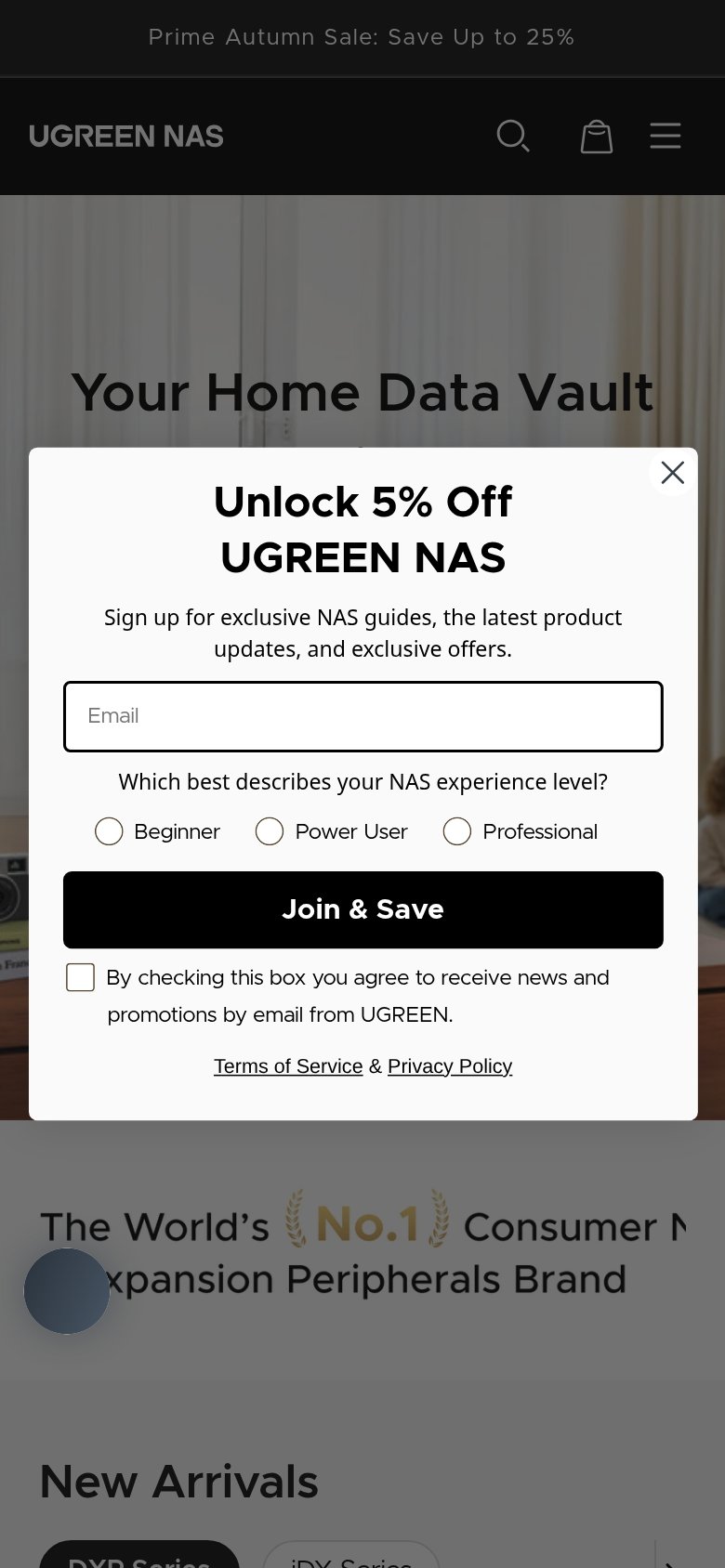
What works
What to improve