
Your landing page’s weakest score is Value props.
How Claim Health ranks
72Growth scoreupdated
category scores
category scoresShowHide
Value props
68FairTitle, subtitle, hero — do they sell the product's true value?
Claim Health’s headline undersells
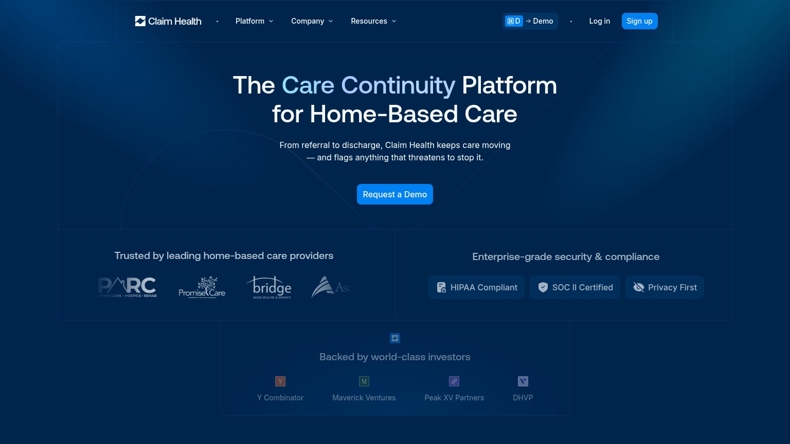
The Care Continuity Platform for Home-Based Care
From referral to discharge, Claim Health keeps care moving — and flags anything that threatens to stop it.
Working
- Subhead names workflow span: referral to discharge
- Flags-risk line taps real anxiety in home care
- Trust badges and provider logos back the claim
Could improve
- Headline is category jargon, not an outcome
- No numbers or quantified proof anywhere
- Hero is empty gradient, shows no product
Information hierarchy
72FairDoes the design help or inhibit what the page is trying to say?
 1234
- Sign up button — Styled identically to the hero's 'Request a Demo' CTA in the same blue, splitting the fold's one action into two.
- Investor logos strip — 'Backed by world-class investors' badges render as tiny illegible icons, adding a fourth same-weight block to the fold.
- PARC logo cropped — First trust logo is clipped at the container edge and the fourth logo is cut off mid-word, undermining the trust row.
- Demo keyboard shortcut — The '⌘D → Demo' hint duplicates the hero CTA in the nav and reads as UI clutter to first-time visitors.
Trust
72FairProof that the product is real, competent, and safe to try.
How Claim Health compares
Trust read
Mobile web
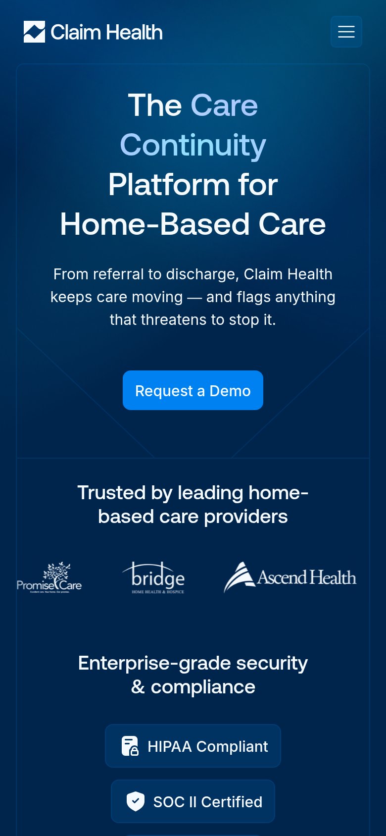
72FairThe phone experience as a first-class citizen.
What works
What to improve
CTA
76FairCopy, size, verb, cost-feel — does the primary CTA earn the click?
How Claim Health compares
Recommended rewrites