
Your landing page’s weakest score is Mobile web.
How ComfyUI ranks
65Growth scoreupdated
category scores
category scoresShowHide
Mobile web
52FairThe phone experience as a first-class citizen.
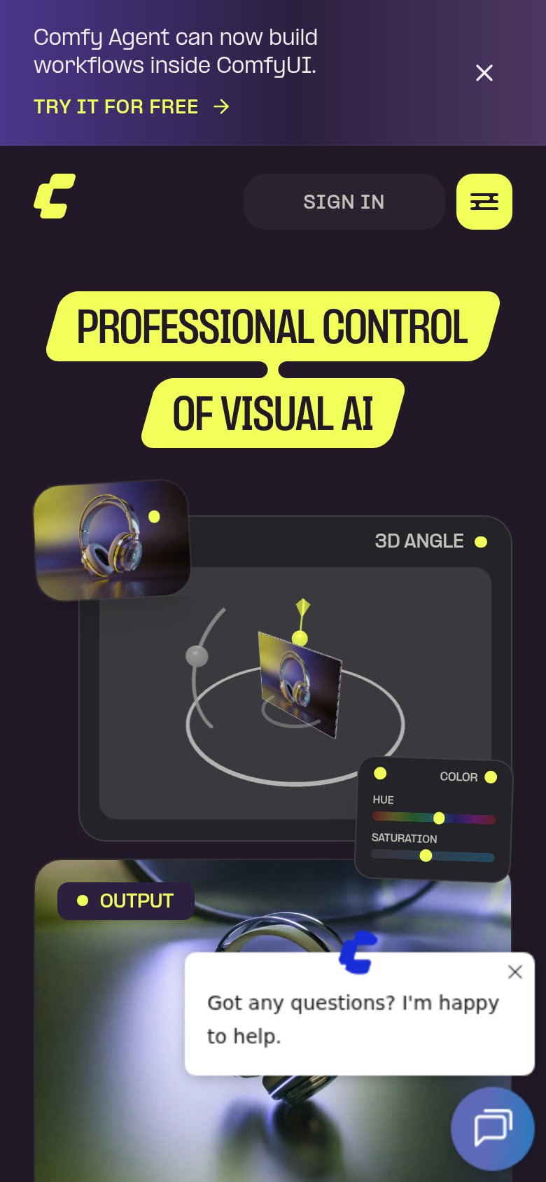 123
- Sign In pill — Only visible action is low-intent Sign In; no Try Free CTA appears anywhere in the mobile fold.
- Chat helper bubble — Auto-opened 'Got any questions?' bubble covers the OUTPUT demo — a dead blocker with no conversion CTA.
- Comfy Agent banner — Three-line promo banner consumes the top of the viewport before the brand or headline appears.
Information hierarchy
64FairDoes the design help or inhibit what the page is trying to say?
 1234
- Triple header CTA cluster — TRY FREE, DESKTOP, and SIGN IN sit at equal weight, splitting the primary action three ways before the banner and hero CTAs pile on.
- Banner TRY IT FREE — The announcement banner adds a fourth free-trial CTA above the nav, competing with TRY FREE for the same click.
- GET STARTED FOR FREE — Outlined low-contrast styling makes the hero CTA weaker than the header buttons it duplicates.
- GitHub star badge — A 143K outbound GitHub link sits beside the CTAs, leaking high-intent attention off-site.
Trust
66FairProof that the product is real, competent, and safe to try.
How ComfyUI compares
Trust read
Value props
68FairTitle, subtitle, hero — do they sell the product's true value?
ComfyUI’s headline
PROFESSIONAL CONTROL OF VISUAL AI
Working
Could improve
CTA
76FairCopy, size, verb, cost-feel — does the primary CTA earn the click?
How ComfyUI compares
Recommended rewrites