
Your landing page’s weakest score is Trust.
How Voltus ranks
70Growth scoreupdated
category scores
category scoresShowHide
Trust
52FairProof that the product is real, competent, and safe to try.
| Trust read | |
|---|---|
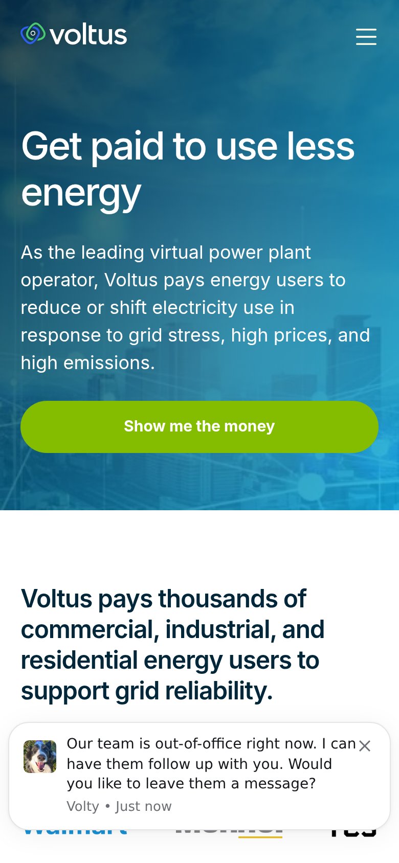
| Voltus | "Voltus pays thousands of commercial, industrial, and residential energy users to support grid reliability." with a part |
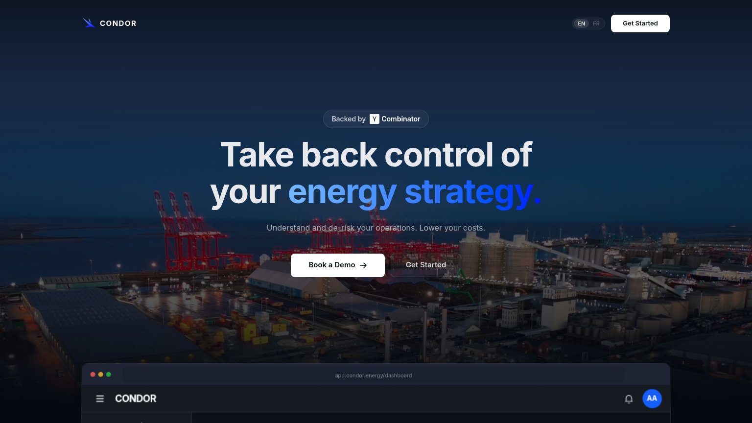
| "Backed by Y Combinator" badge above the headline | |
| "Backed by leading global investors" section with SAMSUNG logo (mobile) | |
| implicit context Enel X may benefit from pre-existing familiarity among its target audience. | |
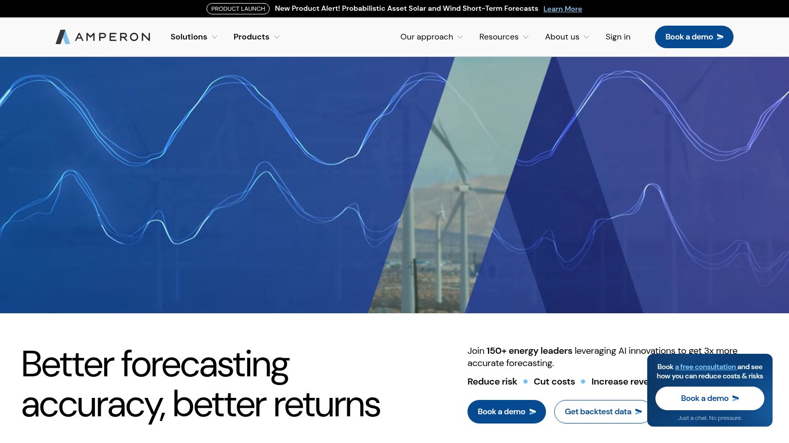
| "Join 150+ energy leaders leveraging AI innovations to get 3x more accurate forecasting" |
Information hierarchy
62FairDoes the design help or inhibit what the page is trying to say?
 1234
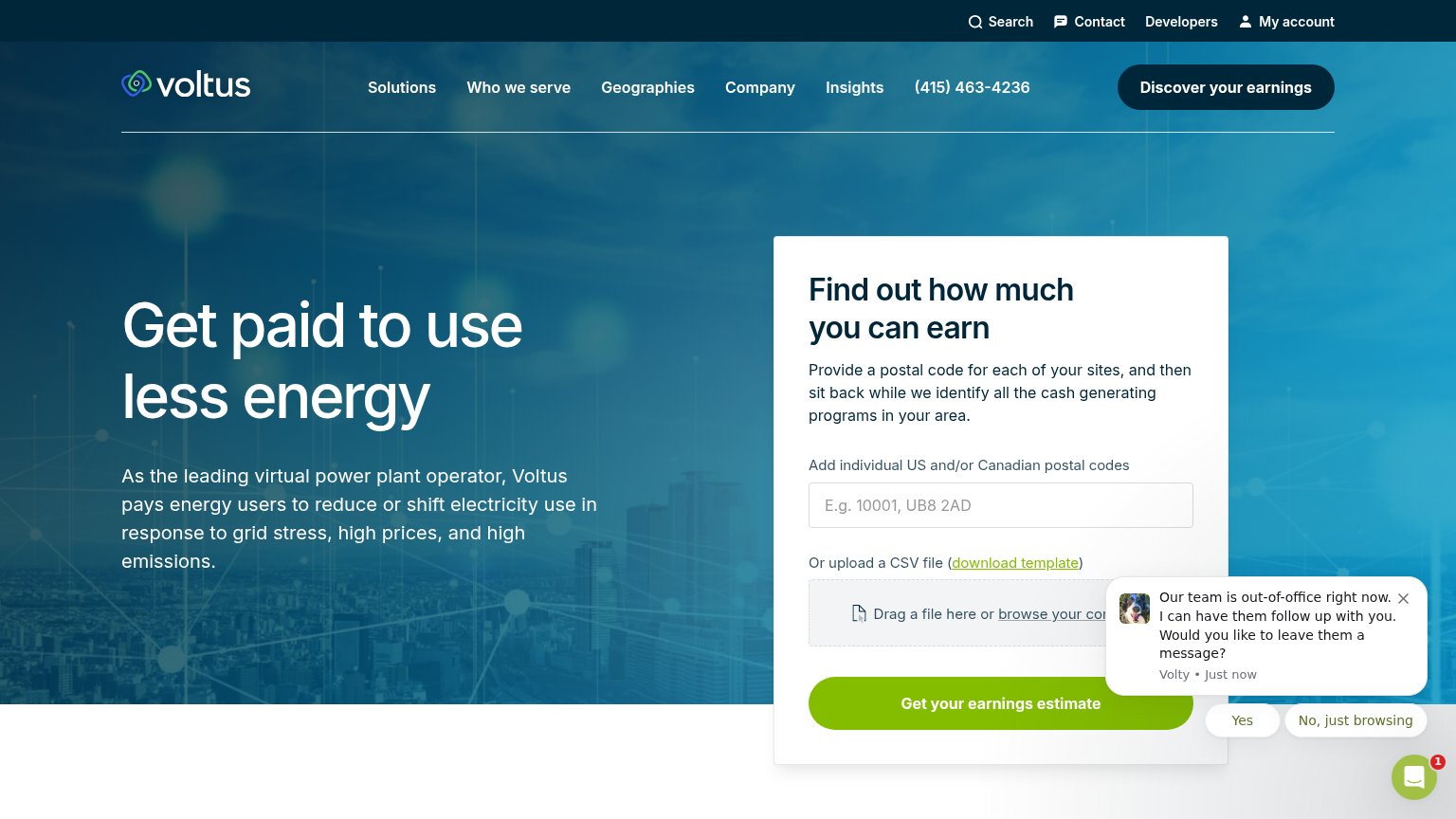
- Chat popup over form — The 'Volty' out-of-office chat bubble covers the CSV upload zone and Yes/No buttons crowd the green CTA, hijacking attention at the exact moment of conversion.
- Double top navigation — Two stacked nav bars (Search/Contact/Developers/My account plus six main menu items and a phone number) put a dozen exit paths above the headline.
- Duplicate dark CTA — 'Discover Voltus's earnings' in the nav is styled at near-equal weight to the form's 'Get Voltus's earnings estimate,' splitting the primary action into two.
- File upload in fold — The CSV drag-and-drop option adds a second input mode to the hero form, doubling the decision load before the first CTA click.
CTA
76FairCopy, size, verb, cost-feel — does the primary CTA earn the click?
How Voltus compares
Recommended rewrites
Mobile web
76FairThe phone experience as a first-class citizen.
What works
What to improve
Value props
82StrongTitle, subtitle, hero — do they sell the product's true value?
Voltus’s headline
Get paid to use less energy
As the leading virtual power plant operator, Voltus pays energy users to reduce or shift electricity use in response to grid stress, high prices, and high emissions.
Working
Could improve