
Your landing page’s weakest score is Mobile web.
How Amperon ranks
60Growth scoreupdated
category scores
category scoresShowHide
Mobile web
44PoorThe phone experience as a first-class citizen.
 12
- Three-line promo banner — Announcement wraps into three lines plus a pill badge, eating the top of the screen before the brand appears.
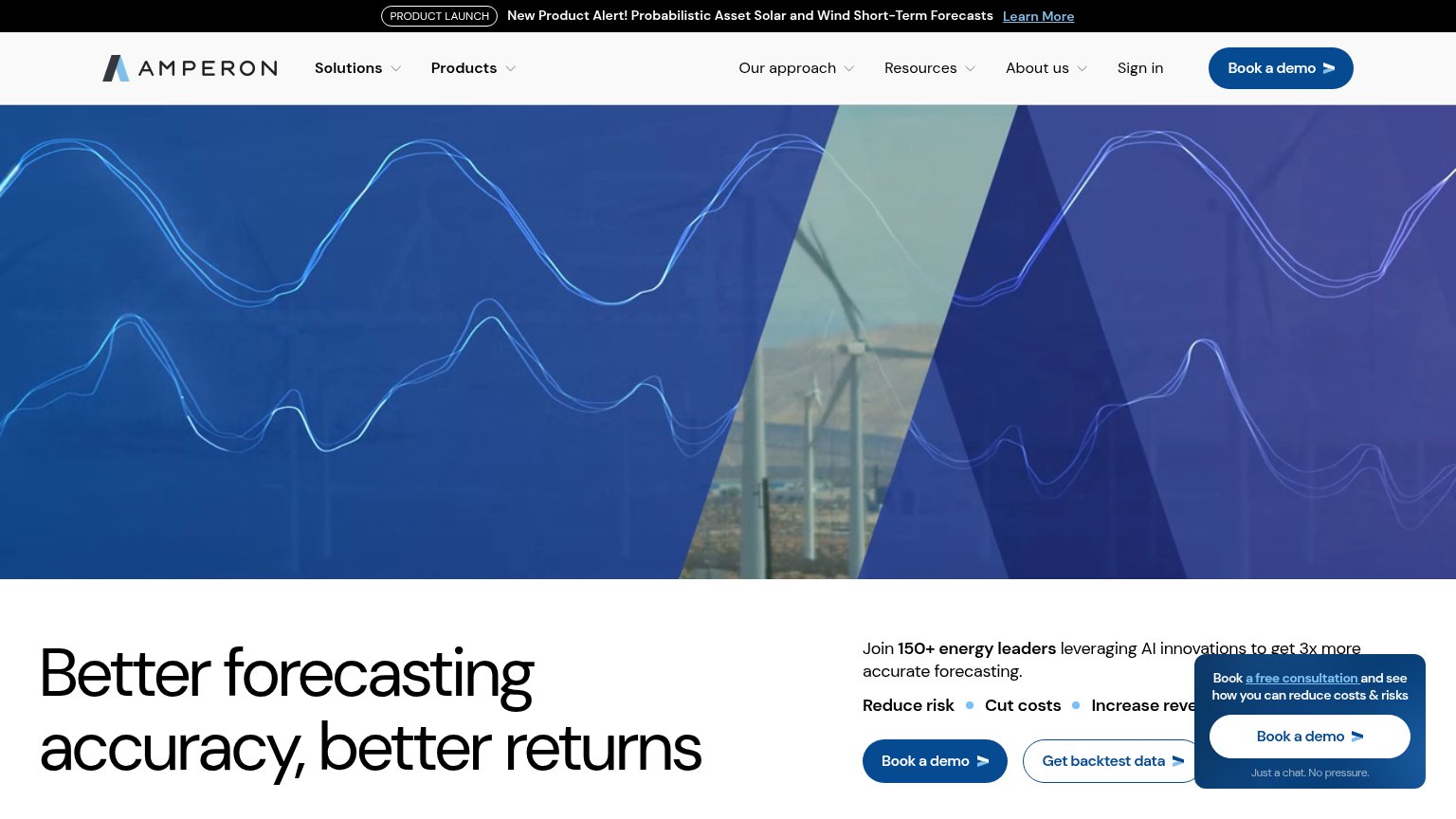
- Clipped hero headline — "Better forecasting accuracy, better returns" is cut at the fold edge with no CTA anywhere in the viewport.
Information hierarchy
58FairDoes the design help or inhibit what the page is trying to say?
 123
- Floating consultation card — Fourth 'Book a demo' instance overlaps the hero copy and competes with the in-body primary CTA.
- Get backtest data button — Styled at near-equal weight beside 'Book a demo', splitting the click decision.
- Headline cut off — 'Better forecasting accuracy, better returns' clips at the fold edge, arriving after the visual instead of with it.
Trust
58FairProof that the product is real, competent, and safe to try.
How Amperon compares
Trust read
CTA
64FairCopy, size, verb, cost-feel — does the primary CTA earn the click?
How Amperon compares
Recommended rewrites
Value props
76FairTitle, subtitle, hero — do they sell the product's true value?
Amperon’s headline
Better forecasting accuracy, better returns
Join 150+ energy leaders leveraging AI innovations to get 3x more accurate forecasting.
Working
Could improve