
Your landing page’s weakest score is Trust.
How Vital ranks
Trust
56FairProof that the product is real, competent, and safe to try.
| Trust read | |
|---|---|
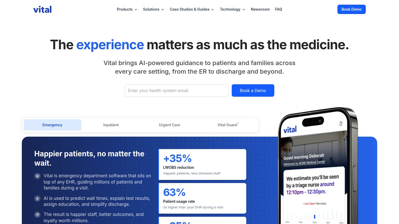
| Vital | Product UI on phone mockup: "We estimate you'll be seen by a triage nurse around 12:10pm - 12:30pm" with live wait-time |
| "BACKED BY Y Combinator" badge | |
| Banner: "Commure Raises $70M at $7B Valuation to Transform Healthcare Operations Using AI" | |
| "TRUSTED BY LEADING HEALTH SYSTEMS" logo strip at the bottom of the desktop fold | |
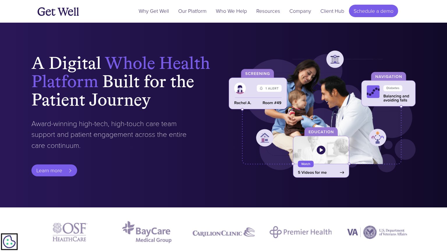
| Customer logo bar: OSF HealthCare, BayCare Medical Group, Carilion Clinic, Premier Health, U.S. Department of Veterans A | |
| AI Agent chat demo showing a patient intake conversation ("Hi, my PCP sent me over for a GI consult. Can you help with t |
CTA
72FairCopy, size, verb, cost-feel — does the primary CTA earn the click?
Problems
- 'Book' click feels like a sales commit
- email gate before the button adds friction
- nav says 'Book Demo', hero 'Book a Demo'
Value props
76FairTitle, subtitle, hero — do they sell the product's true value?
Vital’s headline
The experience matters as much as the medicine.
Vital brings AI-powered guidance to patients and families across every care setting, from the ER to discharge and beyond.
Working
Could improve
Information hierarchy
78FairDoes the design help or inhibit what the page is trying to say?
What works
What to improve
Mobile web
85StrongThe phone experience as a first-class citizen.
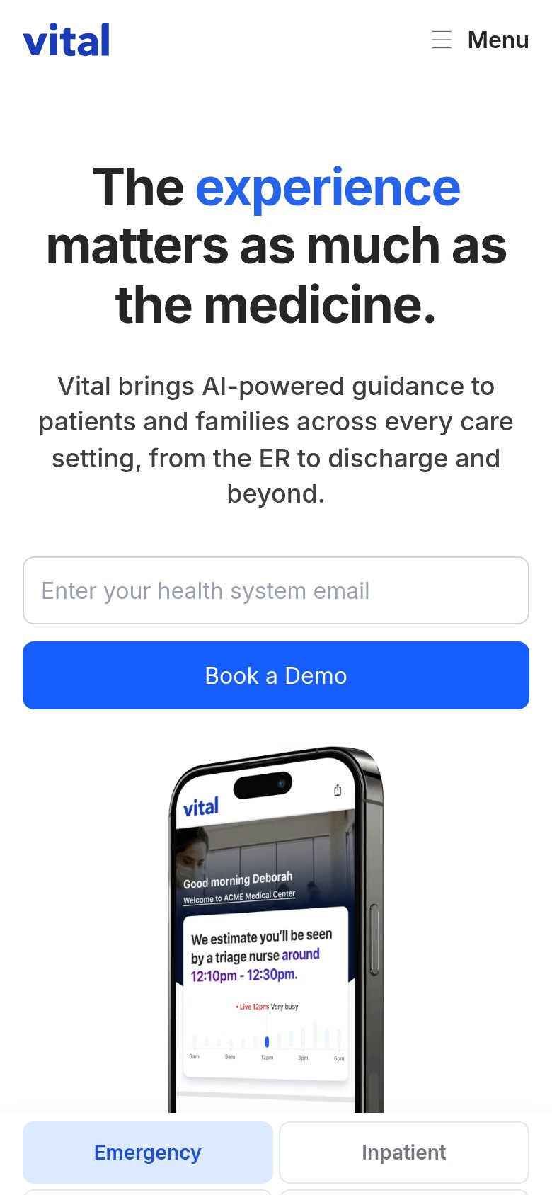
What works
What to improve