
Your landing page’s weakest score is Mobile web.
How Memora Health ranks
Mobile web
42PoorThe phone experience as a first-class citizen.
 1234
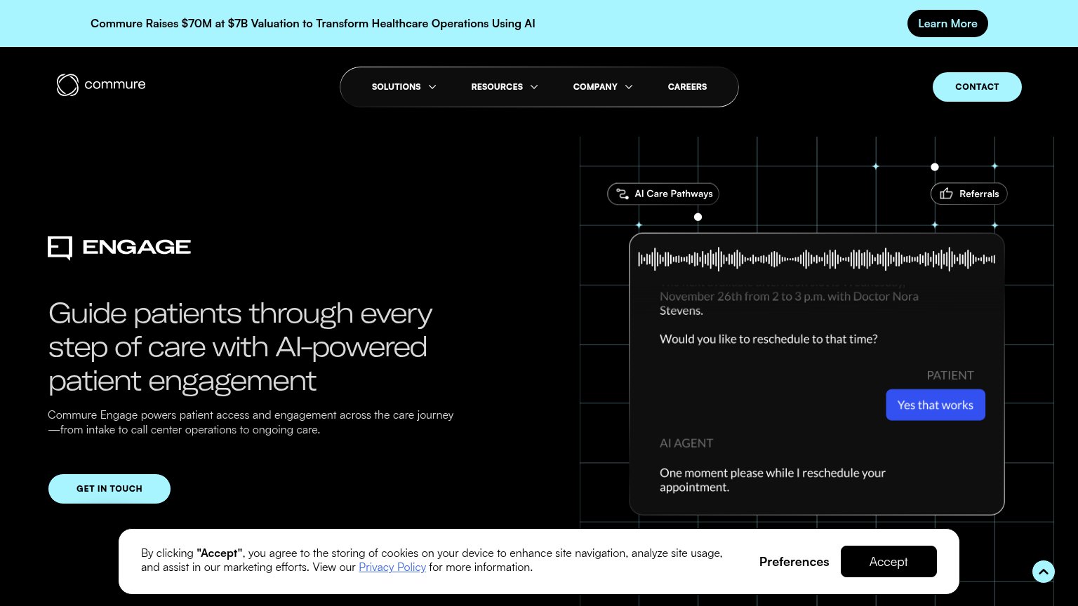
- Cookie consent banner — Dead blocker covers the bottom half of the fold with a giant 'Accept' button doing zero conversion work.
- Cut-off headline text — 'Guide patients through every...' clips at the fold edge and the 'GET IN TOUCH' CTA is pushed entirely below the viewport.
- Promo announcement banner — Two-line funding banner plus 'Learn More' button eats roughly the top 15% of the fold before the brand appears.
- Oversized hero animation — The AI-agent chat graphic consumes most of the viewport, delaying the value statement and CTA far down the page.
Trust
52FairProof that the product is real, competent, and safe to try.
| Trust read | |
|---|---|
| Memora Health | Banner: "Commure Raises $70M at $7B Valuation to Transform Healthcare Operations Using AI" |
| "BACKED BY Y Combinator" badge | |
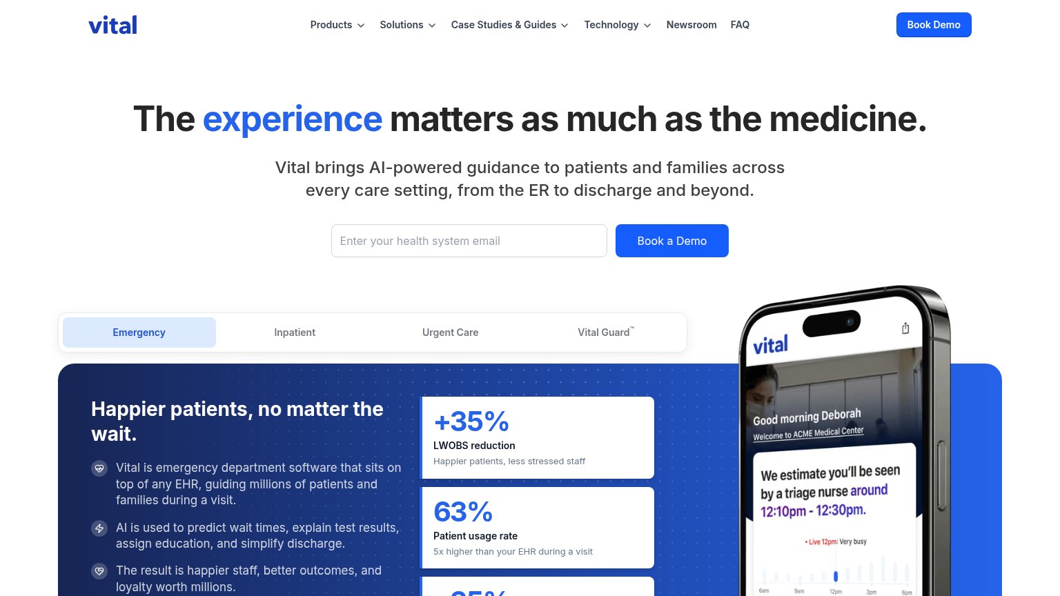
| Product UI on phone mockup: "We estimate you'll be seen by a triage nurse around 12:10pm - 12:30pm" with live wait-time | |
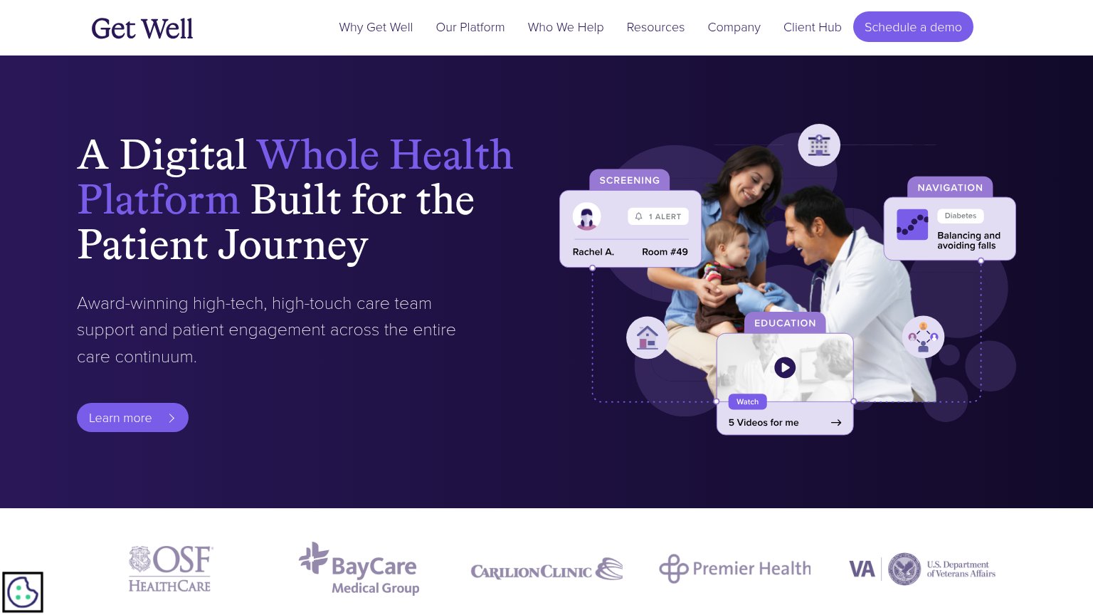
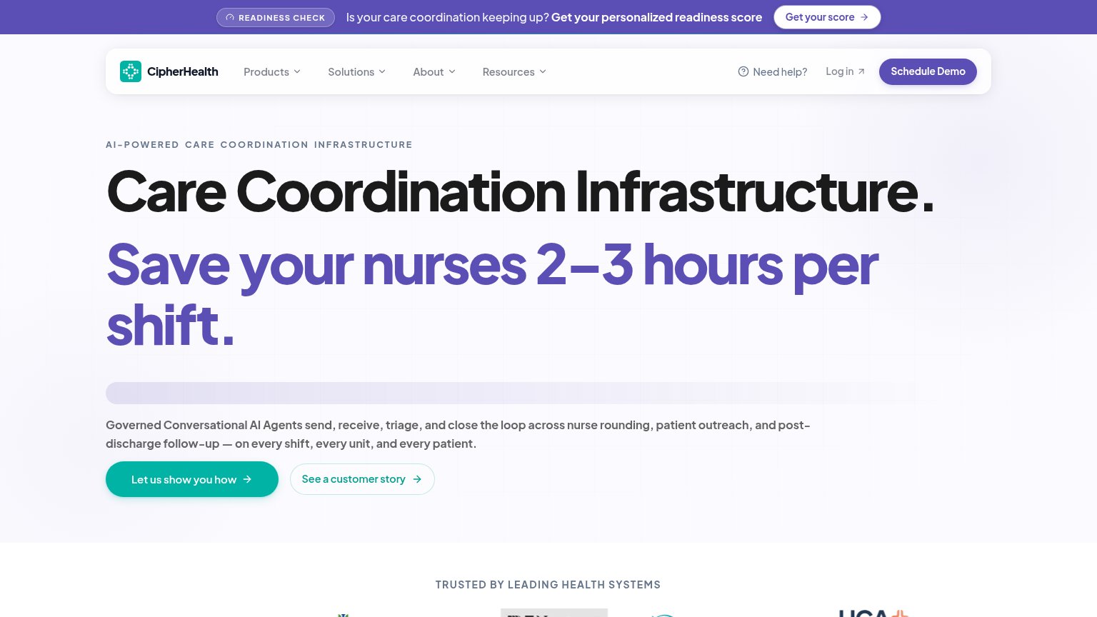
| "TRUSTED BY LEADING HEALTH SYSTEMS" logo strip at the bottom of the desktop fold | |
| Customer logo bar: OSF HealthCare, BayCare Medical Group, Carilion Clinic, Premier Health, U.S. Department of Veterans A | |
| AI Agent chat demo showing a patient intake conversation ("Hi, my PCP sent me over for a GI consult. Can you help with t |
CTA
58FairCopy, size, verb, cost-feel — does the primary CTA earn the click?
How Memora Health compares
Recommended rewrites
Information hierarchy
62FairDoes the design help or inhibit what the page is trying to say?
What works
What to improve
Value props
68FairTitle, subtitle, hero — do they sell the product's true value?
Memora Health’s headline
Guide patients through every step of care with AI-powered patient engagement
Commure Engage powers patient access and engagement across the care journey—from intake to call center operations to ongoing care.
Working
Could improve