
Your landing page’s weakest score is CTA.
How Vantel ranks
CTA
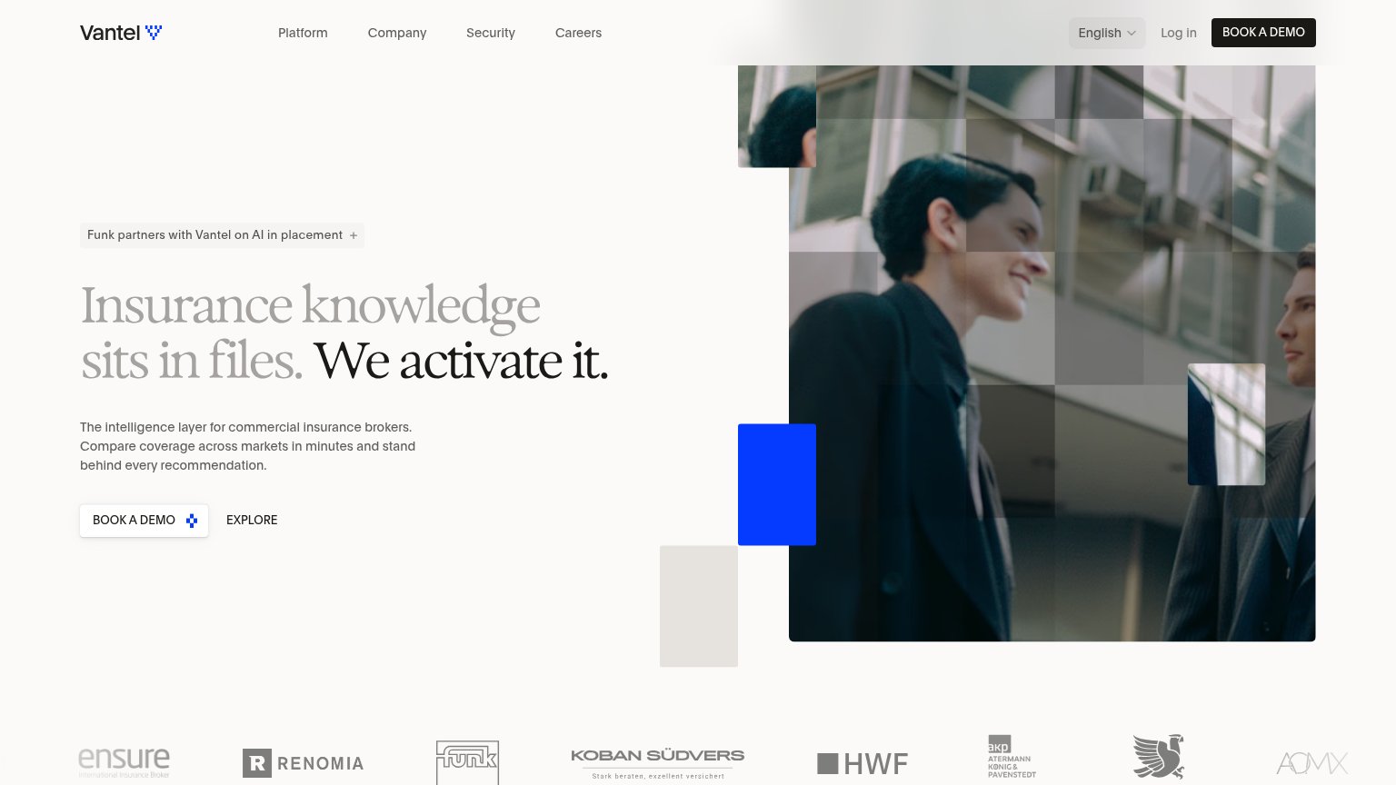
64FairCopy, size, verb, cost-feel — does the primary CTA earn the click?
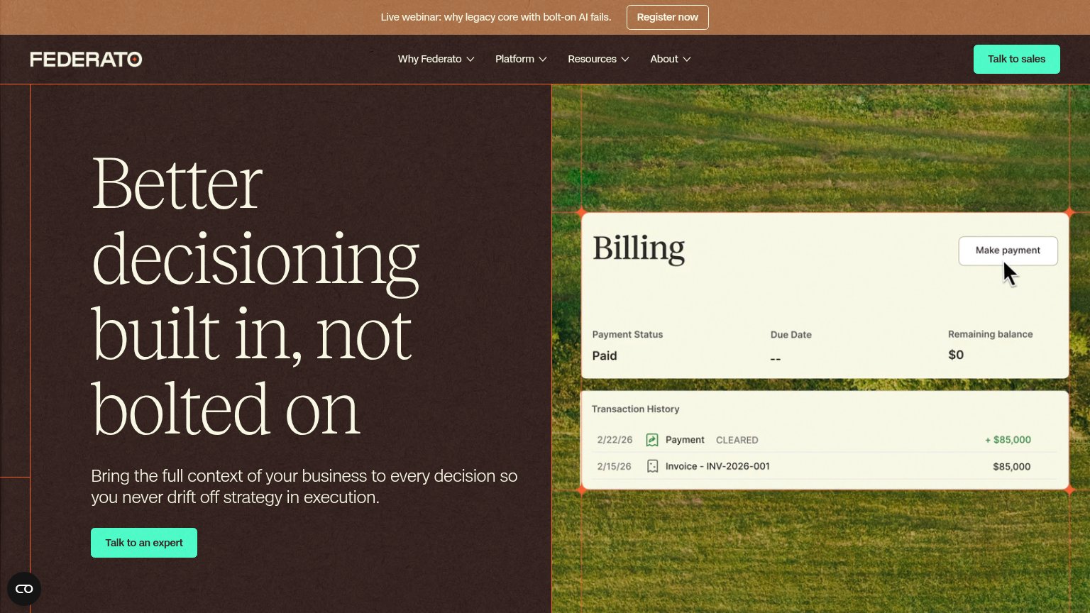
Problems
- 'demo' feels like a sales-call cost
- hero button visually quiet on desktop
- secondary 'EXPLORE' is vague bare text
Trust
72FairProof that the product is real, competent, and safe to try.
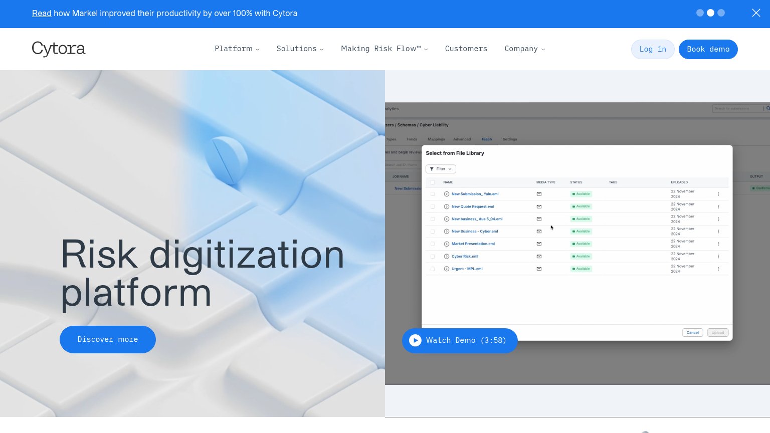
| Trust read | |
|---|---|
| Vantel | "Funk partners with Vantel on AI in placement" banner above the headline |
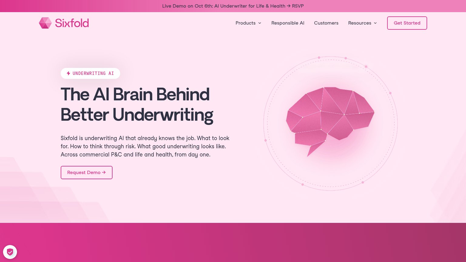
| Announcement bar: "Live Demo on Oct 6th: AI Underwriter for Life & Health → RSVP" | |
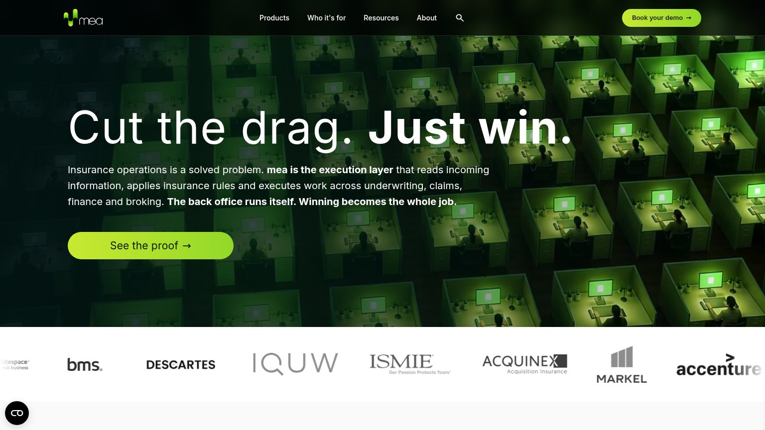
| Banner: "Read how Markel improved their productivity by over 100% with Cytora" | |
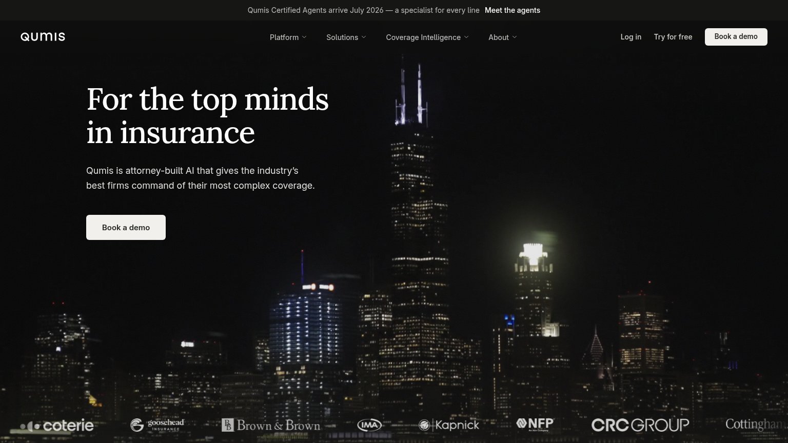
| Customer logo strip: Coterie, Goosehead Insurance, Brown & Brown, IMA, Kapnick, NFP, CRC Group, Cottingham | |
| No visible trust signal identified. | |
| Logo bar with Markel, Accenture, Descartes, IQUW, ISMIE, Acquinex, BMS |
Value props
76FairTitle, subtitle, hero — do they sell the product's true value?
Vantel’s headline
Insurance knowledge sits in files. We activate it.
The intelligence layer for commercial insurance brokers. Compare coverage across markets in minutes and stand behind every recommendation.
Working
Could improve
Information hierarchy
82StrongDoes the design help or inhibit what the page is trying to say?
What works
What to improve
Mobile web
82StrongThe phone experience as a first-class citizen.
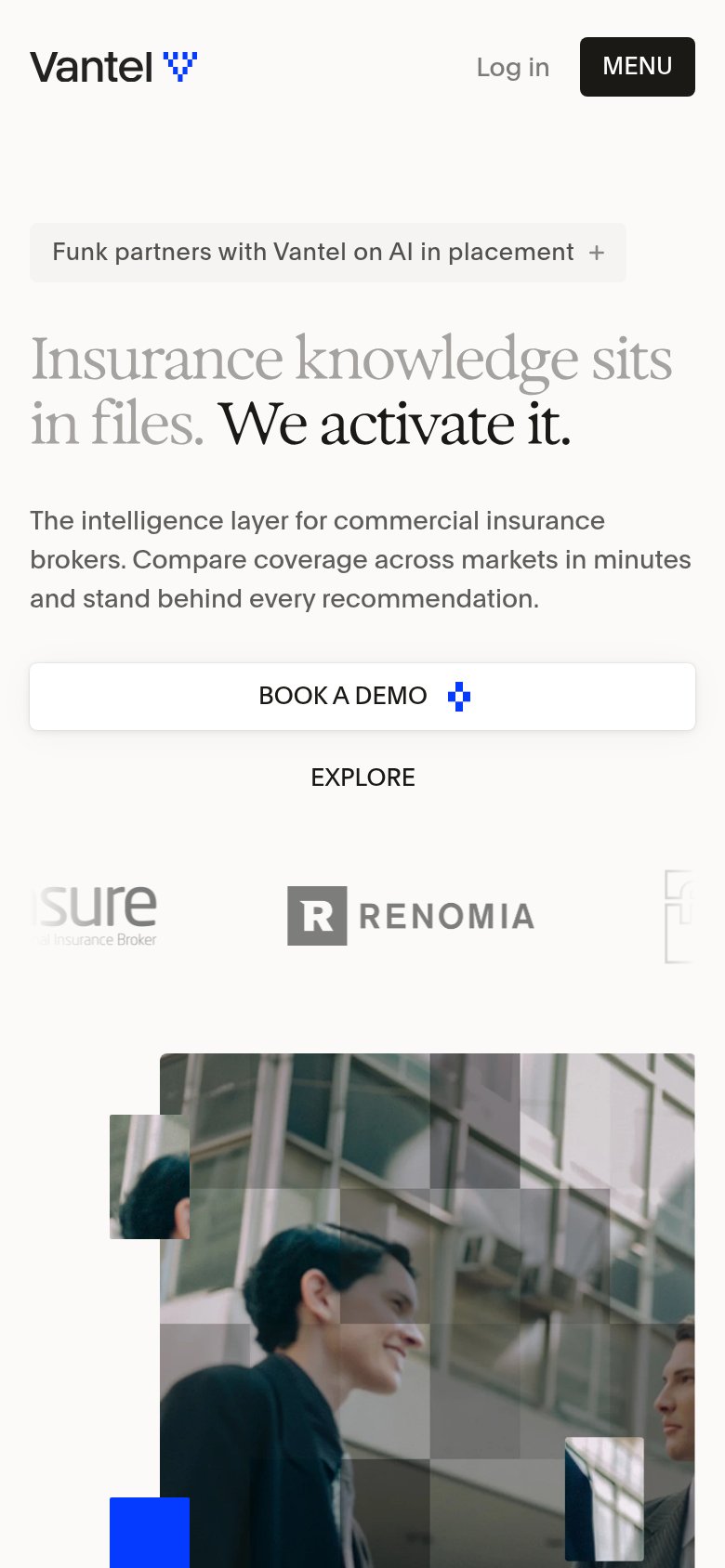
What works
What to improve