
Your landing page’s weakest score is Information hierarchy.
How UpNano ranks
37Growth scoreupdated
category scores
category scoresShowHide
Information hierarchy
28PoorDoes the design help or inhibit what the page is trying to say?
 1234
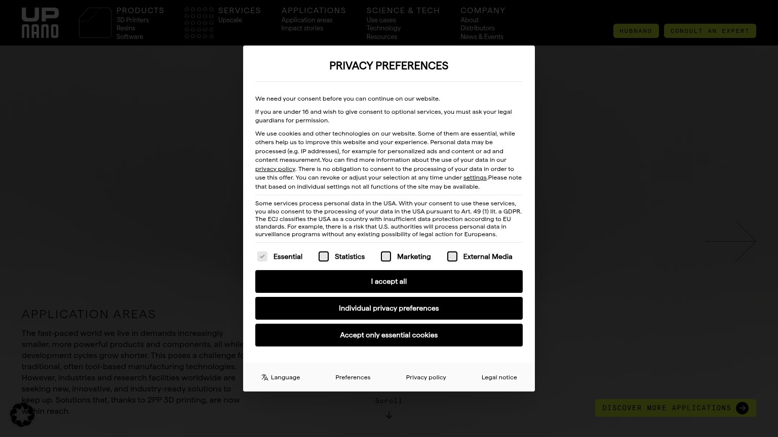
- Privacy consent modal — A full-screen cookie dialog blocks the entire hero, hiding the value proposition and any primary CTA on first paint.
- Three same-weight buttons — 'I accept all', 'Individual privacy preferences' and 'Accept only essential cookies' are styled identically, forcing a three-way read before any choice.
- Consent legal text — Five dense GDPR paragraphs form a text wall the visitor must process before reaching the product at all.
- Dual header CTAs — 'HUBNANO' and 'CONSULT AN EXPERT' share identical weight, splitting attention even once the modal clears.
Mobile web
32PoorThe phone experience as a first-class citizen.
 12
- Long legal text block — Six paragraphs of desktop-density GDPR copy force scrolling inside the modal before the accept buttons are reached.
- Accept buttons cut off — The third consent button is clipped at the viewport edge, so the full choice set requires a scroll to see.
Value props
38PoorTitle, subtitle, hero — do they sell the product's true value?
UpNano’s headline
APPLICATION AREAS
The fast-paced world we live in demands increasingly smaller, more powerful products and components, all while development cycles grow shorter.
Working
Could improve
Trust
38PoorProof that the product is real, competent, and safe to try.
How UpNano compares
Trust read
CTA
48PoorCopy, size, verb, cost-feel — does the primary CTA earn the click?
How UpNano compares
Recommended rewrites