
Your landing page’s weakest score is CTA.
How Exaddon ranks
CTA
48PoorCopy, size, verb, cost-feel — does the primary CTA earn the click?
Problems
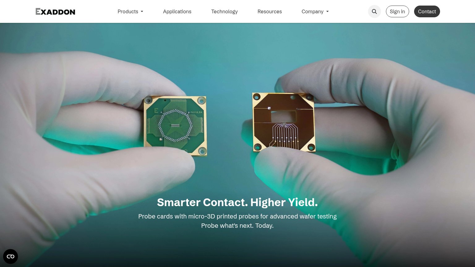
- no CTA in hero, nav-only
- no action verb or payoff
- hidden behind hamburger on mobile
- sales-call cost feel
Mobile web
52FairThe phone experience as a first-class citizen.
 123
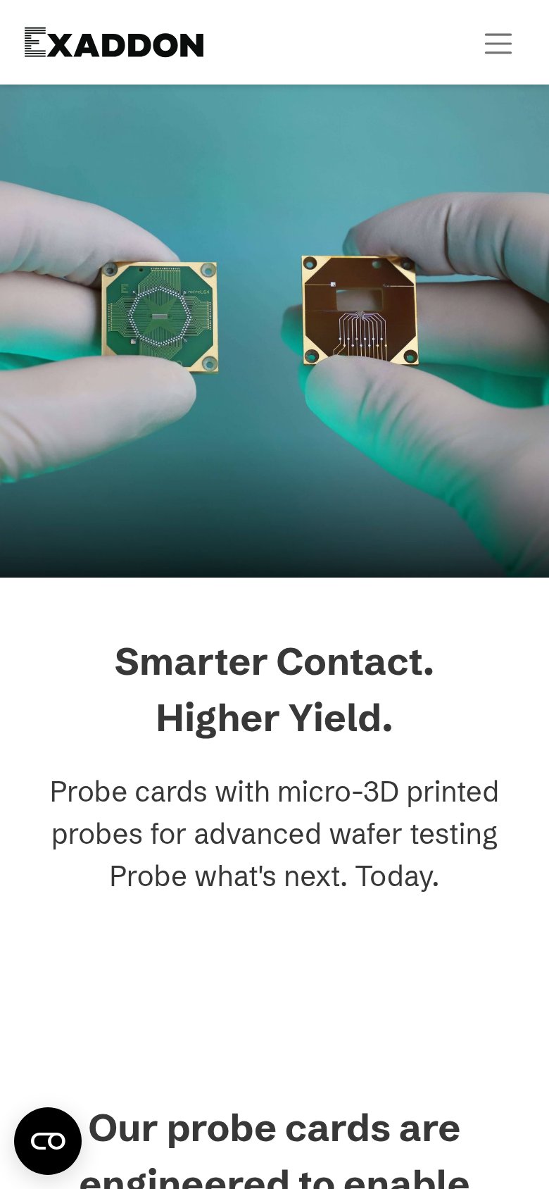
- Hero subhead area — No CTA anywhere in the first viewport — the desktop Contact button is hidden in the hamburger, leaving nothing to tap.
- Chat bubble overlap — Floating widget sits on top of the section heading text, obscuring the first word.
- Oversized section heading — "Our probe cards are engineered to enable" renders desktop-large, wrapping cramped lines and pushing content down.
Information hierarchy
58FairDoes the design help or inhibit what the page is trying to say?
What works
What to improve
Trust
58FairProof that the product is real, competent, and safe to try.
How Exaddon compares
Trust read
Value props
68FairTitle, subtitle, hero — do they sell the product's true value?
Exaddon’s headline
Smarter Contact. Higher Yield.
Probe cards with micro-3D printed probes for advanced wafer testing Probe what's next. Today.
Working
Could improve