
Your landing page’s weakest score is Value props.
How Upit ranks
59Growth scoreupdated
category scores
category scoresShowHide
Value props
35PoorTitle, subtitle, hero — do they sell the product's true value?
Upit’s headline vague
Recent & Top Games
Working
- Play counts (609K, 128K) add social proof
- Vivid game art shows real content
- Feed proves an active community
Could improve
- No statement of what Upit is
- Creation value hidden in a nav icon
- No emotional or outcome-driven copy
Information hierarchy
48PoorDoes the design help or inhibit what the page is trying to say?
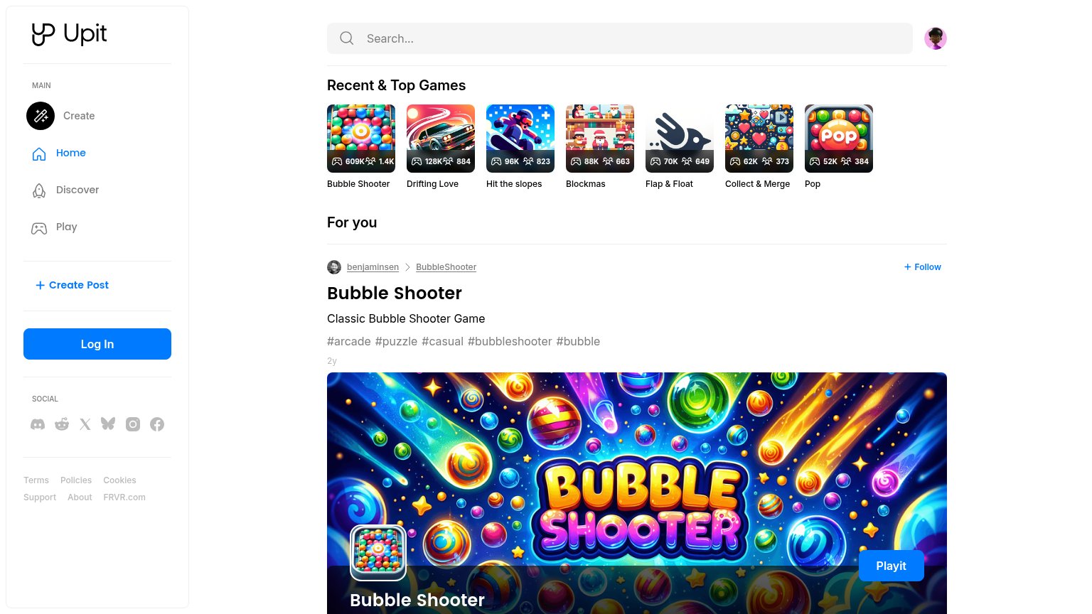 1234
- Log In button — Styled in the same blue weight as "Playit" and "+ Create Post", so three CTAs compete and none reads as primary.
- Recent & Top carousel — Seven equal-weight clickable tiles sit above the featured post, splitting attention before the "Playit" action.
- Sidebar social icons — Six outbound social links plus six footer links sit above the fold, leaking attention before any conversion.
- Playit button — Pinned to the far-right bottom edge of the hero, outside the left-anchored scan path of the title and tags.
Trust
64FairProof that the product is real, competent, and safe to try.
How Upit compares
Trust read
CTA
72FairCopy, size, verb, cost-feel — does the primary CTA earn the click?
How Upit compares
Recommended rewrites
Mobile web
74FairThe phone experience as a first-class citizen.
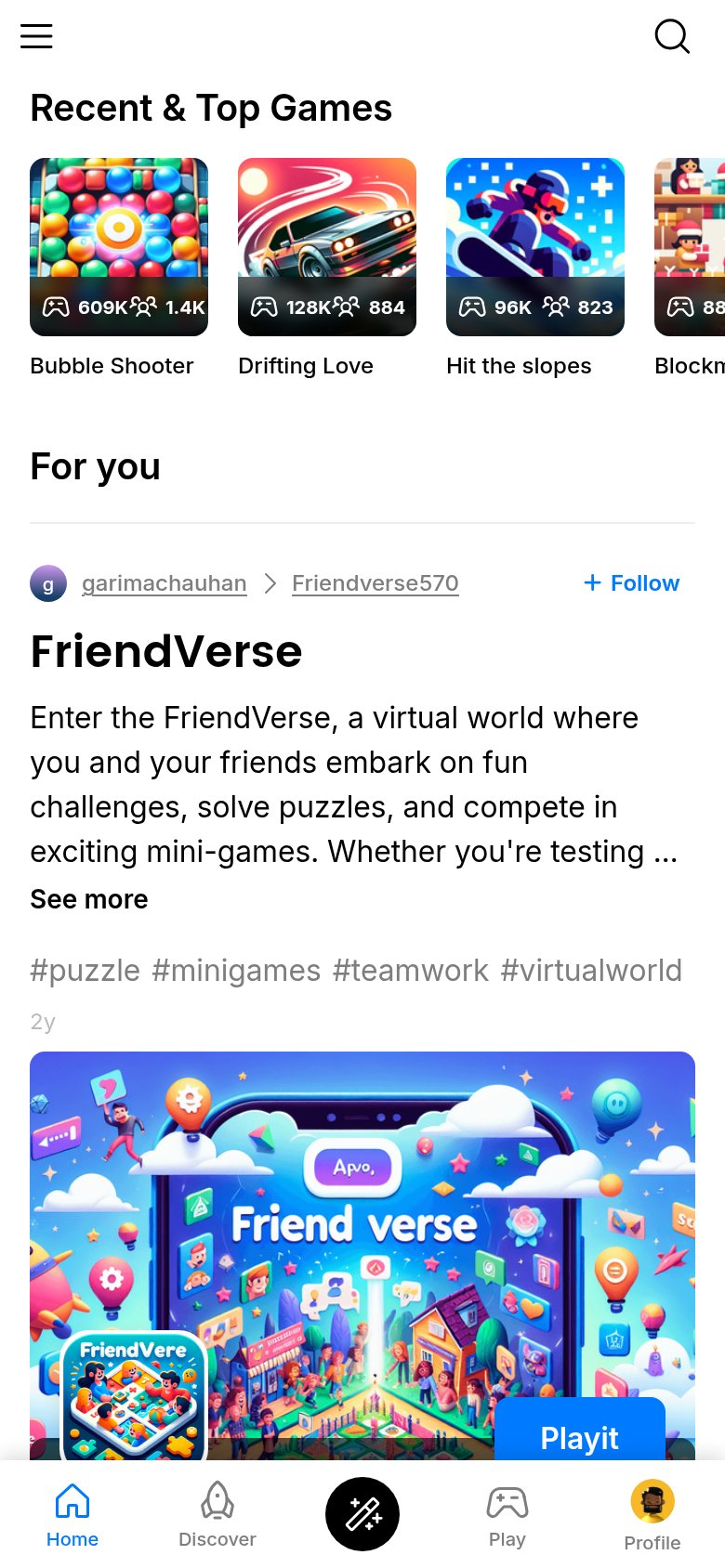
What works
What to improve