
Your landing page’s weakest score is Information hierarchy.
How Fifth Door ranks
- 1.
Bitmagic76
- 2.
Rosebud AI72
- 3.
Fifth Door68
- 4.
Upit59
- 5.
websim.ai57
68Growth scoreupdated
category scores
category scoresShowHide
Information hierarchy
58FairDoes the design help or inhibit what the page is trying to say?
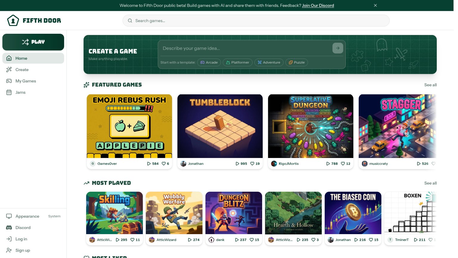 1234
- Discord beta banner — Top banner pushes an outbound Discord exit before the visitor sees the create-a-game surface.
- Featured game cards — Four bright, high-saturation thumbnails outweigh the darker create panel and pull the eye off the primary action.
- Submit arrow button — The primary create CTA is a small low-contrast arrow inside the input, easy to miss at a glance.
- Play sidebar button — A second dark-green pill styled like a primary CTA competes with the create panel's action.
Value props
62FairTitle, subtitle, hero — do they sell the product's true value?
Fifth Door’s headline undersells
Create a game
Make anything playable.
Working
- Prompt box shows the product in action
- Template chips clarify what to build
- Play counts on games act as proof
Could improve
- No mention of AI or no-code promise
- Subhead is vague, adds no specifics
- No numbers or time-to-value claim
Trust
68FairProof that the product is real, competent, and safe to try.
How Fifth Door compares
Trust read
Mobile web
72FairThe phone experience as a first-class citizen.
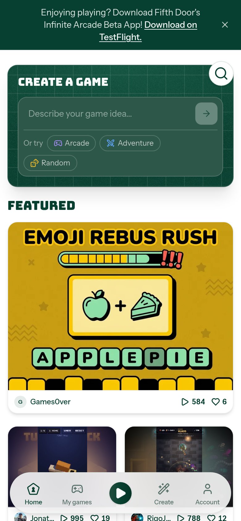
What works
What to improve
CTA
78FairCopy, size, verb, cost-feel — does the primary CTA earn the click?
How Fifth Door compares
Recommended rewrites