
Your landing page’s weakest score is Value props.
How Websim ranks
57Growth scoreupdated
category scores
category scoresShowHide
Value props
32PoorTitle, subtitle, hero — do they sell the product's true value?
Working
- Feed shows real user-made creations
- Play counts (899k, 90k) signal traction
- Create button hints at making, not just playing
Could improve
- No headline or subhead anywhere in fold
- Featured card copy is project content, not messaging
- New visitors must guess what Websim does
Information hierarchy
48PoorDoes the design help or inhibit what the page is trying to say?
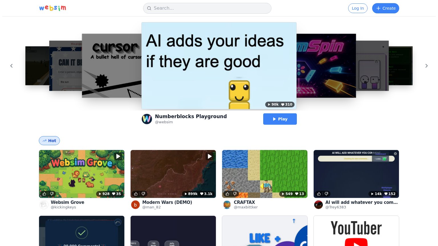 1234
- Hero project carousel — The fold's largest surface shows a rotating project thumbnail instead of any statement of what Websim is, so the value prop is entirely absent.
- Play button — The boldest CTA on the page drives into one project, outranking the platform's real conversion action, Create.
- Create nav pill — The actual conversion action is a small header button visually subordinate to the carousel and Play CTA.
- Hot card grid — Eight-plus equal-weight thumbnails compete at once, each an exit path before the visitor understands or joins the product.
Trust
65FairProof that the product is real, competent, and safe to try.
How Websim compares
Trust read
CTA
68FairCopy, size, verb, cost-feel — does the primary CTA earn the click?
How Websim compares
Recommended rewrites
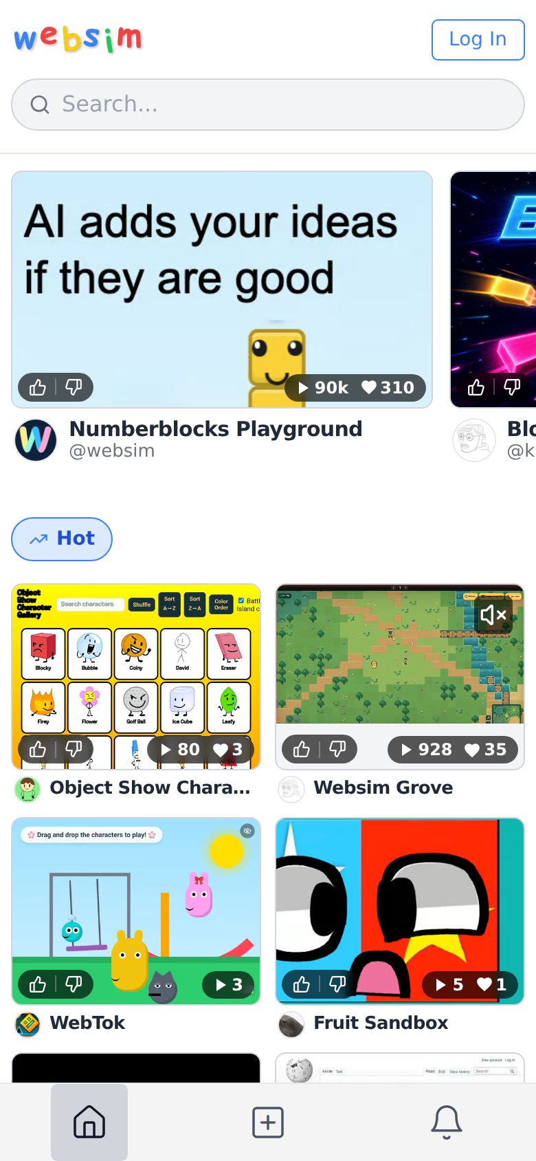
Mobile web
71FairThe phone experience as a first-class citizen.
What works
What to improve