
Your landing page’s weakest score is Information hierarchy.
How Upheal ranks
84Growth scoreupdated
category scores
category scoresShowHide
Information hierarchy
78FairDoes the design help or inhibit what the page is trying to say?
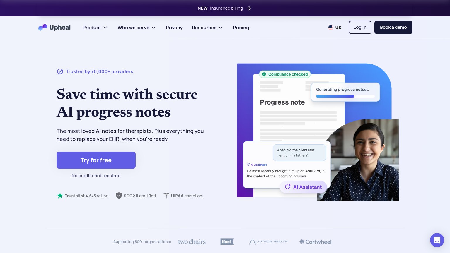 123
- Book a demo button — Dark filled button outweighs the hero 'Try for free' CTA visually, splitting the conversion path.
- Top navigation row — Five nav items plus dropdowns and a login link give attention nine exits before the hero CTA.
- Insurance billing banner — The 'NEW Insurance billing' announcement with arrow is the first clickable element and pulls attention off the value prop.
Value props
84StrongTitle, subtitle, hero — do they sell the product's true value?
Upheal’s headline sells
Save time with secure AI progress notes
The most loved AI notes for therapists. Plus everything you need to replace your EHR, when you're ready.
Working
- Outcome + security + product in 7 words
- Dense proof: 70k providers, SOC2, HIPAA
- Hero image shows notes generating live
Could improve
- Subhead lacks a concrete number
- "Most loved" is an unproven superlative
- No emotional hook for after-hours burnout
Trust
84StrongProof that the product is real, competent, and safe to try.
How Upheal compares
Trust read
CTA
86StrongCopy, size, verb, cost-feel — does the primary CTA earn the click?
How Upheal compares
Recommended rewrites
Mobile web
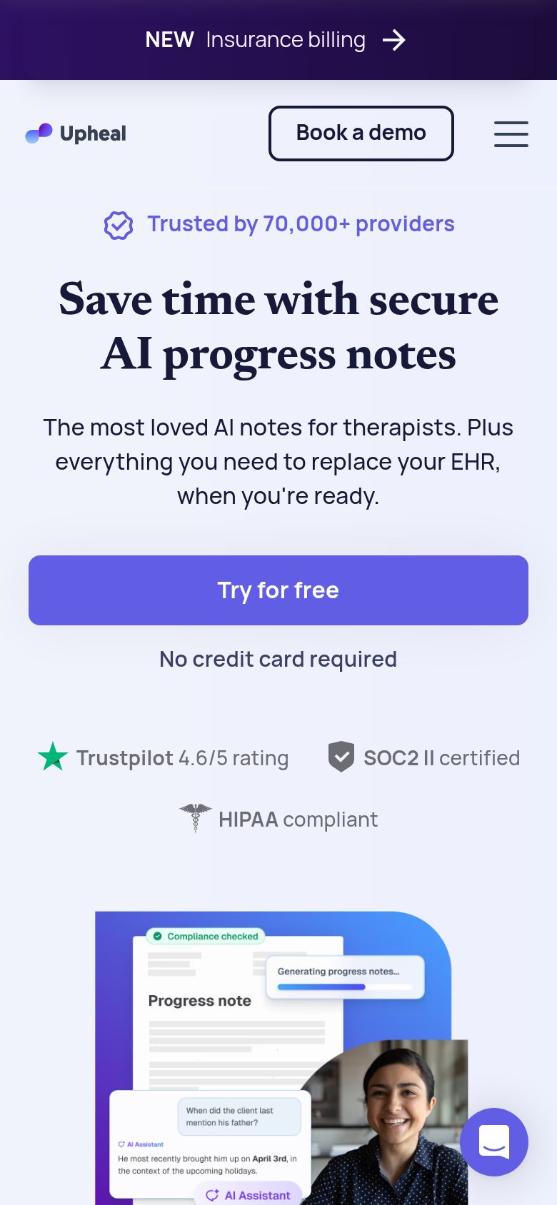
86StrongThe phone experience as a first-class citizen.
What works
What to improve