
Your landing page’s weakest score is Trust.
How Blueprint ranks
79Growth scoreupdated
category scores
category scoresShowHide
Trust
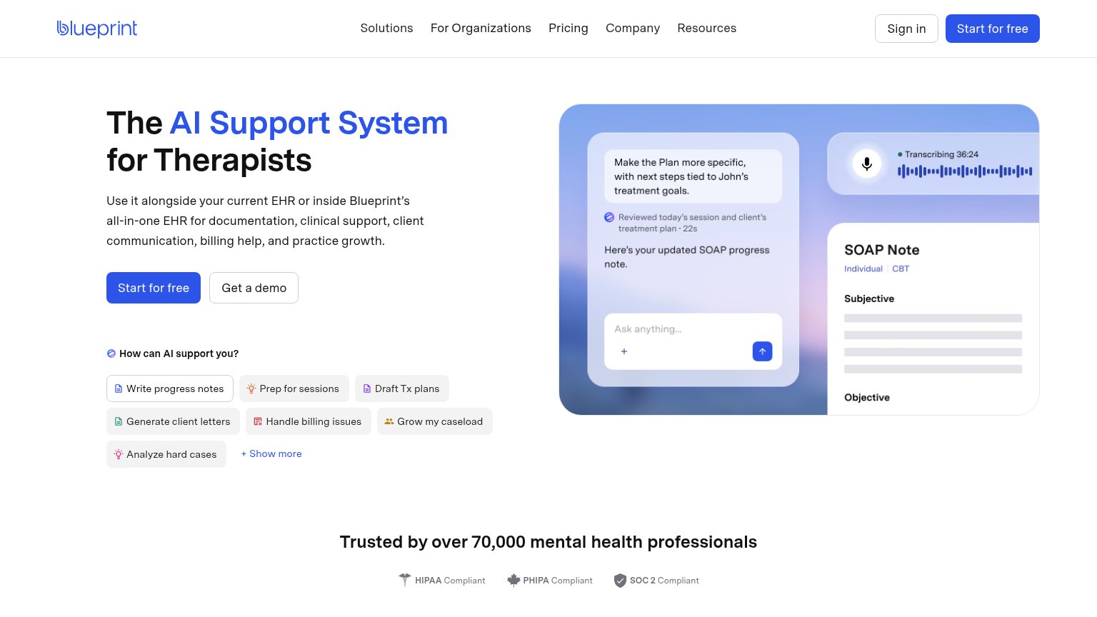
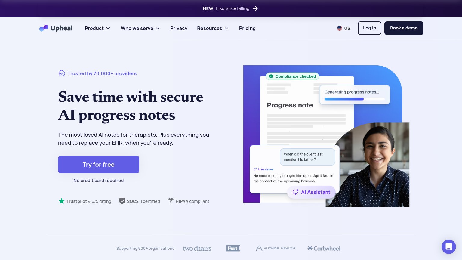
76FairProof that the product is real, competent, and safe to try.

| Trust read | |
|---|---|
| Blueprint | "Trusted by over 70,000 mental health professionals" with HIPAA, PHIPA, and SOC 2 compliance badges |
| No visible trust signal identified. | |
| Truncated banner line beginning "Trusted by leading community-based organizations across the US" | |
| "Trustpilot 4.6/5 rating · SOC2 II certified · HIPAA compliant" badge row under the CTA | |
| Trusted by 30,000+ mental health professionals — 4.7/5 · 1,376 in-app ratings, G2 4.8/5, Capterra 4.5/5 | |
| No visible trust signal identified. |
Information hierarchy
78FairDoes the design help or inhibit what the page is trying to say?
123- Prompt chip grid — Seven equal-weight chips plus '+ Show more' form a second decision block that competes with the CTA row directly above.
- Five-link nav row — Solutions, For Organizations, Pricing, Company, Resources plus Sign in give six exits before the visitor reaches the hero.
- Get a demo button — Sits at the same size directly beside 'Start for free', splitting the click between two conversion paths.
Value props
78FairTitle, subtitle, hero — do they sell the product's true value?
Blueprint’s headline
The AI Support System for Therapists
Use it alongside your current EHR or inside Blueprint's all-in-one EHR for documentation, clinical support, client communication, billing help, and practice growth.
Working
Could improve
Mobile web
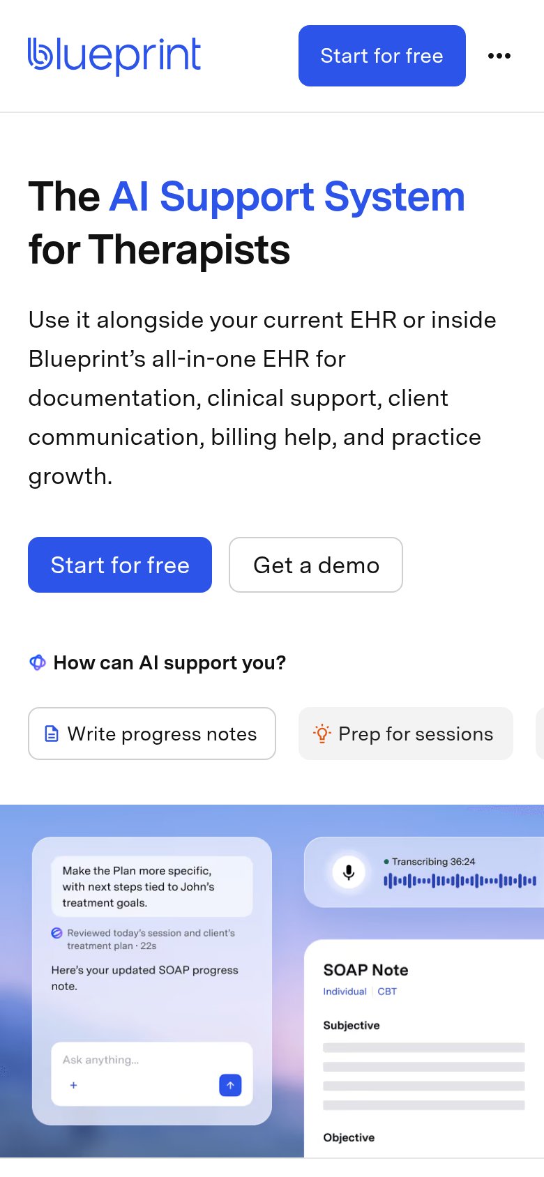
78FairThe phone experience as a first-class citizen.
What works
What to improve
CTA
86StrongCopy, size, verb, cost-feel — does the primary CTA earn the click?
How Blueprint compares
Recommended rewrites